Collection 47: Blue

Since I don't have any news to post on the blog today, how about some new concepts? I tried to pick one of the themes suggested in the comments of the last post, but I didn't really have what you guys were looking for. I know you'll be sad to hear that so here are some blue jerseys.

Collection 28: Canadian White Out

It's weird. Last time I updated Concepts was only a week ago and the Lightning had just dispatched with the Pittsburgh Penguins in the first round of the playoffs. Now the Bolts are already moving on to the Conference Finals with a sweep of the Capitals! So much can happen in a week.

Now with a brief break in the action, I thought it might be time for a concept post that honors a playoff tradition — the white out. And it just so happens these are all Canadian teams.

If it seems my team's unlikely playoff run is resulting in fewer updates to the site, I won't argue with that. I fully expected to be enjoying the Stanley Cup playoffs from the sidelines. But with my team in the middle of it, I find it hard to spend my free time doing anything but cheering them on.

I'll do my best to keep the updates coming when I can.

Collection 18: To the Northeast

Today's batch of concept art brings us to the Northeast Division.

Last month, I re-posted some early sketches from the Sabres' 2006 rebranding on the blog. Here, Ross decided to spruce up one of the sketches and put it on the current uniforms. I get the feeling something like this would've gone over a lot better with fans than the "Buffaslug."

We've gotten Jets and Nordiques concepts on this page recently, and I didn't want to leave the Whalers out. They were part of the Northeast Division back in their day.

Benoit brings a unique set to the table. A bold choice with the red-free, two-tone blue jerseys for the Habs, but that's why it's interesting to look at.

New concepts are rolling in all the time. If you'd like to submit yours, just send a JPG or PNG file by email.

Collection 4: Ivall Redux

I've got a handful of new concepts to share from Mike Ivall. He's tackling Predators, Thrashers and Islanders as well as revisiting the Bolts and Leafs.

Knowing the Lightning are looking to ditch the black and silver and go with a blue/white color scheme, Mike thought perhaps they might try a two-tone blue. Personally, I'm a fan.

A lot of you have been asking about how to make your own concept art. Unfortunately, there's no simple or quick way to throw stuff together. Most of the designers who submit work are very talented graphic artists with knowledge of image editing software. If you want something free to get started, look up something like Gimp or Inkscape. I'd love to put together some kind of tutorial, but it's not really that simple. I will try to get together some templates at some point though. So keep an eye out for that.

Mike Ivall is Back!

Long time concept contributor and friend of Icethetics, Mike Ivall has caught the creativity bug, eager to express himself with jersey artwork. And I think that's something we're all happy to hear. Over the last few days he's immersed himself in the following designs.

After the St. Pete Times shared some new details on what the Lightning may be planning for their upcoming uniform redesign, Mike took a stab with some familiar elements. The lack of any black or silver does squarely put the look in Maple Leafs territory, which I'm not wild about. But you never know what Stevie Y has up his sleeve (i.e.: Dwayne Roloson).

I don't know what it is about this color combination but I absolutely love it. I saw Mike's concept and it's made me want to completely redesign Icethetics again — in these colors. The two-tone blue is all right if not overused these days, but add the red and suddenly it's completely unique. Anybody else with me on this?

How can Ottawa improve upon this? It's simple. They can't. Do this and the Senators will never need another jersey for the next century.

As usual, Mr. Ivall's work is outstanding and worthy of a post all to himself. And I can assure you there is more coming not only from Mike but many other talented artists as well.

There's Something About Retro

They say fashion is cyclical. Trends come and go and come around again. In the NHL, we seem to be re-entering a retro phase. Throwback jerseys have always been popular with fans, but it seems only in the last few years have teams started to take advantage of that. Classic designs that bring history back to life have started making their way back into the mainstream, in the form of alternate jerseys and special events such as the Winter Classic.

So "retro" is the theme of today's post. Let's see what our artists have come up with.


Jared LeBlanc

I'm a big fan of Jared's Winter Classic concept uniforms, especially what he's done for the Penguins. It's been suggested that the Pens might join the Bruins in borrowing elements from multiple past jerseys for a unique new look that still feels vintage.

Jared's also submitted some ideas for the Heritage Classic, details of which will be announced later today. Regarding the design, he writes, "The Canadians jersey is really the only vintage jersey left that they haven't worn already. ... For the Flames, I took a look at the Cowboys jerseys, which looked like a pretty solid design. I considered doing a carbon copy but I thought they might still want the Flames logo on it."

Both sets get a big thumbs up from me!

Connor Hanley

Another set of retros based in real life, come by way of Connor. Over the summer, it was announced that the Canucks would don a throwback jersey to celebrate their 40th anniversary. While this won't be the one, the Kings' vintage threads seen here are probably not far from what they'll be wearing on a few occasions this season.

The Kings did give their first round draft pick a gold jersey from the 1960s after all. We're still waiting on an official announcement from the team, however.

Connor Hanley

Connor also sent in this set which calls back to the 1920s and the NHL clubs that arrived long before the Penguins and Flyers — that's the Pirates and Quakers. Of course the design is a little dated now with Gagne's name on the back. (He plays for my team now!)

I suppose it might be a treat for centenarian hockey fans in Pennsylvania to see those two sweaters hit the ice again. But they shouldn't hold their breaths.

Jack Martineau

Canadian fans always like to see their teams don the retro duds. Jack digs back deep into Maple Leafs history with these St. Pats sweaters. The team actually wore that green jersey for a game or two back in the mid-90s. They should do it again!

Ryan Haslett

And while we're on the subject, here's another throwback for the Leafs from Ryan. Just like the St. Pats jersey, this one also saw life in the afterlife when it was dusted off for at least one game in the early '90s. Now that the Leafs seem to be taking an interest once again in looking like the storied hockey team they are, maybe more of these throwbacks are in the cards.

Matt Marczel

And to finish things off, one of our most prolific artists, Matt Marczel, offers up this throwback to the previous iteration of the Ottawa Senators club. He points out that it could be used if the Sens ever play in a Winter/Heritage Classic. Unfortunately, the first problem is legibility. The second is the Canadiens just wore a very similar stripe-y sweater last year.

By the way, I have lots of new concept art ready and waiting. Someone needs to stay on me about keeping this page updated. I'm very forgetful.

Numerous Northeast Concepts

Settle in, folks. This is one of the biggest sets of concept art I've ever posted. Because I haven't had a lot of time to write new posts, obviously the artwork has been piling up. The Northeast Division seems to be the most popular for Icethetics artists, so I thought it'd be the best way to unload a dozen new designs. Here we go.


John Fusco

Had to start with this one. It's just phenomenal. You wouldn't think this type of design would make a good hockey sweater. Then you look at it. I'm waiting for an NHL team to jump onto an idea like this. Very sharp look. Well done, John!

Drew Krause

Another great Maple Leafs concept comes from Drew. He's made some updates to the traditional leaf logos, and they look great. Even the striping on the uniforms really works. Can't believe I haven't gotten around to posting some of these sooner.

Matt Marczel

By now we all know the Sabres will go back to their original uniforms next season — or at least something similar. Matt's put together a solid concept here with a nice modern flair.

Joni Oksanen

However, if you want more of a throwback feel, Joni's concept is the way to go. It's much simpler and features a royal blue just like the originals did in 1970. The only thing he's changed a bit is the striping on the dark jersey.

But either way you go would be a win for the Sabres and their fans, desperate for a return to the vintage uniforms. Sometimes you get it right the first time, don't you?

Jake Slavik

And sometimes we mix things that probably shouldn't mix. Jake's concept plays off of every era in Sabres history. And it's not ideal. Stare into those yellow eyes. Stare deep.

Frightening. Let's move onto another team.

Joshua Heckman Adam L'Italien

Joshua and Adam have both opted to experiment with brown jerseys for the Bruins — something I half expected to see at the Winter Classic earlier this year. Joshua's could even work as a third jersey this coming season if they were up for a change.

Adam's isn't bad either but doesn't lend itself well to Reebok Edge or television, for that matter. It's a very drab-looking jersey with the dark brown and the slight striping. However, I really do like the crest.

Dallas Hicks Ryan Haslett

Got a couple of new Senators concepts here. Dallas tries his hand at a Winter Classic-insipired concept... you know, in the event the NHL decides Canada should play an outdoor version of its own sport.

Ryan's isn't bad either — though without the stripes, the O just looks like a zero and nobody wants that associated with their team. Unless it's in the goals-against column, I guess. But if nothing else, this uniform has the best socks so far!

Ryan Haslett

That's right, it's all Ryan all the time for the rest of this post. This is his Canadiens throwback. Unfortunately, the numbers are rather illegible on the striped back of the jersey. Other than that, it's a nice-looking sweater with an old-time feel.

Ryan Haslett

Lastly, as a bonus, this concept is based off of a Quebec Nordiques logo that designed in 1995 but never implemented as the club was relocated Denver to become the Avalanche. And that is, in fact, where Ryan gets most of the elements of his design. I'll be honest. Makes more sense in the Rocky Mountains. Oh, what could have been.

And breathe. That was a lot to take in. Up next, it's Elliott Strauss' final rebranding set. That comes this weekend. After that, I'm implementing a new element into our concept posts. Details to come.

JerseyWatch Concepts

In today's brand new concept post, we take a look at what's in store for the 2010-11 season. The following designs are what Icethetics artists came up with based on descriptions in the initial JerseyWatch 2010 post.


A.J. Bloomquist

One concept that caused a stir after the JerseyWatch post went live was this one by A.J. He posted his work on Sabres' message board months ago. The crest, a script similar to what was described to me, is taken from the old logo of the Buffalo Bisons of the AHL.

A.J. submitted a clean version of his concept so we could all get a good look at it. And who wouldn't love to see Buffalo paying tribute to their town's hockey history on their 40th anniversary?

Jeff Wozniak

Similarly, Jeff sent in his understanding of the rumored new script crest. But this veers pretty far from what I was originally told — which is that it's basically a baseball-type script with the 1970s logo positioned in the tail.

Still, that was just a preliminary concept and things can change. So Jeff may be right on the scent.

Doug Graham

The Penguins are also big news right now. Word from Reebok is they're launching a new alternate sweater for 2010, not to mention all the rumors that the Pens will see action in their second Winter Classic in four years.

Doug's concept is based on the rumor that the Penguins will dig up another blue jersey from their past. He could be on the right track with this. I could see them making it the home jersey one day.

Tony Galiffo

The Blue Jackets will allegedly be debuting a new third jersey in the fall. The team has said it will feature a cannon as its primary emblem. So Tony's incorporated that as well as his own little tribute to the old Cleveland Barons, who wore large patches shaped like Ohio on their sleeves.

Michael Lapsley

Michael tackled a couple of JerseyWatch rumors. The Maple Leafs will be putting stripes and shoulder patches back on their mostly-plain jerseys next season. This is more than likely what we should expect to see — unless the Leafs design a brand new shoulder patch.

Michael Lapsley

And the Ducks are on the list to add a new third jersey in 2010. Absolutely no details have circulated as of yet, but Michael's thinking they go with an orange sweater with the webbed D front and center on the chest.

He's done some nice work but I kind of hope he's wrong. I'd like to see the Ducks introduce a new logo with this alternate sweater. Maybe something that actually resembles a duck wouldn't be too much to ask?

Our NHL rebrand series continues with Part 7 this weekend!

Freak Out Friday XLV

Friday is here again and you know what that means. Time to freak out!

I'm really trying to get back into the habit of having a Freak Out Friday for you guys every now and then. Of course it relies primarily on your submissions. So keep them coming!

This week's theme is Original Six. Just how horrible can we make these most legendary of teams look? The answers to that question ensue.


John B

I don't mean to always be picking on the Blackhawks, but I think we can all agree that gravity-defying feathers are not the way to go. Not by a long shot.

Even the colors have me a little concerned. Maybe we should just move on.

Charles Cadieux

Nope, shouldn't have moved on. Adding black to the Rangers color scheme. Now that's something I never thought I'd see. And obviously I hope I never have to. Hockey fans everywhere would revolt!

But since it is only fake, we can all rest easy. The tricky part will be removing it from your memory.

Randy Dudek

The Maple Leafs were the focus of the previous concept post and we had a lot of really nice artwork. Now it all goes out the window because this just beats everything. I mean, it's a Maple Leafs jersey covered in actual maple leaves!

Wonder why we've never seen a third jersey that looks like that.

In closing, all I'll say is I hope you are not bleeding from the eyes. More concept art (the good stuff) this weekend.

Time Traveling in Toronto

Whenever I put together a new concept art post, I often try to tie it all together with a theme of some kind. One of my more common themes is geography. Sometimes I'll take you on a virtual journey across the continent with a number of different teams. Tonight's theme focuses on one team and instead of traveling through space, how about time?

A handful of designers have reached back into history to come with their ideal versions of Toronto Maple Leafs jerseys — be they home, road or alternate. Now strap in. Don't want to lose anyone on the journey.


Matt Marczel

We begin with Matt's combination of present and recent past — though I use the term "past" loosely and you'll see why in a moment.

These home and road Leafs jerseys are pretty much a hodgepodge of the last half-century — especially when it comes to the logos. For the primary logo, he's got the leaf introduced in 1966 with the text stylings that came about in 1970.

The secondary/shoulder mark is based off of the leaf logo launched in 1938. And it looks to me like the T within it is borrowed from the TML shoulder patch which debuted in 2000. So that's a pretty good mix of history there.

Yoav Ickowicz

The oldest thing in Matt's design dated back to 1938. Yoav Ickowicz wants to go back at least another decade. His Maple Leafs concept is based on the less-common 1928 logo. He's also gone with three stripes on the sleeves and bottom of the jersey instead of the usual two.

It's great work and I sure hope we see more from Yoav in the future.

Ryan Haslett

So maybe you thought 82 years was far enough back in time. As it stands, the Leafs themselves are only 84 years old. But you'd be wrong. Toronto's hockey history dates back much further than that, as Ryan demonstrates with his Toronto St. Pats concept.

With the Devils dipping back into their past for green-infused uniforms this St. Patrick's Day, perhaps the Leafs might join them in something like this? Not to mention, I'm sure they'd sell like mad.

John B.

Now this last one may have you puzzled. I sure am. The only way I can figure it, not only would you have to travel to another time, but also another dimension to find it.

It's what I imagine someone from the 1950s would draw if you asked them to predict what the Maple Leafs would be wearing in 50 years. (Except that the CN Tower wouldn't come for another 20 years. Let's just look past that.)

Man, I just gave myself a great idea. What if we started concept contest where we try to imagine/predict what teams would be wearing (or even exist) 50 or 100 years from now? I think it would yield some interesting artwork.

Northeast Roadtrip

This is shaping up to be quite a week. New posts on the blog and jersey galleries, and now brand new concept art. Today, I'm grouping up a handful of artwork for the Northeast Division — namely, the Sabres and Maple Leafs.


Jeff Wozniak

We start with a slew of Buffalo concept jerseys by Jeff Wozniak. The first graphic shows what he thinks the Sabres should wear on a regular basis as road/home/third. I like them all but I always liked that crossed-sword logo better on the red jersey several years ago.

His next attempt is a gold Sabres jersey. I don't believe they've ever worn gold so that would be quite a step out of the ordinary. (And not a pleasant one either.)

The other two are all about early 20th century sweater styles. Lots of stripes and simplistic crests. I think I could get behind the first one for some kind of special event.

However, the "BS" jersey should stay right here on this page where it is and go no further. We learned from the Montreal Canadiens' 100th anniversary that this type of striping does not work. You have to be able to read names and numbers and not be concerned with epileptic fits.

Then there's the white pants. Very few uniforms can make that look good. This is not one of them.

Look back toward the top of this group and you'll see Jeff has some great design ideas for the Sabres. But clearly he should avoid fourth, fifth and sixth alternate uniforms in the future.

Ryan Haslett

Another Icethetics regular, Ryan Haslett, came up with a grey-infused Sabres concept. It's based on the vintage three-stripe sweater from the '70s with several contemporary elements, including the grey/silver accents and numbering and lettering style.

As for my thoughts, white would probably be a better highlight than grey. Simply swapping white in would probably be an improvement. But I think I'd have to see it in a game to know for sure.

Ryan Haslett

This post has been pretty focused on the Sabres, so let's switch to another Northeast team. This Maple Leafs concept calls for two alternate sweaters — one for home games and another for the road.

Also designed by Ryan, it features the two waist stripes that will be returning to Toronto's regular home and road sweaters next season. He's also come up with two new alts. The home design is a dark version of the Leafs' current third jersey. The road whites are a new design borrowed from the team's rich past.

There will be one more new post before I leave for Vegas on Friday. Then beginning Friday, check back for new concepts to be auto-published daily.

The Next Winter Classic(s)

It's hard to believe 2010 is a mere four days away. That means the third annual Winter Classic is coming up at the end of the week.

And on the eve of the big event, a bunch of eager artists have started thinking about the next one. Or should I make that plural? A couple weeks ago, NHL commissioner Gary Bettman said he'd like to see a second outdoor game on New Year's Day 2011 — this one in Canada.

No decisions have been made at this point and any discussion on the topic is pure speculation. But that's what the Icethetics Concepts page is for. So as we prepare for the Philadelphia Flyers to face the Boston Bruins at Fenway Park, let's think about what we might like to see in 2011.

Rumors suggest Yankee Stadium will play host to at least one of the 2011 outdoor games. That puts the Rangers at home to face who? Islanders? Maple Leafs? Capitals? And regarding the Canada game, Bettman mentioned Calgary by name. Would the Flames face their province rivals, the Oilers? Perhaps the Canucks or even Avalanche?

Let's see what some talented people have come up with as suggestions for 2011.


Brendan Droppo

Yankee Stadium

Rangers vs Islanders

This may be the most well-designed Winter Classic 2011 concept I've received. Brendan Droppo is sticking with the New York City rumors and pairing the Rangers and Islanders at Yankee Stadium. Probably a safe bet.

He's got a great logo that evokes the locale (as the past logos have done) and a pair of classic sweaters. Though I'm not sure you can call anything but their current jersey a classic. But then I thought that about the Red Wings too. And theirs worked out just fine last year.

This is an awesome concept and I'm completely on board with it only if western Canada also gets their own Winter Classic. If they don't, I say out with the Isles. Canada deserves to get back into the outdoor games. Pit the Rangers against the Maple Leafs.

If there is a Canadian game, I'd vote to leave it the way it is. Not sure the Rangers have another rival as big as the Isles. Plus we need to share the wealth. Everyone should get a shot at a Winter Classic game.

Cole Jones

Target Field

Wild vs Stars

Cole Jones of The Other 6 Seconds hockey blog emailed in to tell me about his idea. You can read the full proposal on his blog, but here are the bullet points.

While I'm over here trying to get a Canadian team back into their own game, Cole, a Stars fan, is attempting to get a southern U.S. team into the mix — his own. He'd like to pit the Dallas Stars against the Minnesota Wild at Target Field, which is currently under construction in Minneapolis. It will serve as the home of the Minnesota Twins beginning in April 2010 — more than enough time to prepare it for a hockey match.

It would be a huge day for Minnesota hockey fans, that's for sure. To see their current team after 10 years on the ice, facing a blast from the past in the form of North Stars jerseys would probably send some people into a tailspin.

The only problem I see is this: Aside from Minnesotans, who cares? Part of the idea behind the Winter Classic is to appeal to new fans. To put the game in front of people who normally wouldn't watch. The past few seasons the NHL has been going for teams in big markets or with long histories. Yes, Dallas and Minneapolis are two huge markets, but the point is to go beyond them. A Rangers-Isles game would certainly do the trick. Everybody knows the Rangers, even if their not hockey fans.

But this idea of getting the Stars back to Minnesota for a big event is a pretty popular one in hockey circles...

Ryan Haslett

Target Field

Wild vs Stars

Another regular Icethetics artist, Ryan Haslett, independently came up with the same idea. Wild and Stars at Target Field. But Ryan's idea for an event logo and game jerseys is a little different.

They definitely feel like classic hockey, but both designs borrow from current sweaters. The "M" on the Wild jersey comes from the new green third while the Stars sweater is based off their current third, but infused with a little more gold.

Either Cole's or Ryan's designs could work well if, indeed, one of the 2011 Winter Classics were to take place in Minnesota.

Ryan Haslett

Rogers Centre

Maple Leafs vs Canadiens

Speaking of Canada, Ryan did have a second Canadian option — going with one of the oldest rivalries in professional sports. He's got the Habs and Leafs at Rogers Centre in Toronto. Formerly called the SkyDome, the stadium plays home to the Toronto Blue Jays and Toronto Argonauts.

As expected, he's got the teams in vintage sweaters, and surprisingly enough, one that the Canadiens have NOT worn in the past two seasons. The logo is a little weak but it plays off the simplicity of the Rogers Centre logo.

Now to be fair, the Canadiens just took part in an outdoor game in 2003. Maybe they should sit on the bench a little while longer, you know? If you're going to put the game in Toronto, maybe have the Leafs face their province rival Ottawa Senators. As I said, spread the wealth.

One thing I've noticed with these concepts is they're all set at baseball stadiums. Let's not forget the first two NHL outdoor games took place in football stadiums and were quite successful.

In wrapping things up, the one concept I don't have to share that I would really like to see is Calgary. I'm not familiar enough with the city to know where it should be played, but the Flames should host it and their opponent should NOT be the Oilers. (The Oilers faced the Habs in 2003 in Edmonton.) I think it comes down to the Maple Leafs, who play in a huge market and have a long history, or the Canucks, who are geographically closer and a more common foe during the regular season. But it's not up to me.

So what are your thoughts on the 2011 Winter Classic(s)? If you have have concept art to share, I'd be happy to add it to this post. If you just have another thought about a good match-up, drop a line in the comments.

By the way, happy new year!

Strauss NHL Rebrand III

The new concept series in which designer Elliott Strauss takes on the immense task of creating the ideal look of the NHL now continues. All 30 teams will receive his rebranding treatment — some with big changes, others small changes — all, hopefully, for the better.

In Part I, Elliott took on the Capitals, Coyotes and Panthers. Part II, saw updates for the Oilers, Red Wings and Thrashers. This time it's the Penguins, Maple Leafs and Stars.

The bold text below are Elliott's own descriptions.

Pittsburgh Penguins

The logos are all new. I tried to create a dramatic-looking penguin on Pittsburgh's signature triangle. Vegas gold is gone and yellow is back.

An igloo is featured as a patch logo and the jerseys pay tribute to the sweaters from the early '90s. The alternate brings in elements from the mid-00s triangles and also the new triangle featured in my logos.

Certainly a menacing penguin and the classic design is hard to beat. However, it does leave a little to wonder about in terms of logistics.

I like the idea of a yellow third, but is it dark enough that the opposing team could wear white? And while the two-tone jersey numbers may look cool, they don't quite meet their practical responsibility which is legibility — not to mention the nightmare for the person in charge of customizing each sweater.

Despite that critique, though, I am a fan of this look for the most part. By switching to Vegas gold, the Penguins weren't giving themselves the shinier look you'd imagine but rather desaturating their color scheme. It looks horrible and needs a change.

One thing I do like about the Penguins' current design is how they've stepped out of the box with the third jersey in using an entirely new color scheme. Even the Panthers only changed one color. The Pens went all the way.
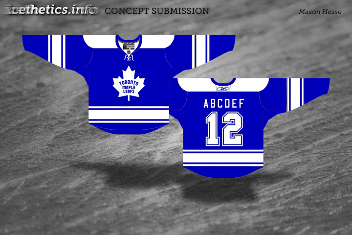
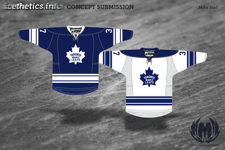
Toronto Maple Leafs

The jerseys aren't much to speak of in terms of changes but I did come up with a new logo package. The leaf is spiky and help forms a T. The shoulder patch is a portion of the iconic CN tower behind a blue version of the Canadian flag.

This will probably end up being one of Elliott's most controversial designs if for no other reason than the sweeping logo changes.

However, the simplicity is hard to argue with and while it breaks from tradition in a big way, I don't think it's for the worse.

The one change I'd make is to dull the corners of the leaf — make them not so sharp. Then when you squint at it, it kind of looks like the Toronto Arenas shield.

Maybe it's just me.

Finishing up in the south with some not-so-sweeping changes in Dallas.

Dallas Stars

Since they seem to be more inclined toward black these days, I left black as the primary jersey color and switched up the logo a little bit. The chest mark is simply a star on top of Texas.

For the striping, I tried to make it in such a way that the gold looks best with the two colors — I'm not sure about a specific thought process.

The alternate eliminates the black and has stripes similar to their current uniforms.

I think Elliott was definitely going for a look that evokes the Stars' early days in Dallas. Apart from the sleeve stripes, it's almost a dead ringer.

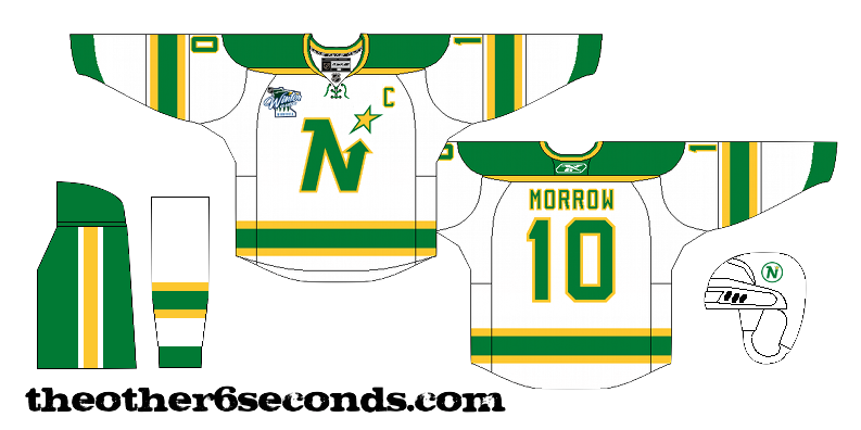
I like the green third. It's something Dallas has struggled with in the Age of Reebok. I still think their best jersey was the green one with a giant star that was once an alternate.

Unfortunately, the Edge stifles that sort of creativity. Am I bitter? Never.

I'm aiming to get Part 4 posted within the next week. It will feature my Tampa Bay Lightning among others.