
Concept Collection 42
/Got a handful of concept art to share. No theme on this one, just a mish-mash of some interesting ideas.
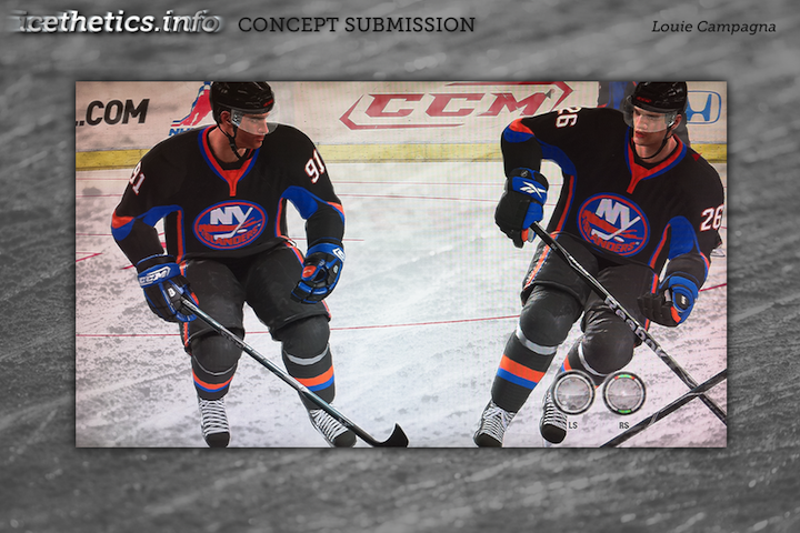
Been getting a lot of Panthers concepts, by the way. Thinking the next post may be Florida-themed.
Got a handful of concept art to share. No theme on this one, just a mish-mash of some interesting ideas.
Been getting a lot of Panthers concepts, by the way. Thinking the next post may be Florida-themed.
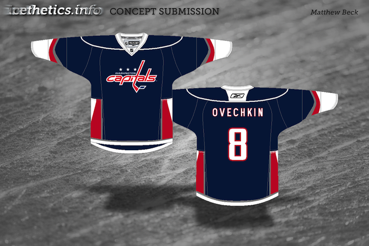
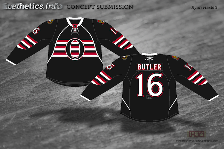
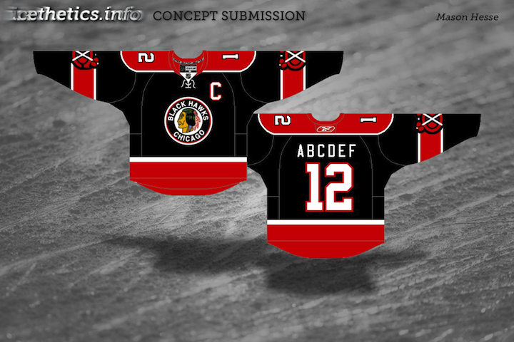
As I was considering themes for today's concept post, I started wondering which teams have gotten the least love on this page. So I took a look back, and as it turns out, there are five teams that have yet to be represented with concept art in 2011. We'll rectify that today.

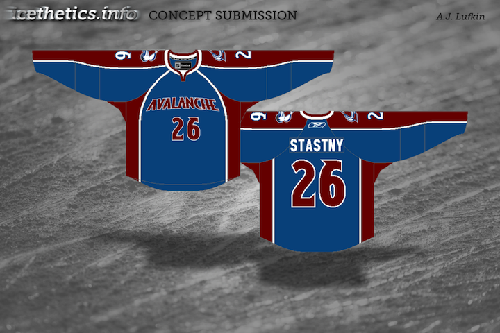


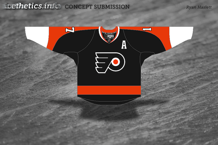
Now these teams won't have to feel left out. Coming in a future concept post, some phenomenal redesigns for another often overlooked group — the minor leagues.
We recently began a new concept series in which designer Elliott Strauss takes on the immense task of creating the ideal look of the NHL. All 30 teams will receive his rebranding treatment — some with big changes, others small changes — all, hopefully, for the better.
In Part I, Elliott took on the Capitals, Coyotes and Panthers. Today, it's the Oilers, Red Wings and Thrashers. We start with Edmonton.
The bold text below are Elliott's own descriptions.
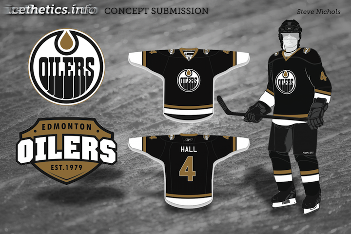
 Edmonton Oilers
 I took a rarely used logo — the one from a shield with a gear and oil drop — and played with some elements to create a new primary mark.
Uniforms are simple, inspired by the old blue and gray alternates. The wordmark is featured on the alternate.
I think most Oilers fans would agree that the new Reebok Edge jerseys need to go no matter what, and that old blue/orange combo of the '80s and early '90s is impossible to avoid.
The more I think about it, the more I think that vintage design should be an alternate worn on special occasions throughout the season.
And any attempt at joining the Thrashers and Stars with text and numbers on the front of the sweater should be nipped in the bud. Still, overall these are solid designs.
Now the one you've all been waiting for.
 Detroit Red Wings
 No logo changes. The uniforms are new, but from the stands you probably would barely notice. You can't do too much with the Wings.
This is one instance where I have to disagree with Elliott. I've posted many Red Wings concepts over the years but most have been met with rejection and disdain.
I think that's a mental block. We can improve upon the Red Wings' logos and uniforms but we choose not to out of a misguided reverence to tradition.
It's undeniable Detroit has a signature look and is one of the most recognizable teams in the NHL, but the idea it can't be changed without ruining years of history is silly.
Still, it would be nice to one day see the Wings add a third jersey — just not their 2009 Winter Classic one.
 Atlanta Thrashers
 The cereal bowl logo is simplified, as is the color scheme, orange and maroon are no more. The jerseys are pretty modern and put a heavy emphasis on the bird head pattern.
The changing crest logos from home-away reference the franchises' original uniforms.
The Thrashers are suffering from a color overload so this simplification is welcome. I did prefer the baby blue jerseys as alternates but I was always a fan of the asymmetrical sleeves — though I know I'm in the minority among Icethetics readers.
Each team should have an element to its uniforms that stand out and separate it from the rest. Slightly altering striping patterns usually isn't enough to create a unique identity. That's one thing the Thrashers achieved with the ATLANTA text down the sleeve.
And they can't get rid of those maroon third jerseys fast enough for me. I think Elliott just about hit the nail on the head with this concept.
Coming up in Part III, the Maple Leafs get a major makeover.