
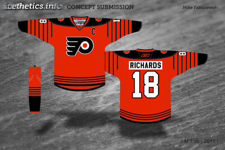
Concept Collection 42
/Got a handful of concept art to share. No theme on this one, just a mish-mash of some interesting ideas.
Been getting a lot of Panthers concepts, by the way. Thinking the next post may be Florida-themed.
Got a handful of concept art to share. No theme on this one, just a mish-mash of some interesting ideas.
Been getting a lot of Panthers concepts, by the way. Thinking the next post may be Florida-themed.
If all has gone according to plan, I should be spending the day on the high seas en route to some tropical island somewhere. But I'm going to put you guys in the opposite state of mind with something a bit more wintry. Collected here are some sharp Winter Classic concepts.
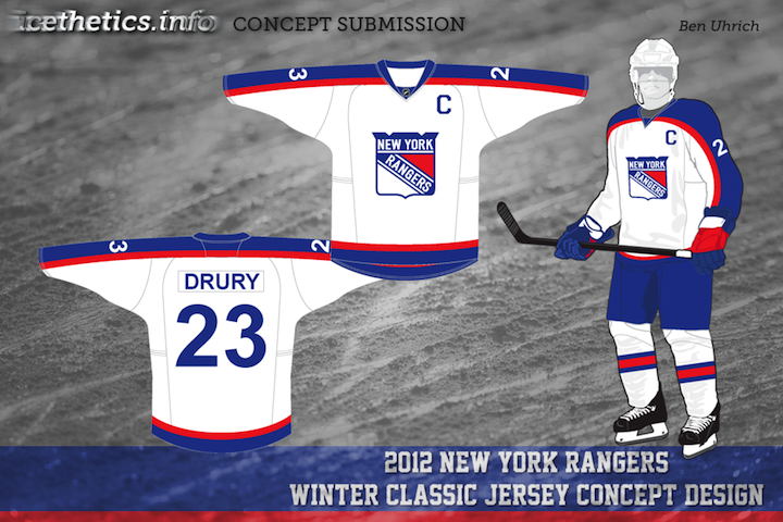
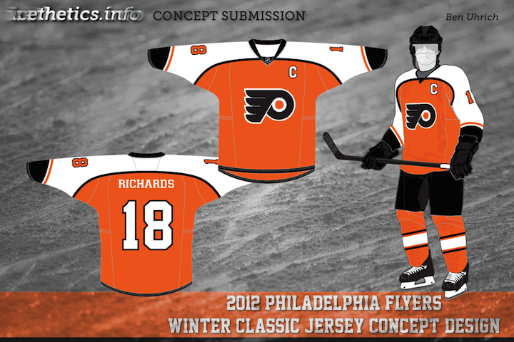
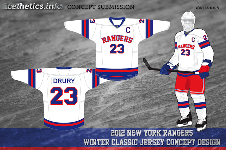
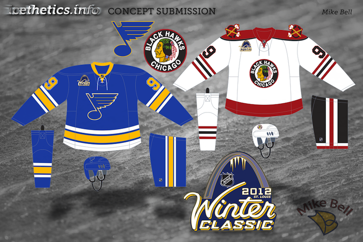
The most prevalent rumors have the Flyers hosting the Rangers on the day after New Year's 2012. Of course that hasn't stopped some from hoping for a Western Conference match-up. Look for a new set of concept art on Wednesday.
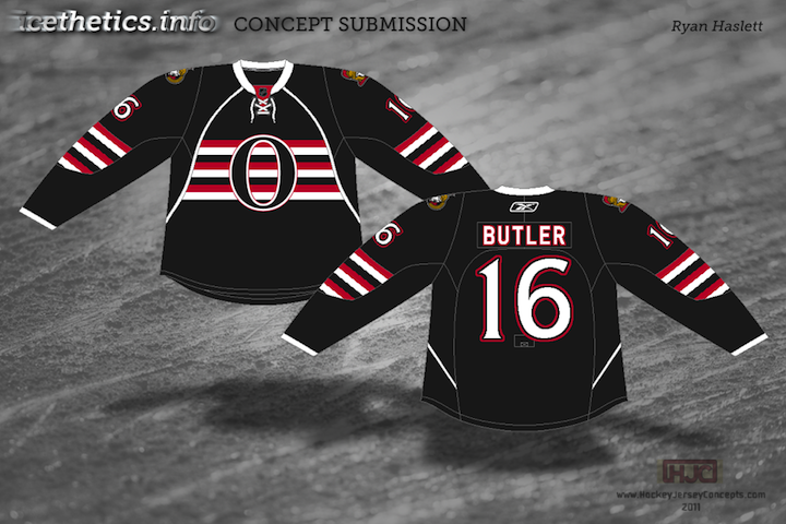
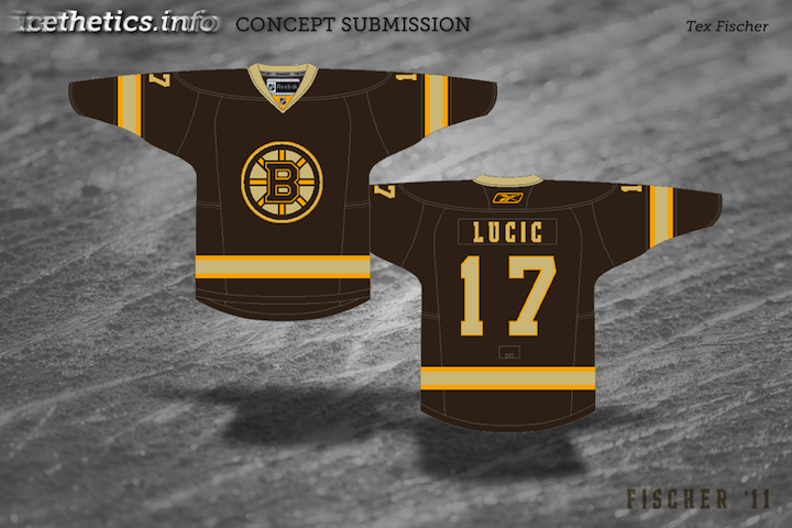
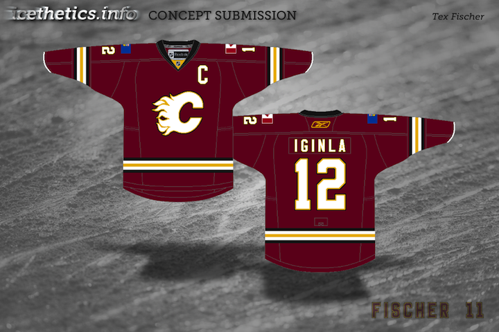
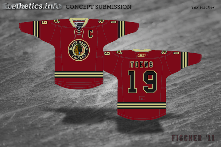
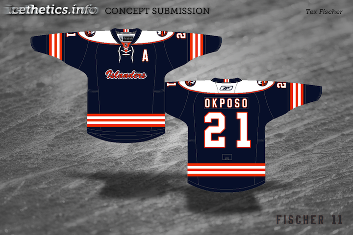
Thought this was a fun story. A lot of readers send in concept art and I love it when someone new comes along because it usually means a new perspective. Somewhat surprisingly, newcomer Tex Fischer was a huge hit with his Senators concept on Sunday. Not to offend, but I'm not sure why it was such a standout considering the entire group was made up of variations on a theme. Regardless, it was a hit. And Tex has been on a tear since. Today's post is dedicated to him.
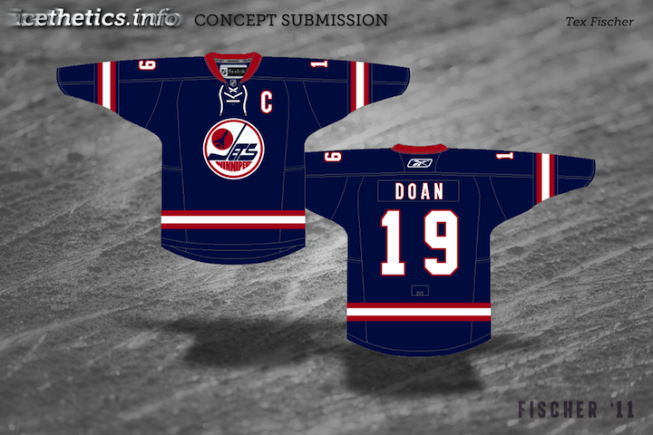
That last one should serve as the segue into our next set of concepts. I put out the word for Winnipeg Jets concepts this week and have already gotten a lot of excellent entries. Looking forward to sharing them.
It's Super Bowl Sunday so that means a super-sized concept post. (Also I haven't put up anything new since Wednesday, so I owe you.) Normally I'd make the big game the theme, but as there are no NHL franchises in Indiana or Louisiana, we'll have to settle for the Central Division.


 Matt Marczel Matt Marczel |
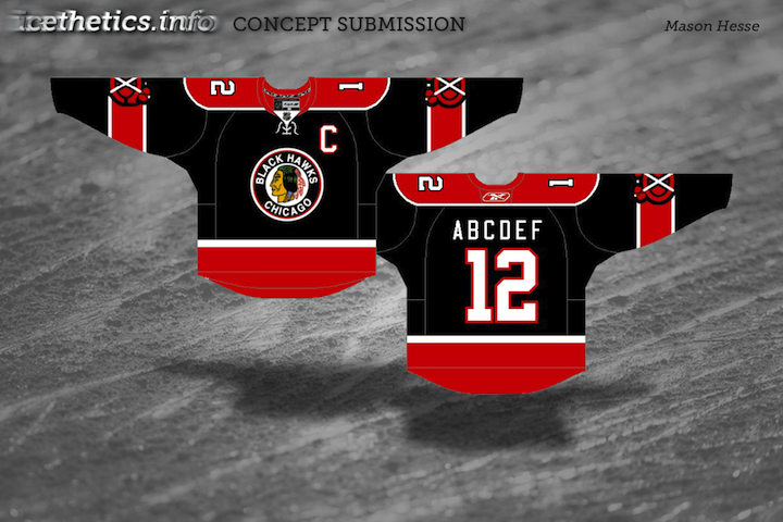
Lately, I've been seeing a lot of great Blackhawks concept art. This one has to be one of my favorites. Matt has ditched white for "vintage white" and it's made all the difference. I love the color combination and the use of color in this uniform set. He's got home/road/third jersey, in that order, and I have to say the third may be the best. If that was ever a real NHL sweater, I'd buy it in a heartbeat. No question. Very nice work here, Matt! |
 Brad McPelican Brad McPelican |
One thing you don't seen an awful lot of in hockey is striped shoulder yokes, the assumption being that it would look terrible. I think this design proves the opposite. I think Brad's design is a winner right up until the third jersey. I just don't think that trumpet logo ever worked for the Blues. Just wasn't meant to be. I think the Blue Note represents the club much better than a literal logo. So what about the third jersey then? |
 Mike Bell Mike Bell |
Mike has this to offer and I think he hit the nail on the head. Throwbacks work for some teams and not others. For example, it was bad news for the Flyers at the Winter Classic but good news for the Blackhawks at the Winter Classic. The Blues would look great in those vintage colors and stylings. All we need is that nameplate. |
 Ryan Haslett Ryan Haslett |
But if your idea of a third jersey is something completely different, Ryan has the answer. I didn't think I'd like a gold Blues jersey. This has changed my mind. Great colors and striping. That is a hockey sweater. |

 Jeff Kennedy Jeff Kennedy |
One team that has struggled with their identity for the last decade — no, not the Canucks — is the Blue Jackets. I think they've finally settled on a good solid look. So that's a plus. What they don't have yet is a third jersey, so Jeff has taken it upon himself to put forth a couple ideas. They're certainly unique, but I'm not sure I'm sold on these. |
 Josh Gagnon Josh Gagnon |
So how about this one? Many of you will say you don't like the sweater number on the front, but it is presented in a unique way. However, I'm not sure the vintage white works with such bright shades of blue and red. Maybe something a bit muted. To be sure, the last thing the Jackets need is to introduce yet another new jersey logo. So we'll just wait and see if 2010-11 is the year the alternate uniform returns to Ohio's capital. |
 Ryan Haslett Ryan Haslett |
We can't leave out the winningest team in the Central Division. Ryan's made some minor changes to the Red Wings' unis. Not sure about the shoulder piping or the repetition of the winged wheel, but the rest of the striping works. |
 Matt McElroy Matt McElroy |
We'll finish off the division with the Predators. Actually, Matt has given us simplified jerseys and primary logos for both the Preds and the Wild. It sort of works for the Wild, but the saber-toothed tiger just looks washed out. And the jerseys may be a little too simple. But let this final graphic today serve as a bit of foreshadowing to the next concept post. |
I'll have new artwork up in a day or two featuring the self-proclaimed State of Hockey.
Friday is here again and you know what that means. Time to freak out!
I'm really trying to get back into the habit of having a Freak Out Friday for you guys every now and then. Of course it relies primarily on your submissions. So keep them coming!
This week's theme is Original Six. Just how horrible can we make these most legendary of teams look? The answers to that question ensue.
 John B John B |
I don't mean to always be picking on the Blackhawks, but I think we can all agree that gravity-defying feathers are not the way to go. Not by a long shot. Even the colors have me a little concerned. Maybe we should just move on. |
 Charles Cadieux Charles Cadieux |
Nope, shouldn't have moved on. Adding black to the Rangers color scheme. Now that's something I never thought I'd see. And obviously I hope I never have to. Hockey fans everywhere would revolt! But since it is only fake, we can all rest easy. The tricky part will be removing it from your memory. |
 Randy Dudek Randy Dudek |
The Maple Leafs were the focus of the previous concept post and we had a lot of really nice artwork. Now it all goes out the window because this just beats everything. I mean, it's a Maple Leafs jersey covered in actual maple leaves! Wonder why we've never seen a third jersey that looks like that. |
In closing, all I'll say is I hope you are not bleeding from the eyes. More concept art (the good stuff) this weekend.
It's Sunday morning and that means I just officially tied the knot! Though nothing's really changed. My new wife and I have been together for a long time. This was just a formality, really. Anyway, I'm certain we'll be enjoying ourselves today.
This is the third of five auto-published concept posts — each with it's own theme. We've covered Freak Out Friday and Rebranding. Today our subject is rebranding once again but in the form of Part 5 of Elliott Strauss' NHL rebranding project, featuring the Ducks, Blackhawks and Flyers. Elliott's descriptions appear in bold text.

 Elliott Strauss Elliott Strauss |
Anaheim DucksThis features a new color scheme with a dark shade of green and a brighter orange. The logos are simplified, getting rid of white outlines around the D and the inner webbing. The jerseys have a modern, wavy feel. The Anaheim Ducks are probably one of the teams most in need of a rebrand. Unfortunately, aside from adding a welcome green to the palette, Elliott hasn't really fixed the main probably — the primary logo. While the D is a refreshing change of pace, I'd really like to see some kind of duck mascot. Logos aside, the jerseys are very distinctive — just what the doctor ordered when you're talking about a rebrand. Let's hope one day the Ducks do move in this direction — even if it's only on a third jersey. |

 Elliott Strauss Elliott Strauss |
Chicago BlackhawksI tweaked the logos by dropping all the excess colors in the feathers. The tertiary color is now an orange-yellow. The jerseys are really just an attempt at consistent striping. The simplicity in this design actually wins points in my book. While many of you would say the Chicago Blackhawks' logos and uniforms are perfect as is, I would disagree (as you well know). This simplification of the color palette is a welcome improvement. But while we're at it, I say the Hawks revert back to the old vintage logo found on the Winter Classic and alternate jerseys. |

 Elliott Strauss Elliott Strauss |
Philadelphia FlyersOriginally this had striping wrapping all the way around the chest, but I simplified things while making the design a little more modern. The logo is NOT the sharp-winged logo that Flyers fans insist on. I figured that since they use the curved wings on all merchandise, it might as well be on the jerseys too. The secondary is the old Zephyr X-line hat logo, I believe. As mentioned in yesterday's post, Elliott is correct about the F logo on the Zephyr hat. Other than that, he's kept things pretty straightforward and simple. The one element I really like is the orange numbers on the black third jersey. That is a Halloween jersey if ever I saw one. The striping on the front of the home and road sweaters is a nice change of pace too, yet doesn't lose the classic feel that goes along with the Flyers. |
That's actually all I have from Elliott at the moment. I'm anticipating he will send along the other half of the league in the next few weeks. Until then, we have two more auto-posts left before I get back from Las Vegas!
This is the last new concept post until I head out west so I'm making the Western Conference today's theme.

 Mike Ivall Mike Ivall |
We begin with Mike Ivall, a longtime Icethetics concept contributor. Today we're flashing back to his roots. That first image you see there is, I believe, his first ever concept submission. It was first posted on July 8, 2008 — a year and a half ago. Now he's sharing the fruits of his labor with us. You see that logo embroidered onto a red Blackhawks jersey, proof that perhaps it should one day take its place on an NHL uniform. And if you were wondering what the entire sweater looks like — including its new shoulder patches, just click here. It's really quite something to see an old Icethetics concept come to life that way. As always, great job Mike! |
 Ryan Haslett Ryan Haslett |
Sticking with the Blackhawks for a moment. If Mike's red jersey is too drastic a change, then maybe Ryan Haslett's is right on the money. I don't know what it is about the red, black and beige that screams old time Blackhawks hockey to me. I love this design and if it ever became a reality, I might be the first in line to get one — and I don't even like Chicago. Sometimes a jersey design just does something to you, though. |
 Ryan Haslett Ryan Haslett |
If you hadn't already noticed, the rest of this post belongs to Ryan. Knowing that the Predators are planning sweeping uniform changes for 2010, he's come up with a simplified uniform design for the Hawks' Central Division rivals. My only concern is that the gold used here may be a little too light. There's not enough contrast for it to be a standout uniform design. Fix that and you may just have a winner on your hands. I'd also consider reverting to the dark blue triangle on the white jersey. I just think it makes for a stronger design. |
 Ryan Haslett Ryan Haslett |
Ryan will get us finished up this afternoon way out west in Anaheim. His third jersey concept for the Ducks goes with the beige that slowly seems to be gaining popularity in the NHL as a vintage color — actually called Vintage White by the Boston Bruins. I like the beige and the orange. But I still think the Ducks need to drop the black in favor of a dark forest green. That would really give their identity a complete and unique feel. The one thing I'm not sure about is the use of a wordmark on the front. I think an alternate sweater in Anaheim would provide the ideal opportunity for an alternate logo that actually resembles a duck. An intimidating duck to be sure, but a duck all the same. |
That's it. The next time you see concept art on this page, it will appear as if by magic as I will be far, far away from my computer — and Florida! (Really though, don't forget. New auto-posts every morning at 9 from Friday until Tuesday. I've worked really hard all week to make sure that happens for you guys.)