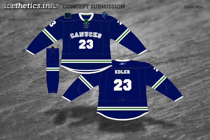
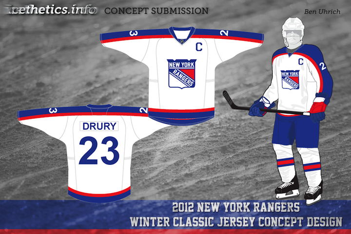
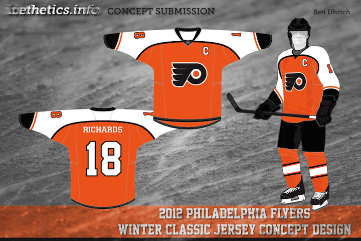
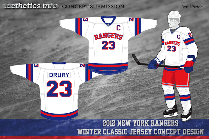
It's Sunday morning and that means I just officially tied the knot! Though nothing's really changed. My new wife and I have been together for a long time. This was just a formality, really. Anyway, I'm certain we'll be enjoying ourselves today.
This is the third of five auto-published concept posts — each with it's own theme. We've covered Freak Out Friday and Rebranding. Today our subject is rebranding once again but in the form of Part 5 of Elliott Strauss' NHL rebranding project, featuring the Ducks, Blackhawks and Flyers. Elliott's descriptions appear in bold text.

 Elliott Strauss Elliott Strauss |
Anaheim Ducks
This features a new color scheme with a dark shade of green and a brighter orange. The logos are simplified, getting rid of white outlines around the D and the inner webbing. The jerseys have a modern, wavy feel.
The Anaheim Ducks are probably one of the teams most in need of a rebrand. Unfortunately, aside from adding a welcome green to the palette, Elliott hasn't really fixed the main probably — the primary logo. While the D is a refreshing change of pace, I'd really like to see some kind of duck mascot.
Logos aside, the jerseys are very distinctive — just what the doctor ordered when you're talking about a rebrand. Let's hope one day the Ducks do move in this direction — even if it's only on a third jersey.
|

 Elliott Strauss Elliott Strauss |
Chicago Blackhawks
I tweaked the logos by dropping all the excess colors in the feathers. The tertiary color is now an orange-yellow. The jerseys are really just an attempt at consistent striping.
The simplicity in this design actually wins points in my book. While many of you would say the Chicago Blackhawks' logos and uniforms are perfect as is, I would disagree (as you well know).
This simplification of the color palette is a welcome improvement. But while we're at it, I say the Hawks revert back to the old vintage logo found on the Winter Classic and alternate jerseys.
|

 Elliott Strauss Elliott Strauss |
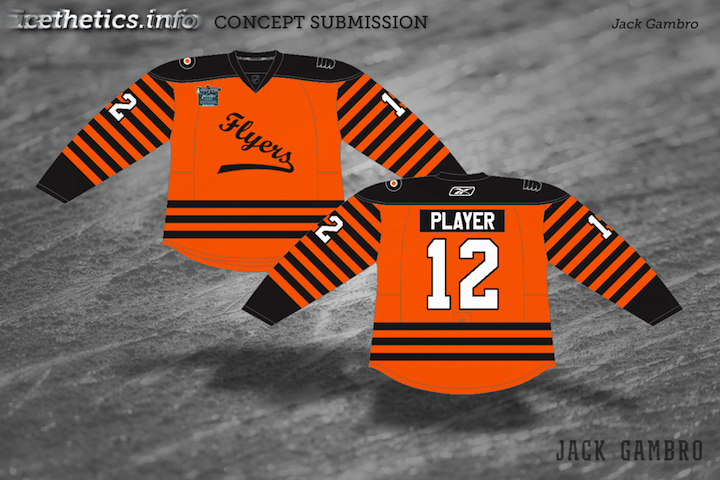
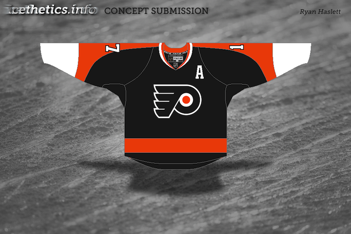
Philadelphia Flyers
Originally this had striping wrapping all the way around the chest, but I simplified things while making the design a little more modern. The logo is NOT the sharp-winged logo that Flyers fans insist on. I figured that since they use the curved wings on all merchandise, it might as well be on the jerseys too. The secondary is the old Zephyr X-line hat logo, I believe.
As mentioned in yesterday's post, Elliott is correct about the F logo on the Zephyr hat. Other than that, he's kept things pretty straightforward and simple.
The one element I really like is the orange numbers on the black third jersey. That is a Halloween jersey if ever I saw one. The striping on the front of the home and road sweaters is a nice change of pace too, yet doesn't lose the classic feel that goes along with the Flyers.
|
That's actually all I have from Elliott at the moment. I'm anticipating he will send along the other half of the league in the next few weeks. Until then, we have two more auto-posts left before I get back from Las Vegas!


