
0137: A Day for Americans
/
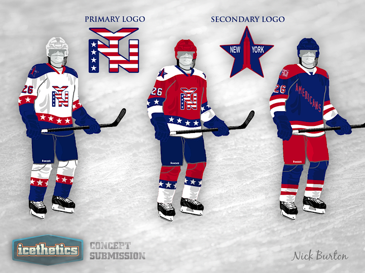
We're celebrating America's birthday with an Americans concept from Nick Burton. Enough red, white and blue for you? Enough stars and stripes? If not, check back for a Team USA concept scheduled for Sunday.
We're celebrating America's birthday with an Americans concept from Nick Burton. Enough red, white and blue for you? Enough stars and stripes? If not, check back for a Team USA concept scheduled for Sunday.

Anyone else think an orange Oilers jersey is long overdue? Justin Nahhas mixes that notion with the Oilers' first-ever third jersey design from the '90s. I miss that one, by the way.

After reading through some of the comments, Justin made some revisions.
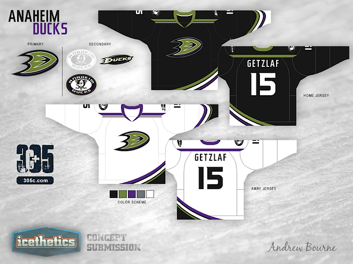
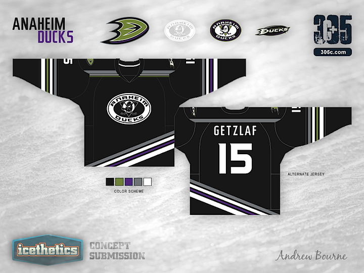
I'm launching a new concept series today from artist Andrew Bourne. He asked if I'd feature his rebranding series, tackling the entire NHL. I told him I'm game so you'll start seeing his work here every few days, starting with the Anaheim Ducks.
Now, what Andrew's doing doesn't exactly fall under the category of "rebranding" in my book. He's changing colors and redesigning jerseys and so forth. Instead, I'm calling his series "Re-Bourne." Hope you get a kick out of it, as I have. Below and in subsequent posts you'll find Andrew's explanation of his work.
Although the orange streak in the current jersey format connects Anaheim geographically (Orange County), I'm not a fan. The orange is a bit too distracting in the Black, Gold and White color palette. It seems to really jump out and take all of your eye's attention. So, I decided to mute the colors a bit and return to a near replication of the Jade & Eggplant. The green is a bit darker than the original, less teal and more 'pond scum' green. The eggplant was tweaked to a more full purple which worked well with the black.
You don't see a lot of asymmetrical jerseys in the NHL, or AHL... or KHL for that matter. Why? Because they usually don't work. I can't say that my idea will work, but I believe that it could work. In the current jersey, Anaheim has a few curved stripes from left to right across the bottom. I liked that idea but I didn't like how it just stops on the left edge of the jersey, leaving a strange black area. The sleeves in the third jersey have a simple striping similar to the bottom, except one side has purple while the other has green. It gives the alternate sweater a sense of asymmetry without actual asymmetry. Make sense? Probably not...
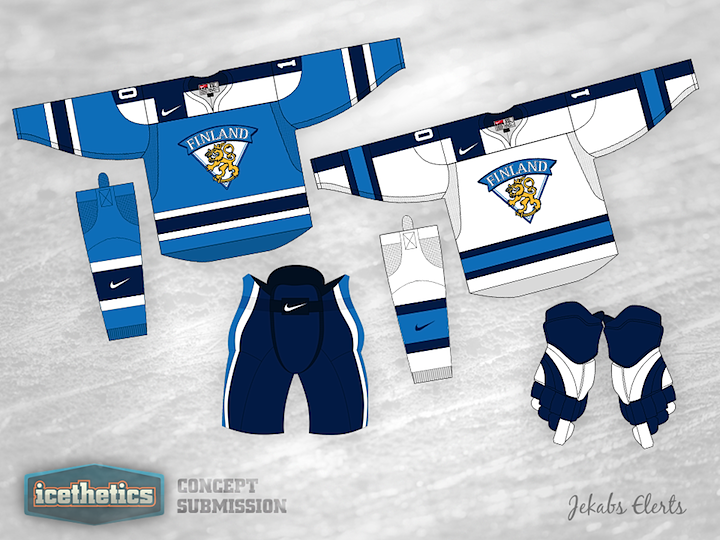
For the last few Sundays, I've been featuring concepts with more of an international flavor. So I thought I'd keep it up with the Olympics around the corner. Today, Jekabs Elerts presents a very sharp look for Finland. But it feels incomplete. Where's the Suomi?
By the way, if I had planned ahead better, I would've held last week's Team Canada concept for today to celebrate Canada's Independence Day. Oops. But you can bet on red, white and blue for the Fourth of July.
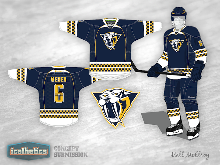
We're probably not getting any new third jersey this fall, but that's not going to stop our concept artists from proving why we should be. Matt McElroy has a blue option for the Nashville Predators and it's a pretty solid look, if you ask me. Now I'm asking you. Thoughts?