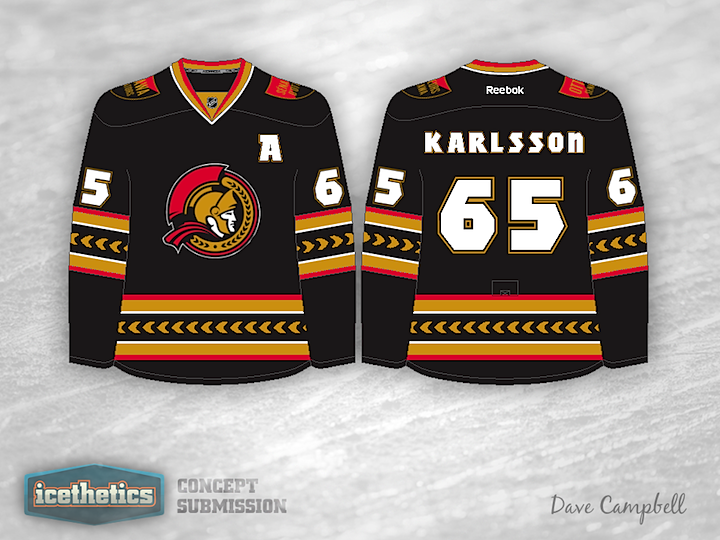
0240: Black, Red & Gold

Here's a good reason for the Senators to go back to black. Dave Campbell's concept is unlike what we've seen before in both its striping and crest. The logo he's using is actually an official mark in Ottawa's arsenal, but I'll never understand why they haven't put it on a uniform yet. It's far superior to their current primary mark. Any thoughts on this?

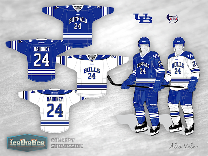
0239: Buffalo Bulls

The University at Buffalo is the subject of this week's University Sunday. Here we have Alex Valvo's take on the Bulls.

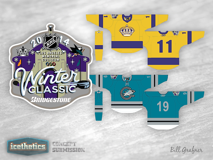
0238: A Golden State Classic

Bill Grafner wants a Winter Classic to take place in California and he's designed a logo and pinpointed jerseys he'd like to see used. Here's what he has to say about it.

This is the hopes that maybe to apologize for a lockout, maybe we can get two winter classics next year. One on the East Coast and than a night game here in L.A. Temps at night should be great for a game and if Vegas can host an outdoor game so can we. I choose the sharks because of the fact that the Seals were also an expansion six team and the great rivalry between Southern California and Northern California.

I know some will say the Ducks but I feel the expansion six is a stronger toe in for a Winter Classic. I choose the California Seal logo and put it on the original Sharks colors for the fans to relate and a throwback to the original Sharks jersey. I went with the gold for the Kings because that was the jersey they wore for the Miracle on Manchester.

I know the Winter classic is supposed to be dark jerseys at home, but the Miracle means a lot to fans here and we already had the forum blue in games versus the Canucks and as a throwback jersey so this is a better jersey for a winter classic. Also, then the Sharks can be in teal not white or cream color.

I also included a fun Winter Classic Logo. I know it may be a bit busy but that is how we do it here in L.A.

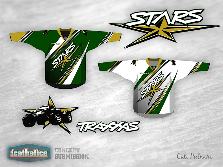
0237: Dallas Freak Out

I can't even begin to describe Cale Putnam's Dallas Stars concept. So I'll let him.

...and now for something completely different.

I think logical assumption is that the NHL is mere seasons away from some form of jersey advertising, probably in a form like the small patch AHL teams use on either side on the upper chest. As the Detroit Red Wings Presented by Amway have already proven, owners will test boundaries, so the idea here is that, as part of the ad deal, an owner might let a sponsor redesign the team brand and jerseys.

What you see here is the result of a chance doodling of NHL logos while I also had my new R/C truck on my mind. Traxxas is a metro Dallas based company that makes R/C vehicles, most popularly the T-Maxx, but also the Revo, Stampede, and what I bought, the Slash. I figured that the Stars, who we all agree could use a redesign, would be cool with whatever Traxxas came up with, so I re-did the primary with lettering more like their corporate logo, used an image of a Revo in the secondary, and designed the jerseys in the same vein as the graphic designs on their cars and trucks.

People are going to hate this, both for the looks and the advertising, but I can honestly see a future for this type of marketing, especially if it makes the owners money. If there's a good response I might try it for other teams.

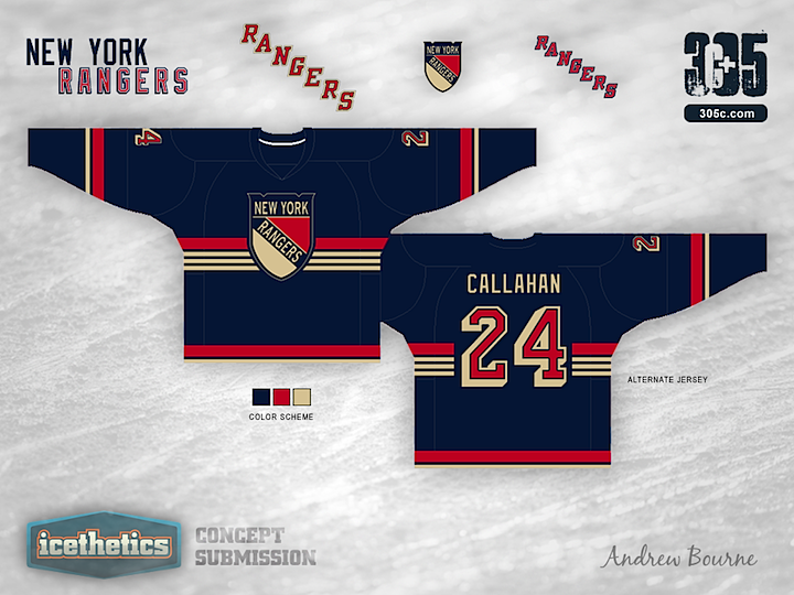
0236: Rangers Re-Bourne

The Re-Bourne concept series has been running here on Icethetics for more than three months now, ever since designer Andrew Bourne came to me with his idea of making over the NHL. I really think he's been hitting his stride lately and today he shares his take on the classic New York Rangers. I think he's done a great job of respecting the history as well as bringing a modern take. And heck, this alternate jersey is even one I would buy.