
0255: Oil Kings Simplified
/
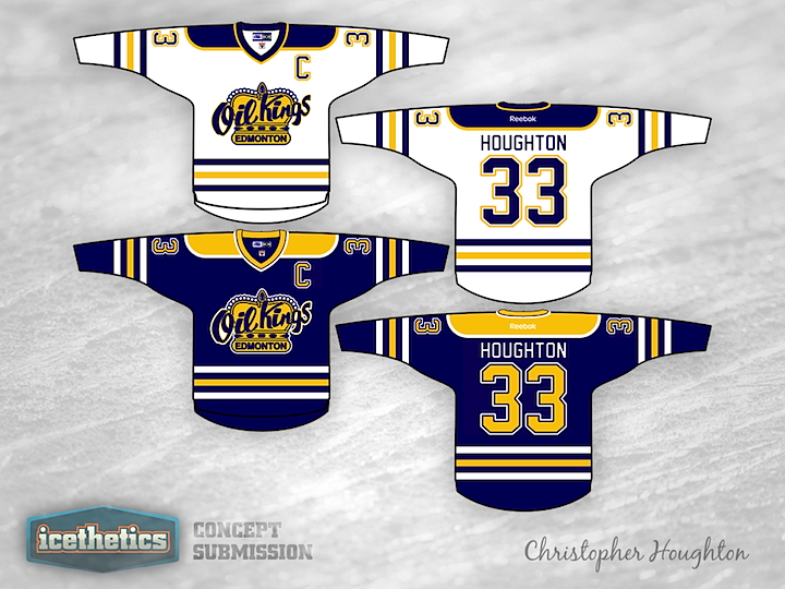
Minor League Week picks up with the WHL today. Christopher Houghton offers a simplified color scheme and uniform design for the Edmonton Oil Kings. What do you think of them without the red?
Minor League Week picks up with the WHL today. Christopher Houghton offers a simplified color scheme and uniform design for the Edmonton Oil Kings. What do you think of them without the red?
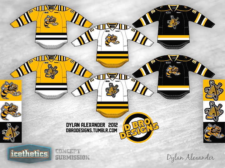
Last week was AHL Week. This week will be focused on the rest of the minor leagues — since we're still without any actual NHL hockey. Today we begin with the OHL's Sarnia Sting and a three-sweater concept from the prolific and talented Dylan Alexander.
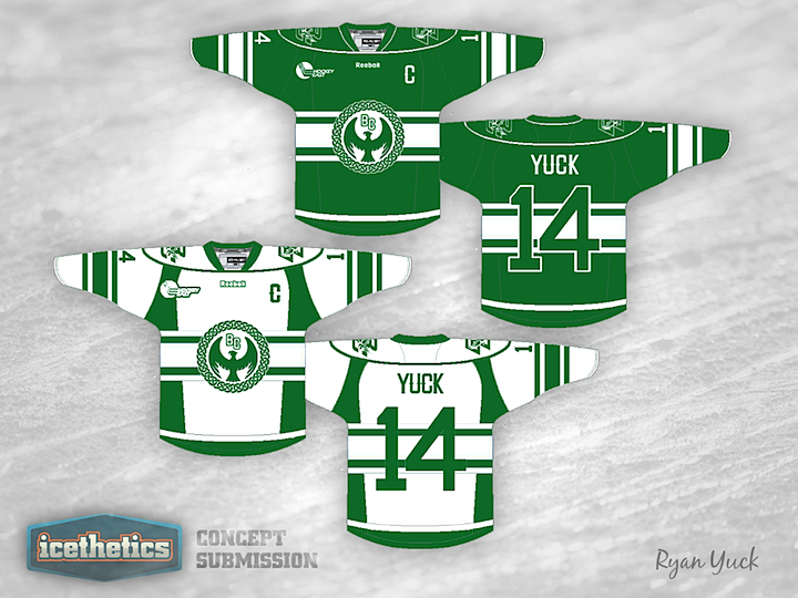
Today's University Sunday concept is a little bit different. Ryan Yuck has decided to merge a few of Beantown's sports icons with Boston College.
I decided to meld some Boston sports team together with the "Celtic" theme. The logo is a Celtic ring and Celtic eagle in the middle. The colors are from the Boston Celtics and the lettering is all from the Boston Red Sox font. I was inspired for the striping again with the Celtic theme.

Someday the Vancouver Canucks will have to figure into the NHL Winter Classic. And when they do, Colin May has a couple of uniform designs that could work quite well. I know we all like to mock the V jerseys (especially in those colors), but I think this blue and green look is pretty sharp. But if that's not your cup of tea, what about this one below?


We wrap up AHL Week on this Freak Out Friday with Brett Ireland's unique take on the Lake Erie Monsters. Here's how he describes it:
This jersey is a mashup of sorts, incorporating two of Cleveland's professional hockey teams. The yoke's a mix of the Crusader's black stripe down the center, and the dashes are lifted from the AHL Baron's old style. The football jersey style crest is also an element lifted from the AHL Barons, a design choice that's truly something from hockey past. The striping pattern is a mimic of the Ohio flag, and lastly I decided that a "faux olde time" choice would be the white nameplate much like the Sabres have.