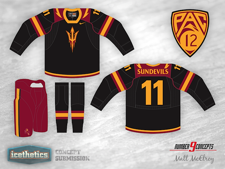
0274: Arizona State Sun Devils

On this University Sunday, we get two different concepts for the same school — Arizona State University – from two of our regular contributors. Matt McElroy and Justin Cox put together a couple of unique looks for the Sun Devils. Which do you prefer?
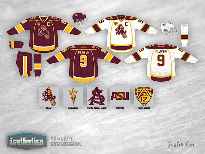
By the way, the response was great last week to my request for more college concepts. We'll be able to keep this series going for some time to come.

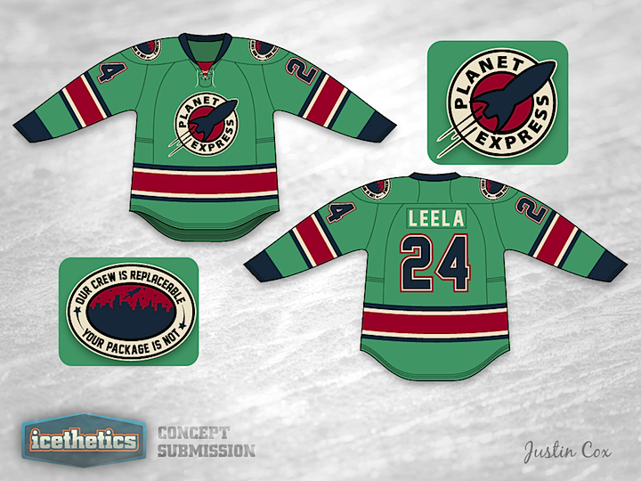
0265: Futurama Meets Hockey

Here's a Freak Out Friday for you as we wrap up our week of non-hockey hockey jerseys. Who wouldn't want to wear this one by Justin Cox?

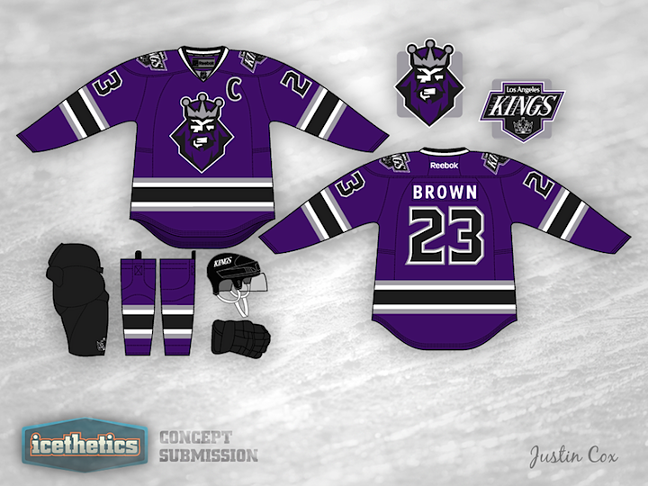
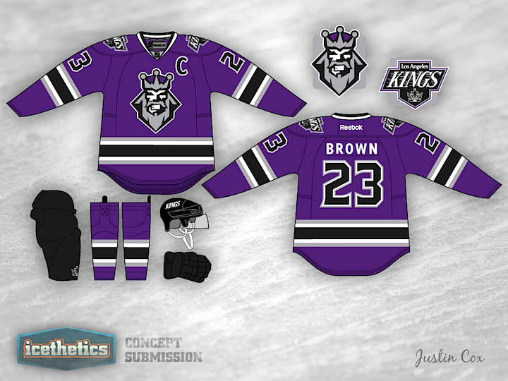
0235: The Purple King

The last time this logo graced a hockey jersey was 1996. But 16 years on, concept artists keep trying out because there's just something about it. Today, Justin Cox has a purple and black Kings sweater that's never been tried before and it's a beauty. Of course that's just one opinion of it. What's yours?

0222: Blue Jackets and Gold

This week seems to be all about changing the color palettes of existing teams. So why not give it a shot in Columbus? If the Stars were to switch to red, white and blue, maybe the Blue Jackets could switch away from it. Justin Cox infuses some gold into a design inspired by the club's alternate jersey. It's a pretty sharp look and would certainly be unique in the NHL.

0193: No Escaping Black and Silver

Ever since the Lightning unveiled their new logo, I've seen countless concepts that attempt to "fix" it by adding back the black and silver in some way. Usually, the attempts are terrible. But this one by Justin Cox really made me take a second look. Granted, it's a little more cartoonish-looking than Tampa Bay's primary mark, but it could certainly work. What do you guys think of this set? As a Lightning fan, I like it a lot.