0468: Triple Dallas Freak Out

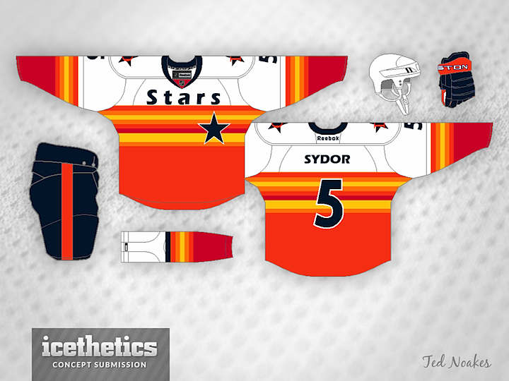
I know we're mostly hockey fans here, but does anyone recognize where Ted Noakes got his inspiration for this jersey design? It's a Freak Out Friday home run!
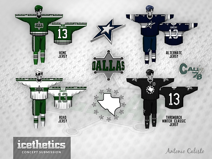

Antonio Calisto has a fascinating set of Stars uniforms to share — but since it has no actual connection to the team itself, I felt compelled to give it a Freak Out Friday placement. I mean, what's with the throwback that doesn't throw back to anything? The great thing about the Stars is they do in fact have a decent uniform history to draw on.
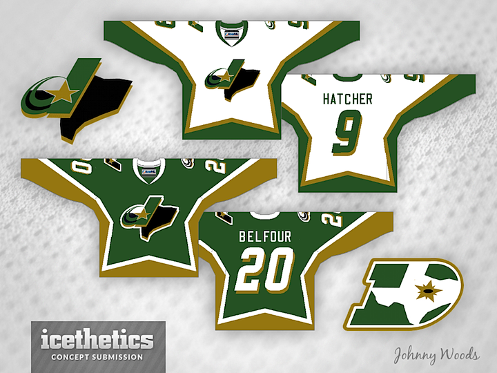

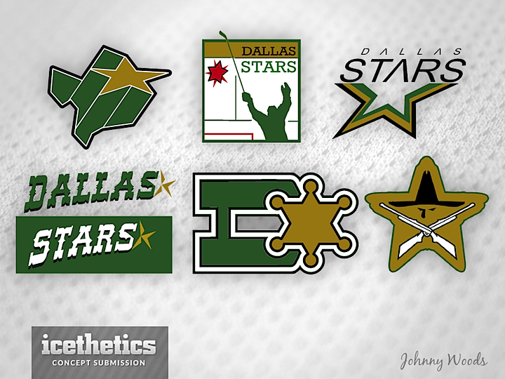
Finally, we wrap up our second solid week of Dallas Stars concepts with this from Johnny Woods. He even has this smattering of logos he's come up with. Certainly trying to be creative and I love to see that.
0467: The Lone Stars

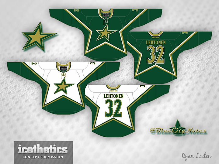
Today is all about the lone star. Maybe you like the Dallas Stars' current star logo. Maybe you just think it needs to lose the text. These guys agree with you. Ryan Laden (a.k.a. the GM of the IceHL's St. Louis Archers) did that with a tried and true jersey style from the club's own history.


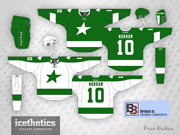
The über-prolific Brian Brideau went with an idea that borders on Freak Out Friday-worthy. He calls it the "Dallas Bay Green Wing Stars" — a clear jab at the monochromatic stylings of the Lightning and Red Wings. But truth be told, it's not really a bad look. Plain, perhaps, but not terrible.


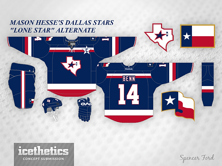
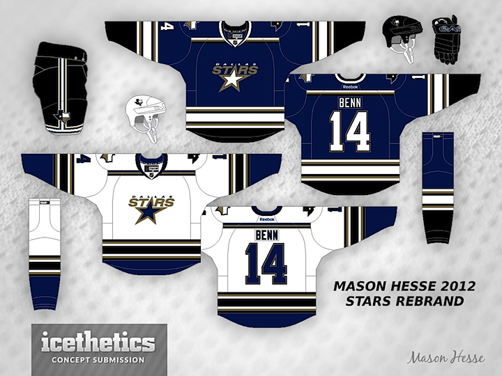
Lastly, a variation on the "lone star" theme. Mason Hesse has the Stars decked out in the red, white and blue of the Texas state flag. You can't see it, but inside the collar reads: "DON'T MESS WITH TEXAS!" We'll leave it at that.

0466: Saddle Up, Cowboys

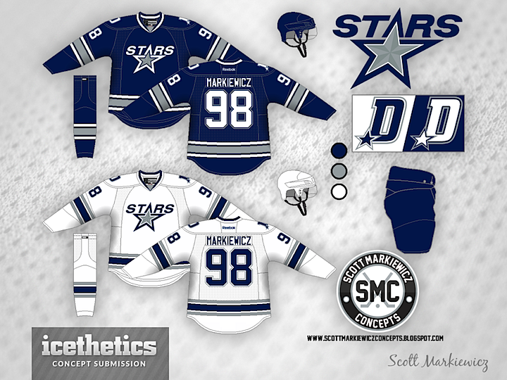
Today's theme is very obviously the Dallas Cowboys. Imagine the Stars decided to align their brand with one of the most well-known in all of sports — and certainly most well-known in their city. It might look something like this option from Scott Markiewicz.


Mason Hesse also tried the blue/silver route with somewhat different results. In fact, despite using the same colors as Scott, Mason's concept feels more like an idea for the Tampa Bay Lightning than the Cowboys. If you had to choose, which option would you prefer?

0465: Flashing the Badge

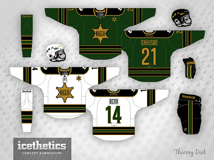
We've got a theme-within-a-theme every day this week as we continue with the Dallas Stars concepts. Today, our artists look at rebranding the team with a old west sheriff motif — badges all around. First up is Thierry Dick's take, which incorporates the badge for the captains' letters.


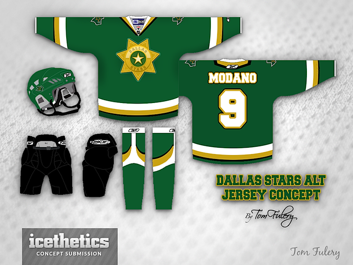
Next, Tom Fulery (I'm sure that's his real name) went with something a bit more shiny.


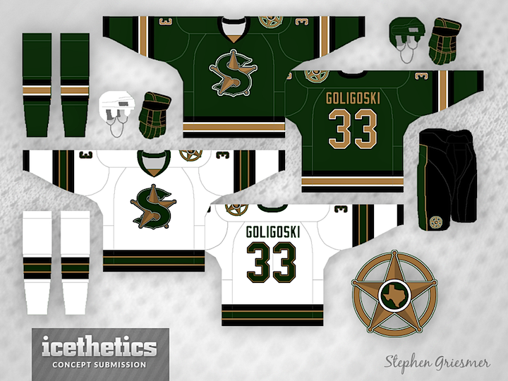
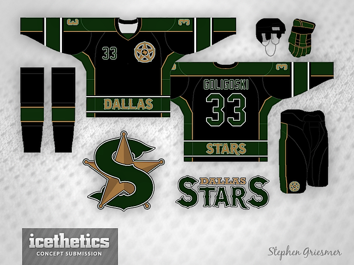
And lastly, Stephen Griesmer presents a design that isn't overtly sheriff-y, but definitely has that feel about it. He's created a full set of jerseys that includes a rather unique alternate option.

0464: Leaked Logo Mania

After the Dallas Stars accidentally leaked their new logos last week, Icethetics concept artists went straight to work! On Saturday we got a taste of how the new logos could be used, and as we start the second week of nonstop Stars concepts, we get a little more. Dylan Wonka has done a phenomenal job by incorporating elements of the club's original jerseys from 1993.


Meanwhile, Bryan Dyck put together these. I think what we're seeing is that given the new logos and the new color palette, it'll be hard for the Stars to get this wrong. I'm anticipating a great new look for this team next Tuesday!