0571: The WNHL Series, Part 5

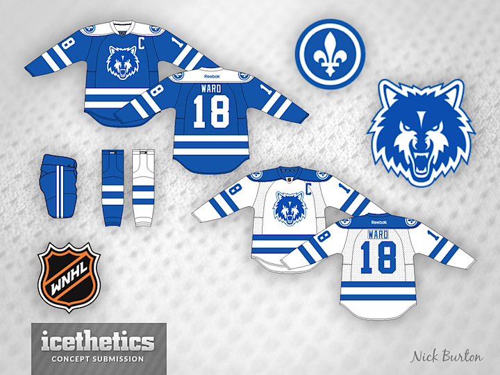
The six-part Women's National Hockey League from Nick Burton continues this week with the Quebec City Wolves. From Nick on the origin of the design:

Québec Wolves/Loups du Québec — The team takes the color scheme of the Quebec Nordiques. The unused logo of the Nordiques was to be a wolf, so the team takes the name Wolves. The logo is an edited Minnesota Timberwolves logo.

Just one more team to go now. Check back next Wednesday for the finale. As for tomorrow... something "devilish" is in store.

0570: Fixing the Hurricanes

Few were impressed by the Carolina Hurricanes' new uniforms this summer. So a couple of our regular contributors to the Concepts page sent in what they thought would be great improvements. Brian Brideau rounds off the shoulder yoke of the white jersey and adds the storm flags back to both.

Meanwhile, Bastian Schmülling has a different solution. If the Canes just wanted more classic striping, why not make the storm flags a little more subtle? I'd say that would've been better than removing them entirely. Which of the two designs do you prefer?

0569: Fixing the Ducks

Dylan Alexander may have the cure for what ails the Anaheim Ducks. This green and orange number would certainly set them apart from the rest of the league — and do it in a way that didn't involve the heavy overuse of black.

By the way, Dylan is using the new IceBorn jersey template by Matt McElroy, now featured on Icethetics' new Templates page. Download a copy and give it a whirl.

0568: Seattle Thunderbirds Go Pro

Seattle Sunday is back this week with Matt McElroy's idea for a re-imagined Thunderbirds team. Currently, the T-Birds play in the WHL, but what if they gave up their name to a future NHL club?

0567: Team Canada in Sochi

Skipping our Winter Classic Saturday series today for something more timely. On Thursday night, the world got a sneak peek of what may be Team Canada's 2014 Olympic jersey. With that in mind, a few concept artists have toyed with the idea. Francis Matte has a revised version of the red sweater along with a white one to match.

Adam Ravenhill decided to stick with the Nike design for the red jersey and also add a white version. Any chance the maple leaf in the middle of that one could be white? Or is that sacrilege in the Great White North?

And now for something completely different. Devin Durocher submitted this one last week, prior to Thursday's leak. He writes: "It's very simple with a few accents. There is a gold 8 in the V of the collar for the 8 golds Canada has won at the Olympics. Also inside the collar at the back of the neck it says TRUE NORTH."

Thoughts on these designs? Are you worried about the official unveiling of Canada's sweaters?