
0675: Capital Blue
/
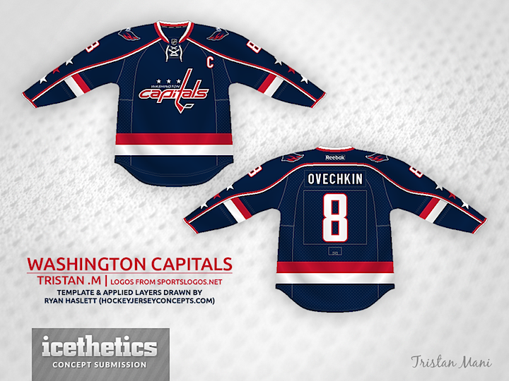
It would be nice to see the Capitals back in blue someday — even if only as a third jersey. This one by Tristan Mani would be a brilliant way to go if you ask me.
It would be nice to see the Capitals back in blue someday — even if only as a third jersey. This one by Tristan Mani would be a brilliant way to go if you ask me.
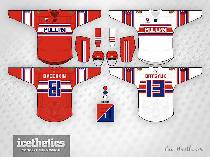
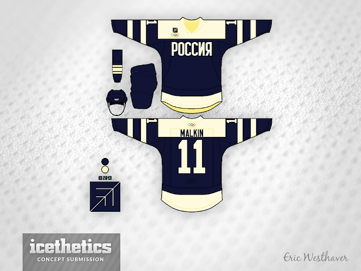
Better late than never, right? As Russia hosts the 2014 Winter Olympics, you might wonder if they could improve on the jersey Nike gave to them. So continues Eric Westhaver's series. Here's his write-up on the design choices.
Say what you want about the Russians, but no one disagrees with their place at the rink. Internationally, only one country has done better (three guesses who). Since I always thought of Russia as a highly industrial nation, I wanted to throw that in with simple chest stripes, a square stencil font, and a print eagle on the back. The third is a throwback to 1954, their first international title.
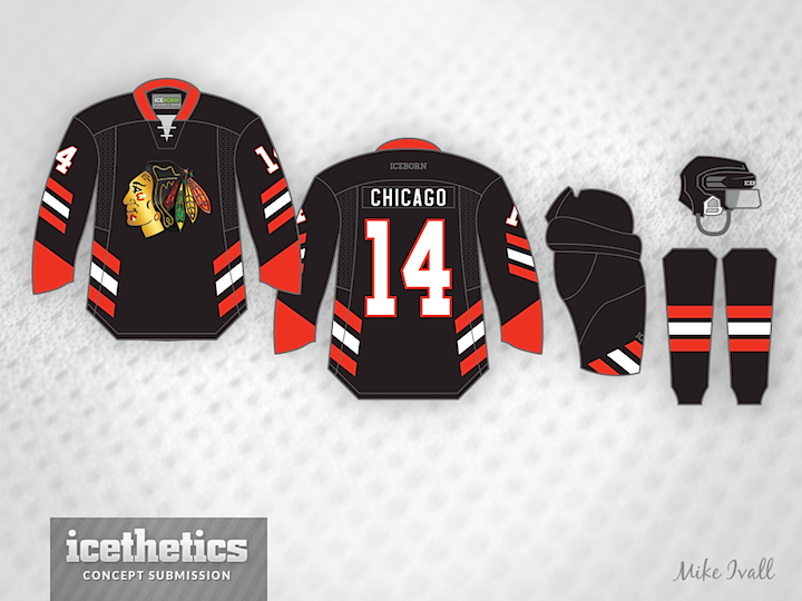
Well, this one was going to be a "preview" of the Chicago Blackhawks' Stadium Series jersey. Back when Mike Ivall submitted it and I made plans to post it, the Hawks had yet to announce an unveiling date. Now we've seen it. So the cool thing about this that we can all appreciate together is just how close Mike came to nailing it!
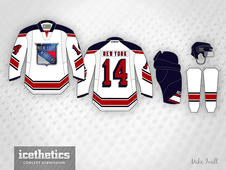
Mike also sent in this one prior to the Rangers' unveiling yesterday. Not bad, though. What do you think of these two sets? Is either one better than the real thing?
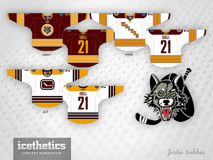
Minor League Week wraps up up with a super-sized Freak Out Friday. First, Justin Nahhas offers his redesigned Chicago Wolves jerseys. The home and road options aren't too crazy — though they do follow the template used by the Penguins in their last Winter Classic appearance.
The alternate jersey is what should freak us out. To be fair, Justin submitted this concept almost two years ago when the Wolves were still affiliate with Vancouver, but could you imagine a Canucks logo on the jersey of a Chicago-area team? Of course, the subtle "C" in that stick-in-the-rink logo could stand for Chicago, right?
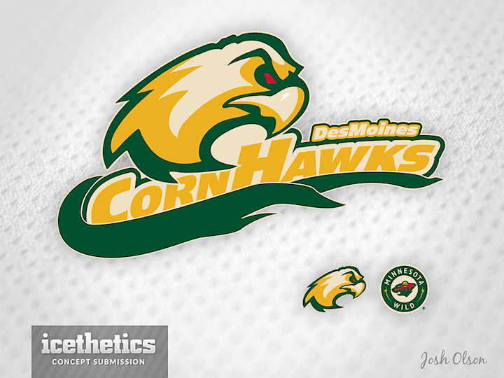
Another oldie I'm just getting around to posting is this one from Josh Olson. Last spring, in between learning the Houston Aeros were moving to Iowa and what the team's new name would be, Josh sent in this idea for a rebranding. He admits making up "CornHawks," but there's no reason it couldn't work as a team name. Do you prefer Des Moines CornHawks or Iowa Wild? (Both are a bit of a mouthful.)
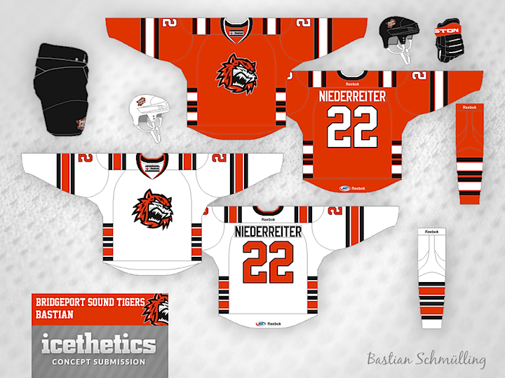
The ever-creative Bastian Schmülling completes a run of being featured on this page for three straight days. Here, he's redesigned the look of the Bridgeport Sound Tigers — swapping Islanders blue for nice shade of black. What do you think of the striping style? I think it's a little out there.
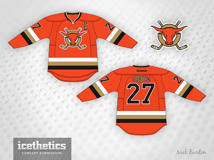
And finally, Nick Burton brings a redesigned orange jersey for the ECHL's San Francisco Bulls. What freaks me out is the sunburned bull on the crest. Yikes! Nice jersey, otherwise.
Check back here tomorrow for a concept that previews Chicago's Stadium Series sweater!
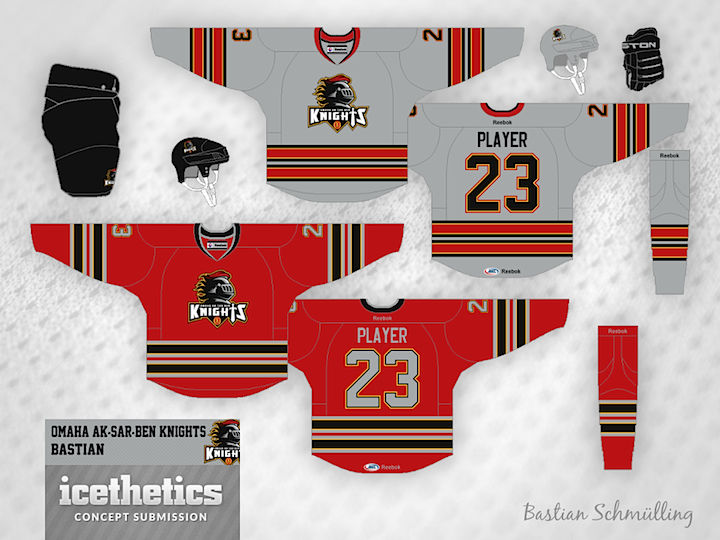
Teams come and go so often in the minors, so today's theme within Minor League Week has to do clubs that no longer exist. Like yesterday, Bastian Schmülling kicks things off. The Omaha Ak-Sar-Ben Knights exist today as the AHL's Abbotsford Heat. But perhaps they could've donned red and grey if they stayed put.
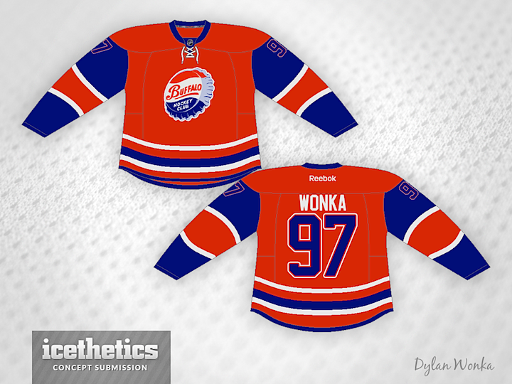
The AHL's old Buffalo Bisons club hasn't been around for 43 years, but Dylan Wonka imagines a comeback, complete with that classic bottle cap crest.
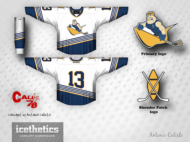
Technically, the Peoria Rivermen still exist, but now as a member of the SPHL. The AHL club was relocated and became the Utica Comets this past summer. Maybe they'd have had more luck as less a riverboat captain and more a canoeist. (Is that a word?) You can tell Antonio Calisto had some fun with this one!
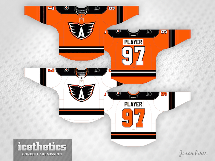
We'll wrap up on a team that's soon to be relocated. The AHL's Adirondack Phantoms will become the Lehigh Valley Phantoms next season. So while this jersey set is cool, the "A" wouldn't work anymore.
Check back tomorrow for some big time minor league Freak Outs!