Brown Buffalo Freak Out

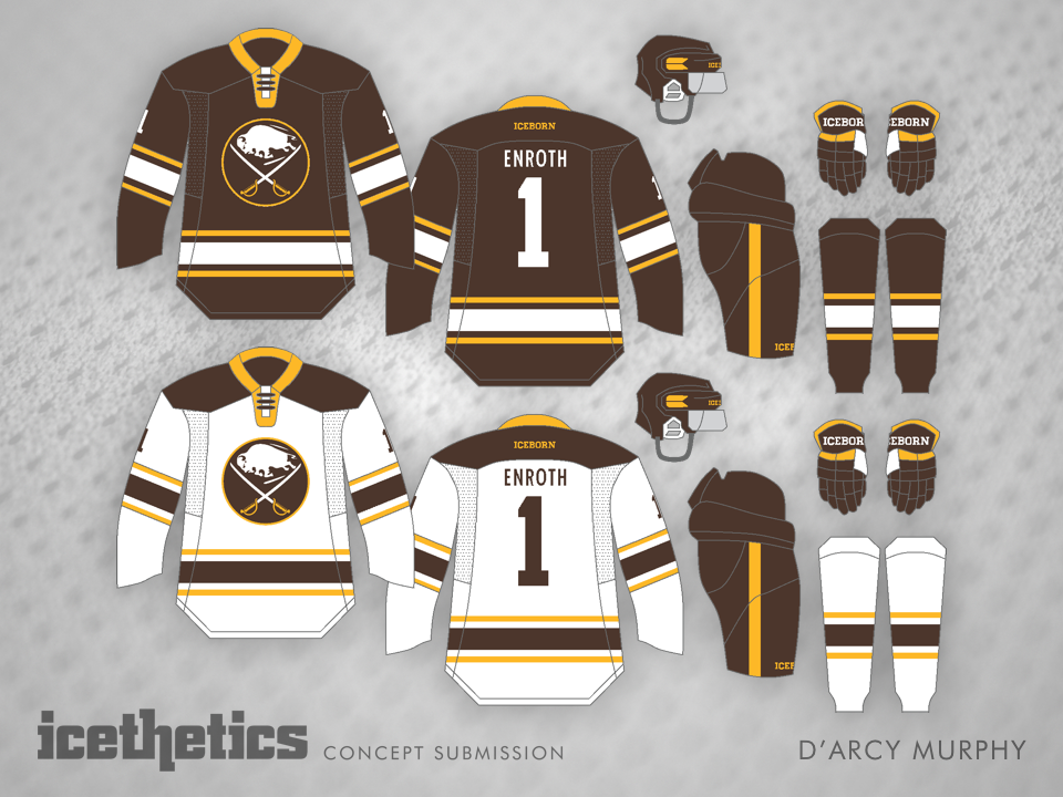
D'Arcy Murphy gives us a little something to freak out about on this Friday. He writes:

I opted to go with brown as the primary colour seeing as buffalo are that very colour. I kept yellow/gold as part of the scheme and ditched blue altogether in an attempt to create a more unique brand for the Sabres. The third sweater design borrows from a past Icethetics concept in that the buffalo and crossed sabres are free standing.

What do you think of blue-less Sabres?

A Shark By Any Other Color

San Jose Sharks fans made a bit of a stink when the team opted for black jerseys in the playoffs once again — despite having created teal ones that matched those famous "weight-saving" measures. But given the collapse we witnessed by a team poised to sweep their way through the quarterfinals, it's probably safe to say we won't be seeing playoff black in the bay area for the foreseeable future.

Having said all that, Ryan Yuck shows us that the Sharks can have a sharp black jersey that uses teal as nothing more than a trim color. Well, I like it anyway. You?

Coyote Beauty

Kevin Dion sent in this concept prior to the Coyotes announcing their name change. As an alternate jersey, it would fit much better with the team's existing home and road aesthetic. Plus, change "Phoenix" to "Arizona" and they could wear it this fall.

Panther Tradition

Nick Burton offers up a more traditional look for the Florida Panthers today. It makes great use of the club's full color palette. What do you think?

Burning Hot

It's not the first time we've seen dark grey dominate a Calgary Flames concept, but it is among the better ones. The minimal use of read makes for a great design, but I'm curious if it would be as welcome on the ice as it is in digital form.