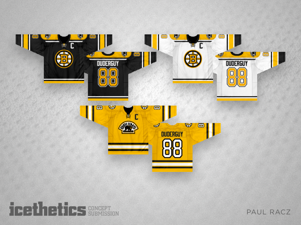
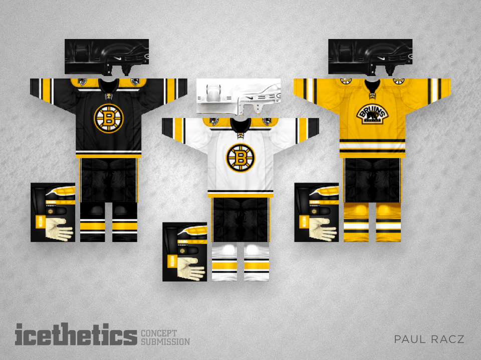
Verticals II
/A few weeks ago, we saw the first of Steven Grant's 2016 Stadium Series jersey sets featuring asymmetrical vertical striping. With this one, he tackles Minnesota and Chicago.
A few weeks ago, we saw the first of Steven Grant's 2016 Stadium Series jersey sets featuring asymmetrical vertical striping. With this one, he tackles Minnesota and Chicago.
If ever there was a team that didn't need to alter its colors, it would be the timeless Montreal Canadiens. But newcomer Taylor Roy thought he'd freak us out anyway.
Still waiting on that third jersey from the Winnipeg Jets. I can't imagine them going this heavy with the red, but Tyler Allen sure can. He writes:
Basically, [this is] my take on what the Jets would look good in as a third jersey. I was never a fan of using the "two-tone blue" scheme, so I went back to the original red, blue and white.
The thin striping is meant to represent "jet streams" you see behind jets in the sky. As much as I do like the new Jets numbering lettering, I felt a more "traditional" fit the bill here and used the original Jets numbering.
The idea of the jersey is to look modern, with some retro-like aspects.
So there it is. What do you think?
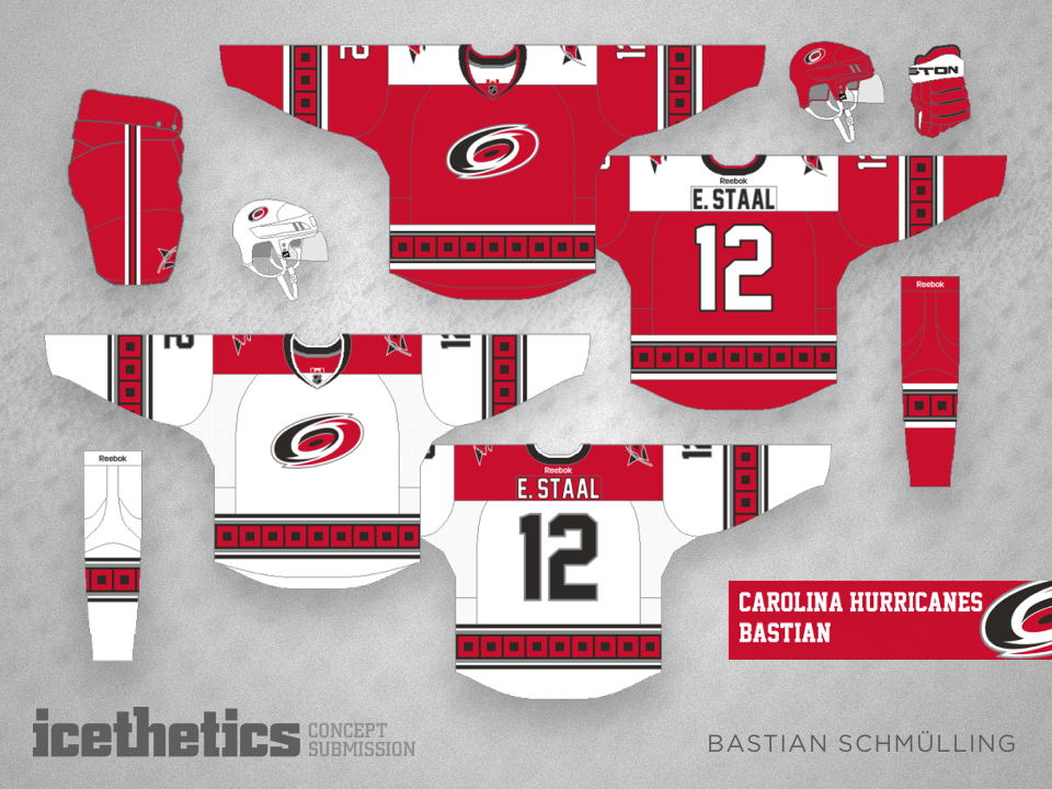
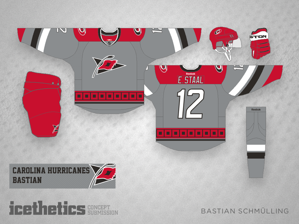
The talented and prolific Bastian Schmülling shares his improvements to the look of the Carolina Hurricanes. Gotta love that grey third jersey!