Freaky Preds
/Freak Out Friday returns this week for a unique treat from Brian Brideau. It's only a matter of time before the Predators have a third jersey again. When they do, how would you feel about something like this?
Freak Out Friday returns this week for a unique treat from Brian Brideau. It's only a matter of time before the Predators have a third jersey again. When they do, how would you feel about something like this?
Teal and black looks great. Add grey and you've got a fantastic look for the Sharks. It's been nice seeing San Jose bring back their original jerseys a few times this season. It might also be nice to see a similar new sweater like this one from Kevin Dion.
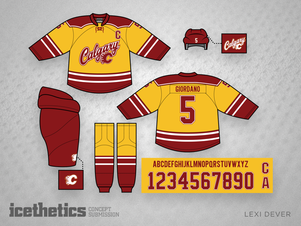
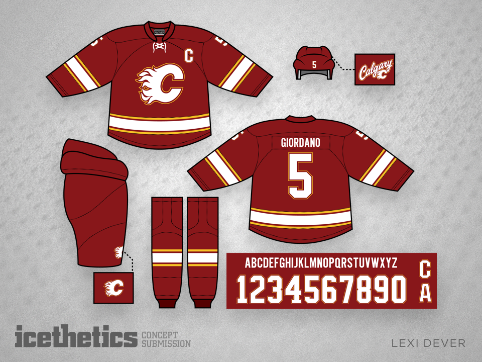
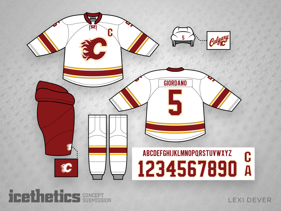
Another common theme among concept contributors is a Calgary Flames set free of black trim. Lexi Dever goes further by avoiding a simple rehash of the team's original sweaters.
Will Kozushko has spent a lot of time thinking about the Carolina Hurricanes' look so I'll spare you my thoughts and provide his words.
Like many others, I think Carolina's "new" uniform is a misguided "design by committee" result that displays too many compromises. My solution brings back the distinctive "hurricane" symbol by adding it to the stripes of their current home template — as done by other concept designers — but I also offer an additional update.
I've never cared for the 'Canes logo, but in studying it, I did notice that the outer "cyclone" shapes are actually rather cool. It's that middle "swirly puck" element that I am not at peace with. The old Hartford logo is recognized as a brilliant piece of design, so I pondered ways to pay homage to that distinctive negative space H shape by adding it to the center of the 'Canes logo, as in "H" for "Hurricanes".
(Some might argue that it looks a bit too much like the Habs logo, as in "CH", but I'd let the lawyers sort that out.)
The fact that the current white jersey doesn't even match or reflect the road uniform is particularly bothersome for me, so I submit an option that mirrors my dark set, but utilizes more black, complimented with enough red to retain the distinctive identity. (I felt that a white jersey with predominantly red stripes looked a bit weak, so to my eye, the black simply looks much more "bad @$$".)