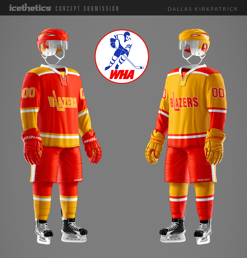
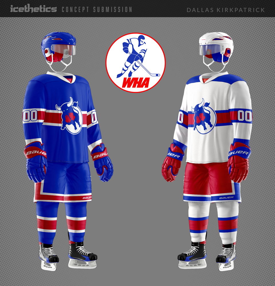
The WHA Collection

Dallas Kirkpatrick has something special for us today. He writes:

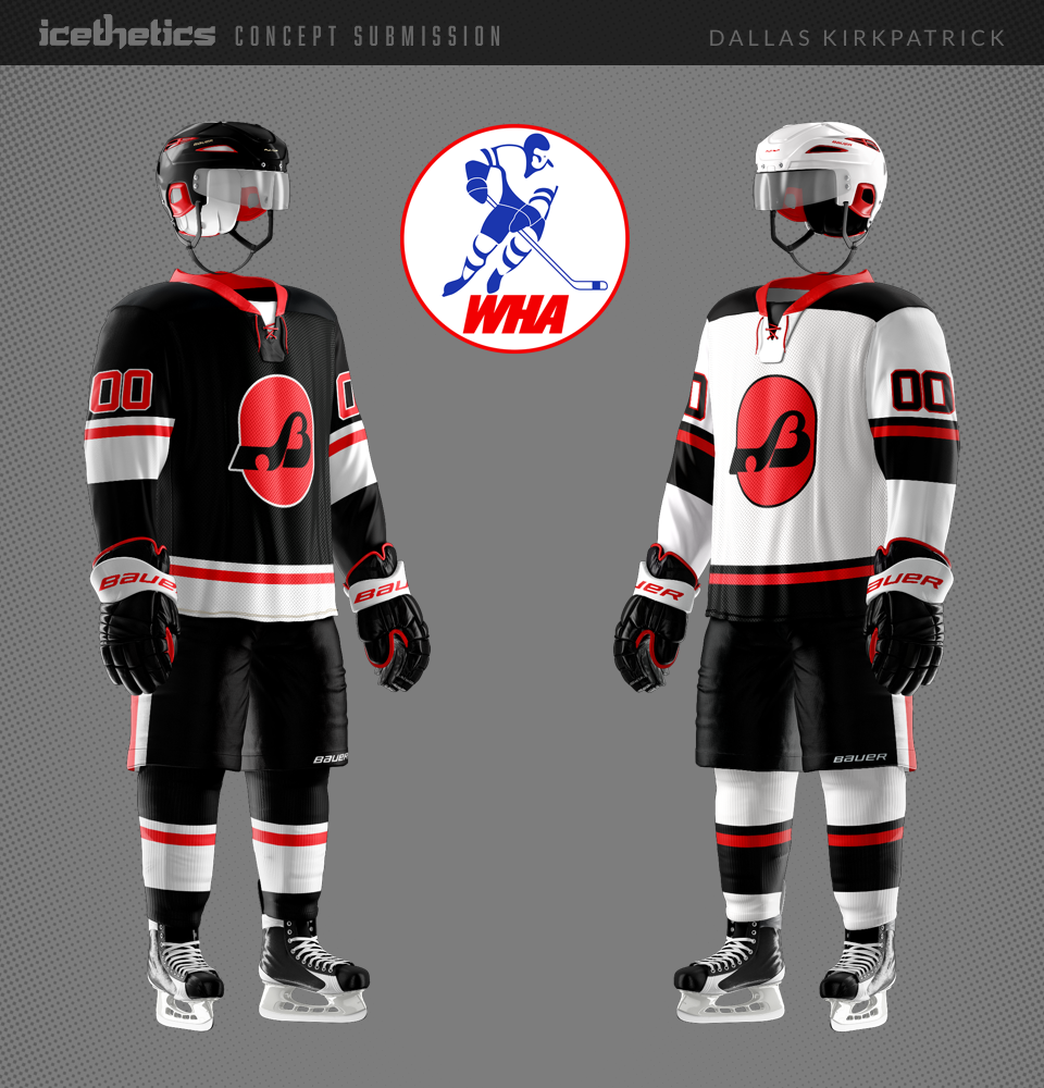
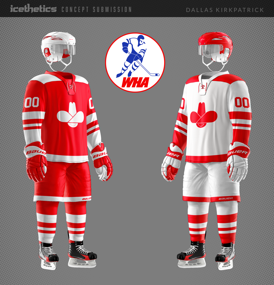
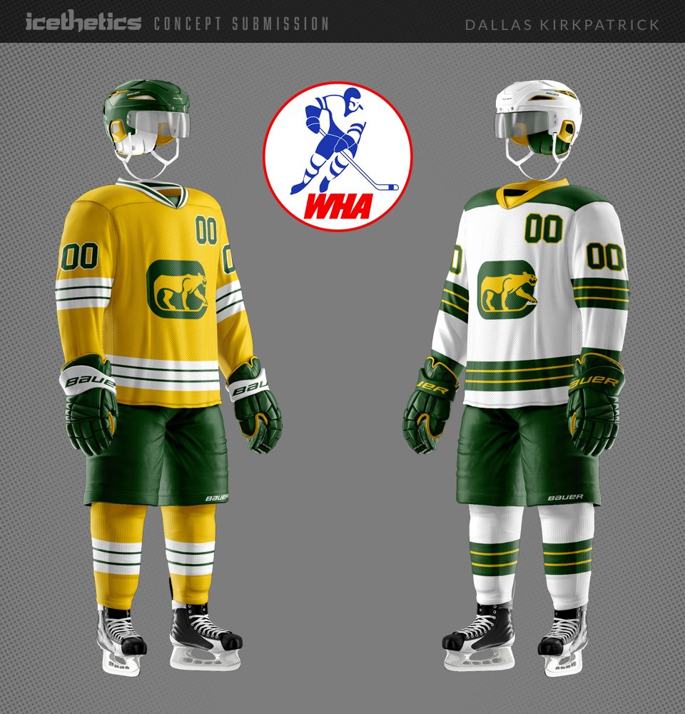
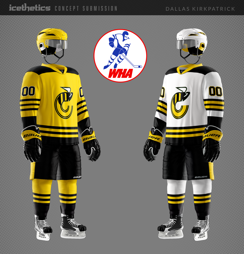
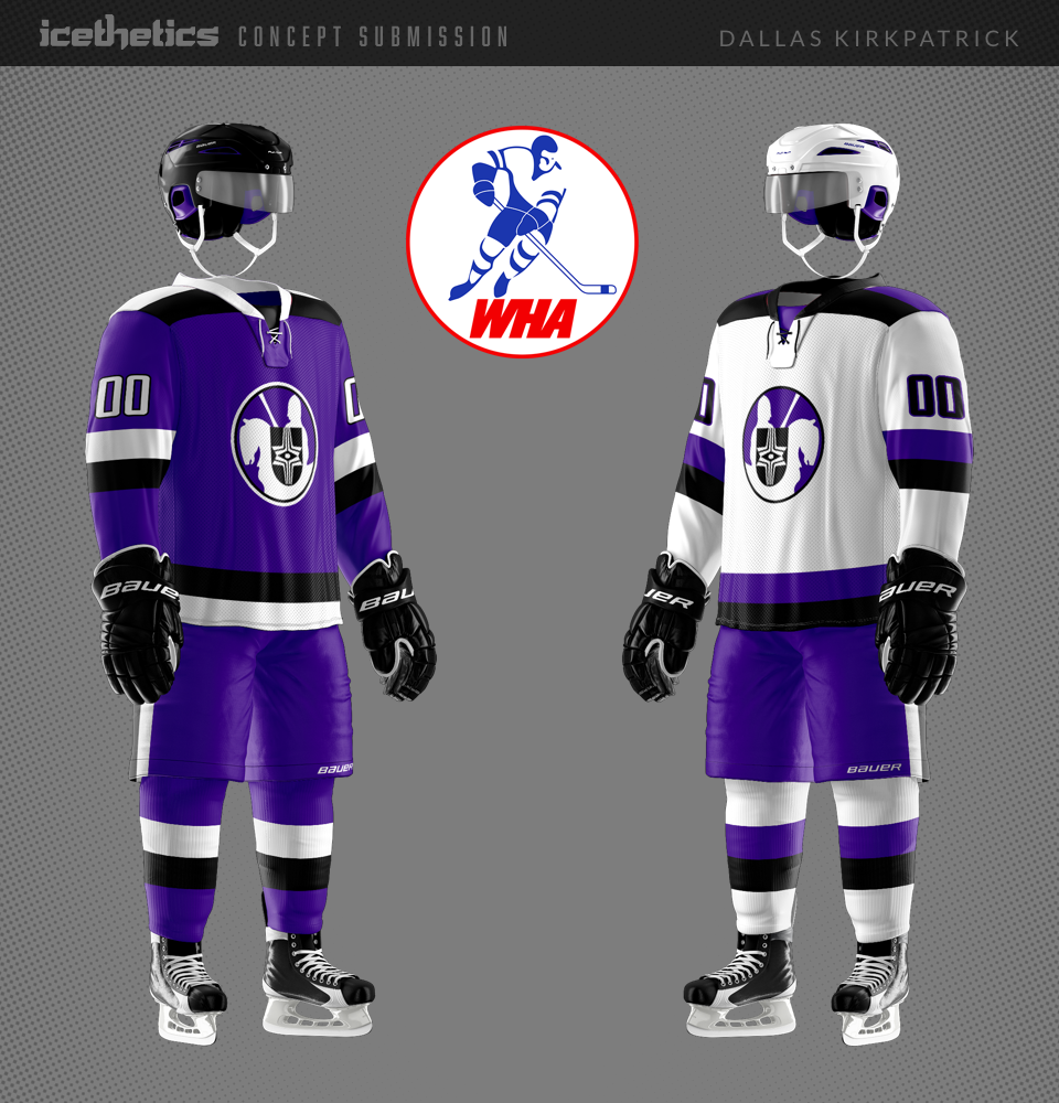
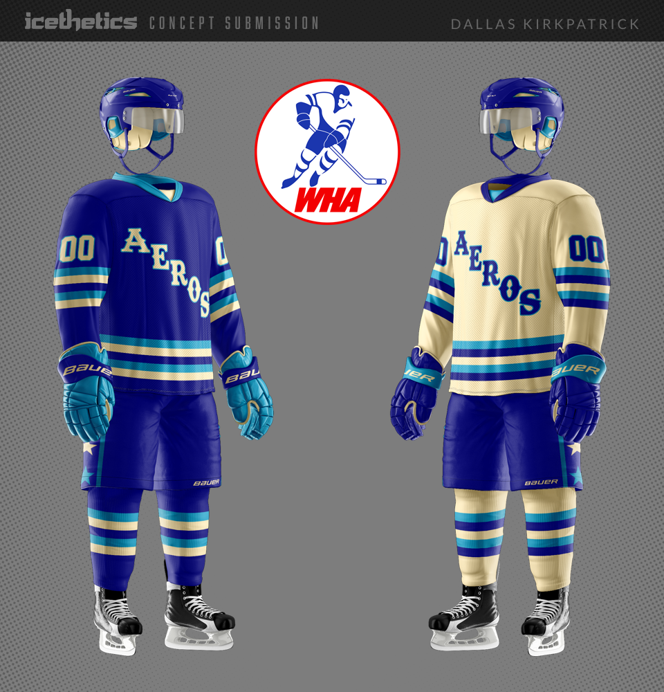
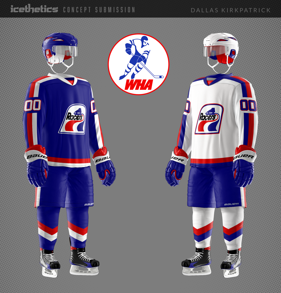
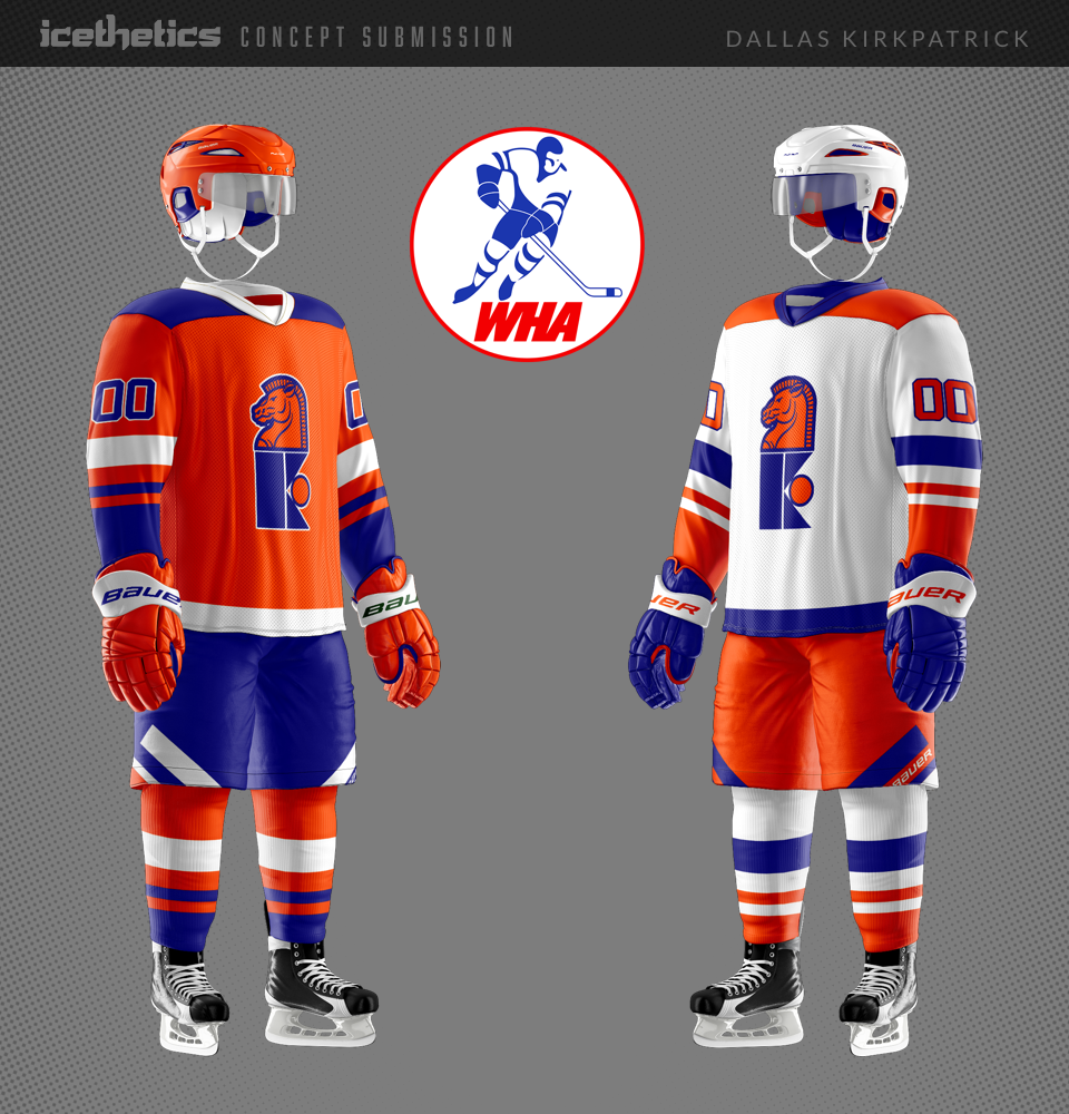
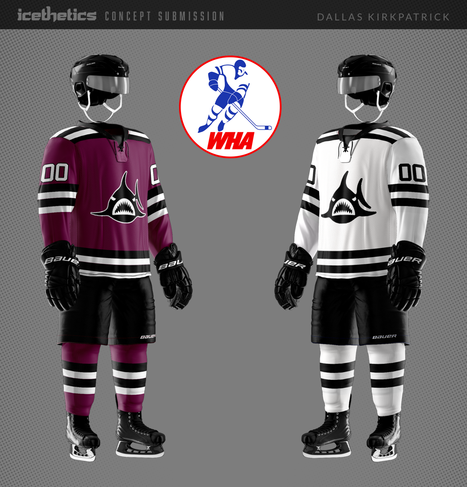
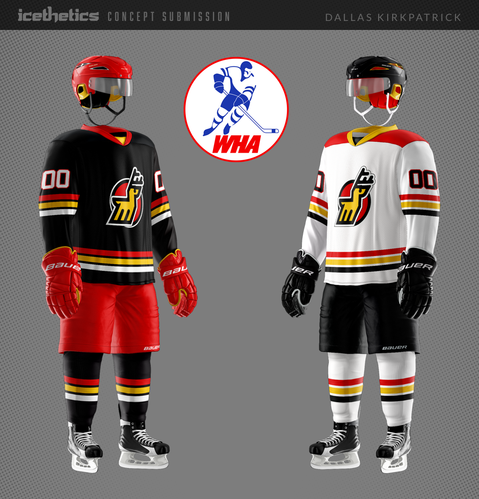
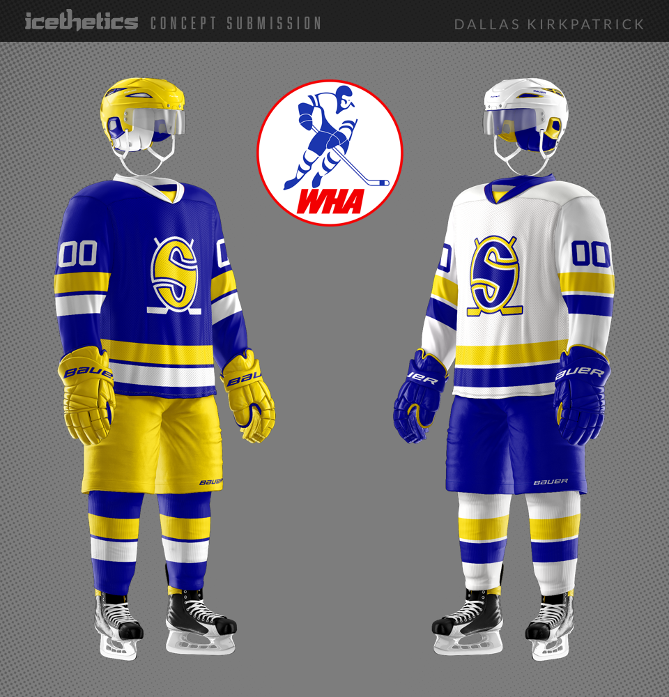
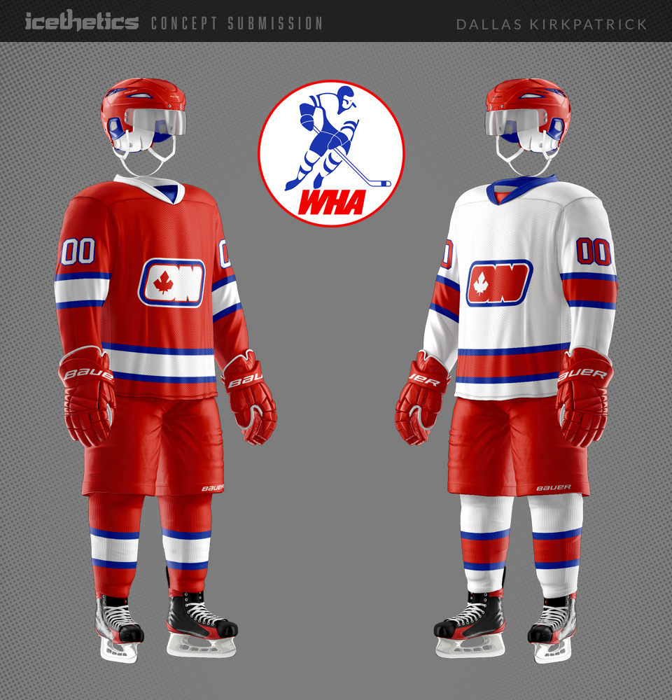
I've been working on a project for a while now, recreating WHA jerseys. I decided to create 14 sets in total. My idea is that this might be what the jerseys looked like if the league were rebooted today — and I've purposely left out Quebec, Hartford, Edmonton, and Winnipeg as I've already done multiple concepts for these teams
I used all original logos (or variations thereof), and have stayed pretty close to the original color schemes in most cases. While I want to be creative, I wanted them all to be believable and based on something from the past.  A few of these designs have bold or outlandish design traits that probably wouldn't be used in real life, but hey, it's the WHA.

Winter From the 90s

Winter Classic uniforms are starting to get a little too predictable. Enter Justin Nahhas from way out of left field. Instead of going all the way back to a team's earliest days, he envisions going back just a couple of decades for some inspiration.

Identity Swap: American Sabres

Lucas Daitchman has another major-minor Identity Swap for us on this Freak Out Friday. He's merging the Buffalo Sabres with their AHL affiliate, the Rochester Americans. What's funny is that it really kind of works!

Simply V

It seems to me the Vancouver Canucks don't get a lot of love around here. But that changes today with one of the best and simplest redesigns I've seen. Avi Stein adopts the "V" logo and returns a subtle "V" to the sleeves. It's a good look!

By the way, today marks 2,000 consecutive days with new concept art on Icethetics!

Outside the Calgary Box

This one's a bit odd — almost perhaps warranting a Friday placement. But I think Charles Noerenberg has the right idea in that the Flames don't really need black. The red and gold work very well together. As far as nameplates at the bottom... that's another story.