Icethetics' annual NHL JerseyWatch series picks up today with the long-awaited June edition. Everything you need to know about NHL logo and uniform changes working their way through the league's pipeline is right here. As we saw, 2012 was a quiet year. Not the case in 2013.
As you dive into this post, keep in mind that it's all subject to change or delay. But as of now, these are the changes expected in the NHL for the 2013-14 season.

Sabres have new alternate jersey in the works for 2013
In the 2013 NHL Season Preview, I mentioned the Buffalo Sabres were retiring their royal blue third jersey. The one with the Buffalo script across the chest. And its successor is already in the pipeline.
The news first broke last August when Sabres president Ted Black told Buffalo Business First writer James Fink that a new alternate uniform would be making its debut next fall. "Yes, it will be blue-and-gold and feature the team's beloved original logo," wrote Fink. "What else is on the jersey is still being determined."
Team president says it won't be a throwback
Black has been talking about the new third jersey a little more recently, too. In fact, just yesterday he was on the radio — WGR 550 in Buffalo — fielding calls from listeners when someone brought up jersey designs.
Bruce (caller): Yeah, I was wondering if the Sabres could bring back the royal blue uniforms with the gold stripes and the gold numbers and the original insignia of the Sabres on the shoulders.
Ted Black: We will have a new third jersey for next season. We're still working on the final designs of that. That probably won't be released until the summer. As I say that, it probably leaks out anyway. But, Bruce, it won't look like what you're envisioning. I think that the rest of the jerseys are gonna remain the way they are. From time to time the league does special events and do these retro jerseys so there may be opportunities to showcase the jersey that Bruce is discussing.
Is Ted inviting his Sabres back for a future Winter Classic (or Stadium Series game)? You'll recall Buffalo hosted the first one back in 2008 and did, in fact, where a retro white jersey from way back when.
In any case, while Black doesn't say what the jersey will look like, he does say what it won't look like. For those of you, like Bruce, still hoping for that original royal blue getup, forget it. Maybe the 50th anniversary in 2020. But it's not happening this year.
That may seem to go against what was written in Business First in August, but then that article was pretty vague. Will the jersey be blue? Good odds for the Sabres. Will it have the team's primary logo on it somewhere? Also good odds. That happens to describe the last third jersey as well.
Black also said he expected the release this summer — which technically starts at the end of this week. In the past, though, the Sabres have waited until training camp in mid-September (nearly fall) to launch new uniforms. From a marketing perspective, it means the new jerseys can go on sale as soon as they're unveiled. But no date has been announced at this point.

Reebok says Flames are swapping out retro third
This one definitely gets a big question mark from me. According to Reebok's catalog, the Calgary Flames are apparently eyeing a third jersey change for next season — or dropping it entirely. The manufacturer is vague about it but does indicate a change is coming.
The logical question you have to ask is, why? Why dump the brightly-colored retro alternate in the first place? Are fans complaining about it? Are they not buying them? Can't imagine either of those things are true. Or that a new Flames third jersey would be any color but black. Which will excite almost none of you.
Here's my hope. Maybe the NHL is wising up to the retro trend and allowing teams a "fourth" throwback jersey. That would allow the Flames to keep their 1980s-style red sweater while also experimenting with a new third design. Then maybe they'll add a few "Retro Nights" throughout the season. On those nights, every team that has one gets to break out their throwback.
But that's all just wishful thinking. Would be nice though, right? And for what it's worth, we've had no confirmation yet from the Flames that a new sweater is forthcoming.

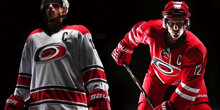
Hurricanes introduce new home and road uniforms
The new sweaters from the Carolina Hurricanes might've caught us by surprise had we not heard from Reebok on the subject back in January. On May 23, the team announced the home and road uniforms would be changed for the 2013-14 season.
As part of their "New Storm" marketing campaign, the Canes teased us with sneak peek photos on Instagram every day for 11 days leading up to the unveiling at a special event on June 4 at PNC Arena. Inspired by hockey tradition, the new jersey designs were simpler in design and color palette.
 Photos from Carolina Hurricanes
The redesign got a mixed reaction as some lauded the more traditional style while others complained that the look was oversimplified and not unique to the Hurricanes. If you read my lengthy review, you know which category I fell into.
Carolina will not change any of its logos or its third jersey.

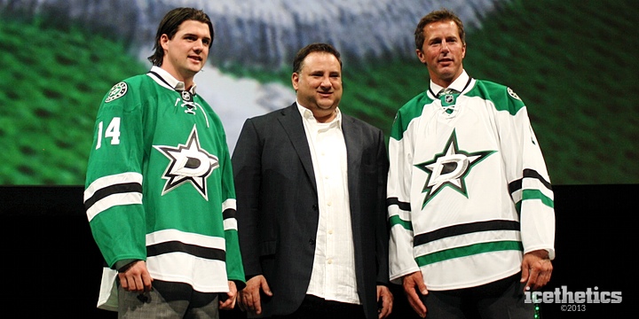
Stars unveil new logo, uniforms for 2013-14
The Dallas Stars had been contemplating new uniforms for a few years, but a recent ownership change delayed things a bit. However, almost as soon as new owner Tom Gaglardi took over, he got the ball rolling on a full reset of the Stars branding.
Two weeks ago, on the same day as the Hurricanes, the Stars introduced new logos and uniforms at a special event for fans and season ticket holders. They even invited Icethetics to cover the festivities — an opportunity which, for me, was an absolute thrill.
When I got back from my trip to Dallas, it took a full week and three separate posts to review everything I saw and experienced that night. I won't rehash it all here since we have a lot of teams to cover, but I'm happy to provide links.
Part 1 looked at the new set of logos that were introduced. Part 2 focused on the unveiling event itself. And Part 3 was the much-anticipated full review of the new uniforms. I hope you guys enjoyed those long reads as much as I enjoyed writing them. There was a lot of excitement in Dallas!
In previous editions of NHL JerseyWatch, I said the Stars' redesign was the one I was most excited about. Now having seen what they came up with, I'm still most excited about this team.

Wild road jersey to be "revamped" this fall
During an online chat with readers in early April, Minneapolis StarTribune scribe Michael Russo confirmed the Minnesota Wild will "revamp" their white road jersey for next season (at 2:04pm). He also confirmed the red homes and green thirds will be unchanged.
Just after Christmas, word first leaked out that the Wild were conducting surveys among fans to determine a new design for their road uniforms. They even had mock-ups to show off — some of which were described in that blog post.
According to one Icethetics reader:
One was a white sweater with the large, Wild head crest on the front, vertical stripes are gone. Replaced with two horizontal green stripes on the arms. The "red was gone" from the shoulder yoke, but didn't specify whether the shoulders had any color left.
The other option was basically a reverse of the current alternates. Antique white base with the Minnesota Wild script and green accents.
The first one sounds better. The final design will probably be revealed some time this summer. My bet is they'll unveil it at the draft and hand it to their first pick of 2013. (Well, that or the green one.)
Could new AHL jersey signal direction?
Of note is the fact that the Wild just relocated their AHL affiliate from Houston to Des Moines, renaming them the Iowa Wild. The club's new white sweater was unveiled last month and looks a lot like the alternate uniform the Aeros used to wear.
The question is, was this jersey designed to match Iowa's NHL parent club? It would seem strange given that the AHL team unveiled it first. And technically the look has been around a lot longer in Houston. But it is something to keep in mind while speculating on Minnesota's new whites.
We still haven't gotten a date from the Wild, but it can't be too much longer now.
Reebok lists new home/road set for Canadiens
Hold everything. That's sacrilege, right? Could the Montreal Canadiens really be thinking about altering their classic home and road jerseys in some way? You wouldn't think so, but there they are on Reebok's list.
I can't imagine any changes would be very significant. If anything, we'll probably seee nothing more than the addition of a lace-up collar like they used to have in the old days. I can't imagine changing any colors or striping — uniform elements that have almost never been touched in franchise history.
It's been a long time since the Habs made any real changes to their uniforms. The red shoulder yoke was added to the white jersey in 1941. They went with a blue chest stripe and no shoulder colors for a few years from 1944 to 1947 before going back to the design we know today.
And as for the red jersey, it has remained exactly the same since the start of the NHL in 1917 — back when hockey sweaters were actual sweaters. And for whatever it's worth they had the lace-up collar going from 1941 to 1975. (All that info gathered from NHLUniforms.com, by the way.)

Penguins to go without third jersey next season
Reebok listed the Pittsburgh Penguins in January as one of the team's mulling a third jersey change for 2013-14. Then about a month ago we got confirmation from Pittsburgh Tribune-Review writer Rob Rossi that the team will be skipping the alternate jersey for a season.
Rossi also said there may be a new one in the future. I have no doubt whatsoever that's true. And then something interesting happened last month.
The NHL officially confirmed its rumored Stadium Series with the announcement the Penguins would face the Chicago Blackhawks at Soldier Field on March 1, 2014. Since then, Islanders GM Garth Snow has confirmed that all teams involved in outdoor games next season will have specially designed sweaters for the occasion.
The good news is that the Penguins still have a lot of options in their historical closet. They've changed their uniforms numerous times over the years. But I know many fans would like to see them roll back the clock a couple of decades to sport something similar to what Lemieux and friends wore whilst leading the team to back-to-back Stanley Cups.
The Pens' previous alternate jerseys were born at their outdoor game appearances in 2008 and 2011 — with different blue jerseys each time. And then in seasons following each Winter Classic, the jerseys were adopted as alternates and used another dozen or so times per season. No reason not to think the same thing won't happen again in 2014 — right on schedule for a three-year cycle.

Reebok indicates Sharks revamping home/road uniforms
Reebok's 2013 catalog has one last surprise for us. Like the Hurricanes and Canadiens, the San Jose Sharks are apparently looking at new or modified home and road sweaters for the fall. And also like the Canes, the black third jersey seems to be sticking around.
This is unexpected because the Sharks just got new uniforms (and a new logo) back in 2007. That leads me to think the changes — if true — won't be significant. So what could they be?
I heard from a source last month that the change could be as minor as swapping out the shoulder patches. Perhaps the orange shield could be used like it is on Worcester's jerseys in the AHL. Or maybe something else entirely. Contrary to some speculation, he didn't seem to think the orange was going disappearing.
One thing I'm hoping for is to see those awful chest numbers vanish. Buffalo and San Jose are the only clubs still clinging to that lousy Reebok trend. Let's be done with it already. But for now, details are scarce. Hopefully we'll see something official soon.

Winter Classic staying in Michigan in 2014
On April 7, the NHL officially announced the next Winter Classic has been rescheduled for Jan. 1, 2014 at The Big House in Ann Arbor, Mich. The Detroit Red Wings will be hosting the Toronto Maple Leafs. The league also took the opportunity to unveil both jerseys.
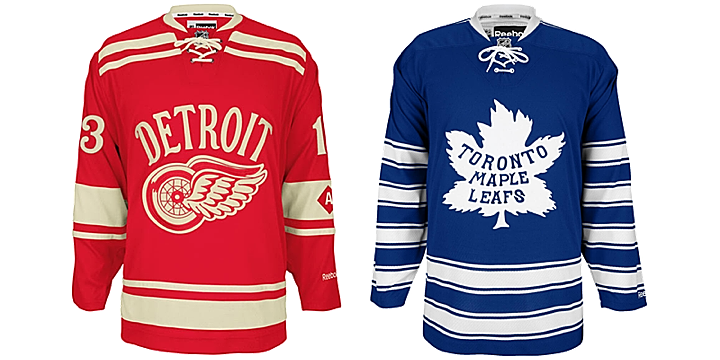
It'll be the first time in a long time we've seen an NHL game without one of the teams wearing white. Can't wait!

Game to be one of six played outdoors next season
As I mentioned earlier, the NHL also announced on May 1 that there will be a number of other outdoor games to take place next winter. The Penguins-Blackhawks game at Soldier Field on Mar. 1, 2014 was first to be revealed in the new Stadium Series.
On May 6, we learned that Dodger Stadium will host a game between the Ducks and Kings on Jan. 25. Then on May 15, the NHL announced two more outdoor games at Yankee Stadium, both of which will feature the Rangers — one against the Devils (Jan. 26) and the other against the Islanders (Jan. 29).
We're also still awaiting confirmation that the Canucks will host the Senators at B.C. Place on Mar. 2 to wrap up the five-game Stadium Series event.
Again, Isles GM Garth Snow seemed to confirm that all of these teams will have special uniforms for their outdoor games — the Islanders definitely will anyway. So it'll be neat to see what everyone comes up with — especially Anaheim and Los Angeles!

No All-Star Game expected in 2014 due to Olympics
Normally, we don't get an NHL All-Star Game in the same year as the Winter Olympics. The league takes a break to allow its players to skate for their countries for a few weeks. In 2014, Sochi, Russia will host the games. And while they're still hashing out the details, I'd be surprised if the NHL doesn't send their players.
This means Columbus will have to wait until 2015 at the earliest to get its hosting duties back — which it lost due to the lockout this season. Though the wait could be longer. During the last lockout, the 2005 All-Star Game was to be hosted by Atlanta. In 2006, Phoenix was slated to get the event — but it was canceled to make time for the Olympics.
Atlanta eventually did get the game in 2008. Phoenix is still waiting. We'll wait and see what happens in Columbus. But it's probably a safe bet that they'll get the next one — whenever that may be.
Hope you enjoyed the second edition of NHL JerseyWatch 2013. Check back for regular updates on the blog as they're available.


 Photos from Florida Panthers
 Photos from Carolina Hurricanes
 Photos from Yahoo! Sports
 Photos from Yahoo! Sports
 Photos from Anaheim Ducks
 Photo from Boston Bruins (via Instagram)
 Photos from Yahoo! Sports
 Photos from Carolina Hurricanes (via Instagram)