0670: Around the Juniors

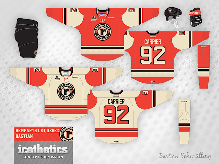
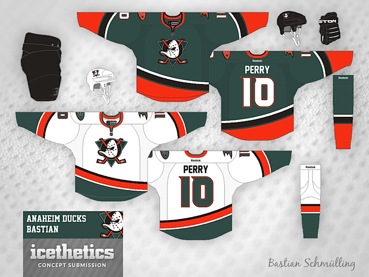
Minor League Week takes us around the Canadian Hockey League today. Junior teams are rarely featured here so this is a treat. The prolific and talented Bastian Schmülling gets us started with a pair. First, the QMJHL are represented by the Quebec Remparts. The Remparts have a history of great jersey designs. This one would not be a departure from that.

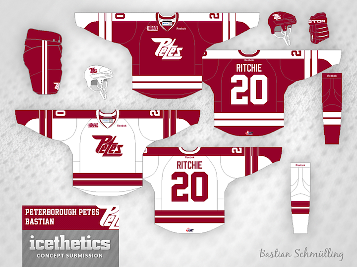
Moving to the OHL, Bastian tackles the Peterborough Petes. This team also lends itself well to great uniform designs. No surprise Bastian knocked this one out of the park too.

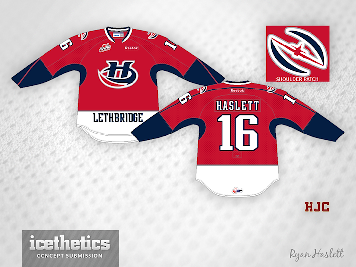
Another regular, Ryan Haslett, takes us to the WHL. He's created a new sweater for the Lethbridge Hurricanes which features a Hurricane (the plane) in the shape of a hurricane (the storm). Pretty clever.

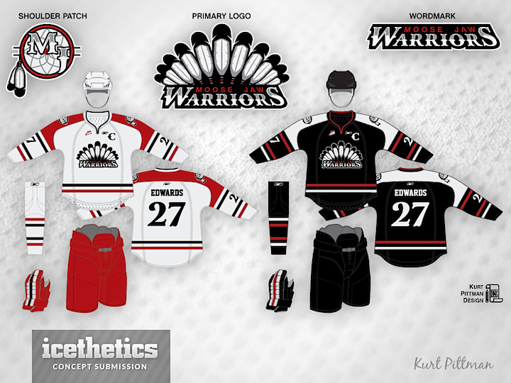
Finally, Kurt Pittman brings us his rebranding of the Moose Jaw Warriors. He introduces some great new logos to go with his uniforms. I'm really impressed with this set!

0652: Heritage Reimagined

We now know what the Canucks and Senators will wear when the hit the ice at B.C. Place in March, but how about a "what if?" Bastian Schmülling imagines the game looking something like this. Hard to say which I like better. This or reality? What's your take?

0633: No Orange in San Jose

So you say you don't care much for the burnt orange found on the San Jose Sharks' logos and uniforms? How about a return to a classic color scheme? Bastian Schmülling continues to impress with his sharp designs.

0622: Halloween in South Florida

Happy Halloween from south Florida! Bastian Schmülling presents this yellow number for the Panthers today. It's a little bright for me. What do you think? A great third jersey in the making here? Or something to hide away?

0583: By Bastian Schmülling

I'm launching a brand new theme week today! We have so many artists who are so prolific that I thought they deserved their own week right before hockey season starts. So each day we'll feature a trio of concepts from a specific designer, starting here with Bastian Schmülling. His Wild jerseys may look a little dingy, but they also look like instant classics.

The Flames could use a uniform simplification and Bastian has the perfect answer and the best use of black I've ever seen on a Flames concept.

Finally, the Ducks need a way to distinguish their palette from the Flyers and that gold just isn't cutting it. So how about green? Not the first time we've seen green and orange combined in an Anaheim concept, but certainly among the better examples.

Bastian still has a ton of work that's gone unpublished to date, but I'm working to rectify that. He's got a great eye for uniform design and I, for one, am always excited to see what new ideas he's come up with.