0037: A Possible Fix for Pittsburgh?

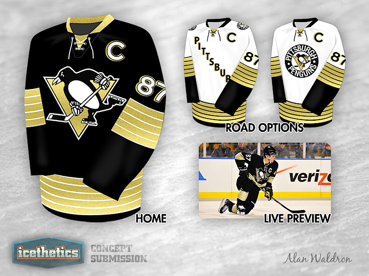
Last week I lent voice to the opinion that the Pittsburgh Penguins are overdue for a uniform overhaul. They wear a generic template with washed out colors and a weak design. I'm not saying Alan Waldron has the perfect solution, but this is certainly a step in the right direction. It minds the club's near half-century of history with bold lines and a design that stands out. If it were me, the one thing I'd change: forget Vegas gold and go with full on Penguins yellow from back in the day. Where do Pittsburgh fans stand on the matter?

Having said mine, it's only fair now that I let Alan say his peace on the design:

I kept the Pens 5-stripe pattern because I like the fact that it's a design element unique to the Penguins and featured on our inaugural uniforms. I know there aren't many people in the 'Burgh that like the diagonal Pittsburgh on the front, so I've included a second option with the circle logo which I think is equally as attractive.
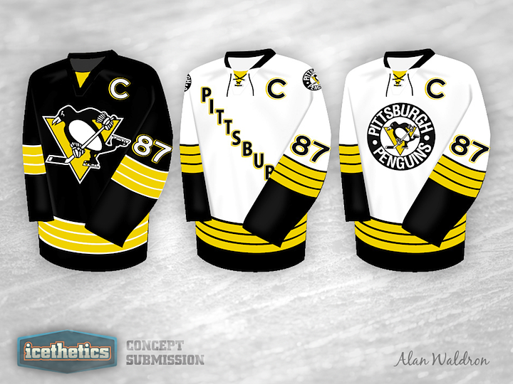
0036: Detroit and Toronto in 2013

We've seen so many throwback designs for the Maple Leafs and Red Wings as part of the Winter Classic Weekends series. Despite that, they all seem to be different and unique. You'd think at some point they'd have to all start running together. Torin Kowalenko adds a great pair of looks to the pile with his set. I could definitely see something like it on open-air ice next January.

0035: Pinstripes on Ice

On this Winter Classic Weekend, we look beyond 2013. If the pattern we've seen over the years persists, it won't be long before the New York Rangers are back in action on the outdoor ice — and with hosting duties, to boot. If the Broadway Blueshirts were to, say, host the Islanders at Yankee Stadium, perhaps their uniforms could pay tribute to the sport normally housed there — baseball. Basically, Colin May shows us what it might be like if the Rangers were to adopt Yankees pinstripes. It's a cool look, but definitely the wrong sport.

0034: The Colorado Rockalanche

Ross Taylor is tossing NHL history into a blender for a three-week series here on the Icethetics Concepts page. Last week, it was Minnesota and a mix between the North Stars and Wild. Today he sets his sights on Colorado with the Rockalanche — a combination of the Rockies, who played from 1976 to 1982 before becoming the Devils, and, of course, the Avalanche.

Sure, it's strange, but my goal with this series of posts is to demonstrate that the Freak Out Friday label doesn't have to be a bad thing. There are some very talented artists with some very interesting ideas. I hope we continue to see more of them.

0033: Bringing Blue Back to D.C.

This idea is not going away. At least not until it comes to fruition in reality. Over the years, we've seen countless concept artists put the Washington Capitals' excellent "Weagle" logo on a blue jersey, but few have hit the mark that I think Justin Wiltron has here. It's a very cool look with a little bit of a throwback feel. And for as much stick as the Caps got during their Blue & Bronze Age, I thought the blue jerseys looked great. Bring the blue back to D.C.!