0113: The Stars Come Out

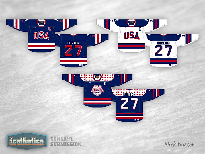
Time for another theme week on the Icethetics Concepts page! During the Stanley Cup Final between the Kings and Devils, superstars solidify their place in the sport and new stars begin to shine. So we're honoring them with Stars Week. And who's best known for literal stars? The USA, of course. Here's Nick Burton's try at some pretty cool Team USA hockey sweaters. Olympics 2014?

By the way, I'm currently floating somewhere in the Caribbean Sea right now so this post was written a couple weeks ago. So at the time I'm writing, I have no way of knowing whether the Stanley Cup Final is over and the Kings drop-kicked the Devils in 5 or if Game 6 is happening tomorrow night. And obviously, being on a boat, I wasn't able to update this post before it went online.
0112: Bleu Foncé, Bleu Clair et Or

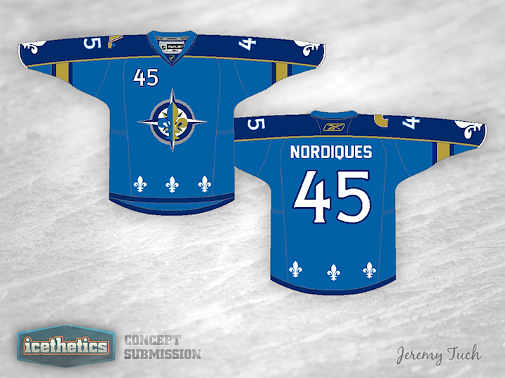
Jeremy Tuch has been emailing concepts to me for almost three years now. And after all that time, today marks the first time that one will actually appear on Icethetics. Jeremy has been persistent if not all that great with computer design tools. But his skills have improved and I thought this Nordiques attempt might be worth sharing with the world. Way to be tenacious!

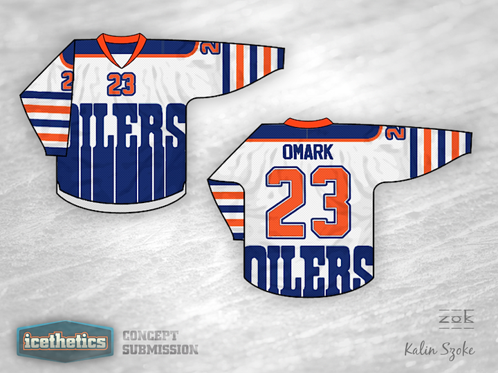
0111: Edmonton Freak Out

We're giving Ross a bit of a break after his epic Freak Out Friday series. Today, Kalin Szoke offers up this very unusual design for the Edmonton Oilers. I'll say this about it... I don't think you can possibly make the logo any bigger. Kalin tells me it was a first attempt at creating a concept jersey. It's certainly out there, but the real question is this: Would you want one hanging in your closet?

0110: Flashback to 1995

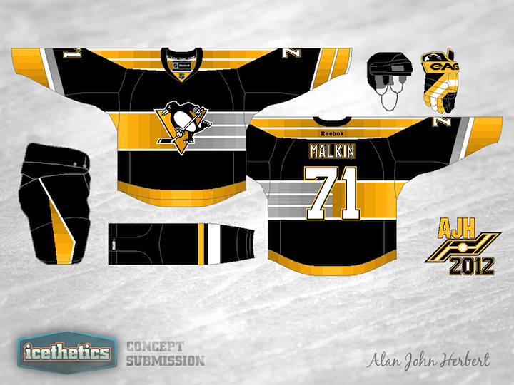
Look familiar? The Pittsburgh Penguins wore a similar third jersey from 1995 to 2002. Alan John Herbert has created a bit of an update to that design for today's concept. We should turn it into a game. Can you spot all the differences?

0109: More Gold for Florida

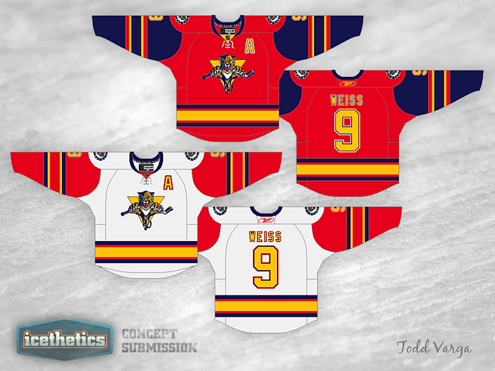
I've never been a big fan of mismatched sleeve colors on hockey uniforms, but I thought Todd Varga has put together an interesting look for Florida. Varga wrote: "I tried to bring out the great color palette that they have." It certainly uses a lot more gold than the Panthers seem comfortable with, but it works.