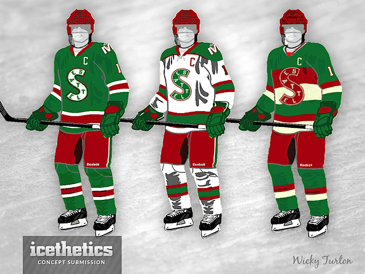
Looks like Santa decided that more of you were nice than naughty this year because he's delivered not one but 10 new concepts today! First up is a Seattle Metropolitans design by Wicky Turton. Hm, it's very... red and green. Maybe Santa had a certain theme in mind for today.
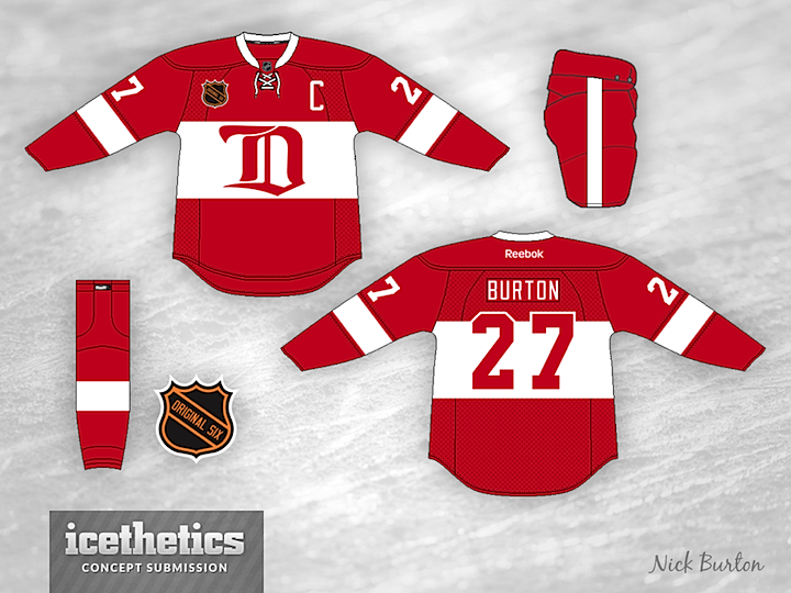
Nick Burton would like to see the Red Wings in a red jersey similar to their 2009 Winter Classic threads. It's a pretty sharp look!
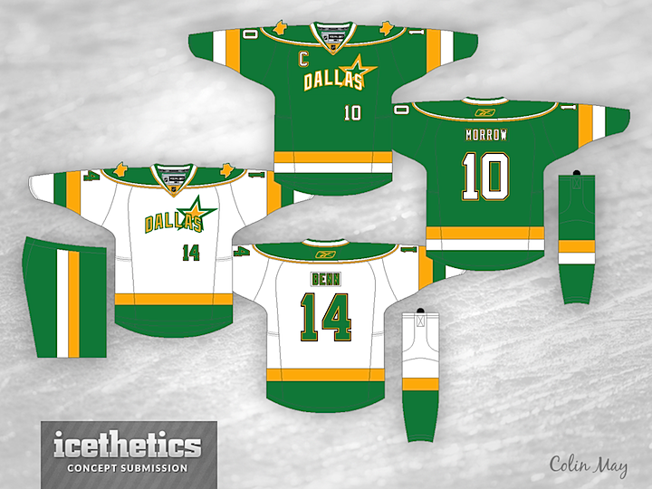
The "Big Guy" definitely likes his green and red. Colin May imagines a brighter palette for the Dallas Stars. It's not bad even if he is sticking to the wordmark crest.
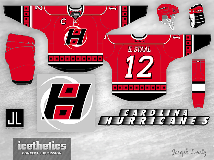
Joseph Loretz offers up an elegant fix for the Carolina Hurricanes' flag problem. The club's secondary logo portrays a single red flag with a black square in the middle, which typically refers to a tropical storm. A hurricane is generally represented by two of those flags. However, the swirling winds behind the H in Joseph's logo would appear to be rotating clockwise — which only happens in the southern hemisphere. Oops.
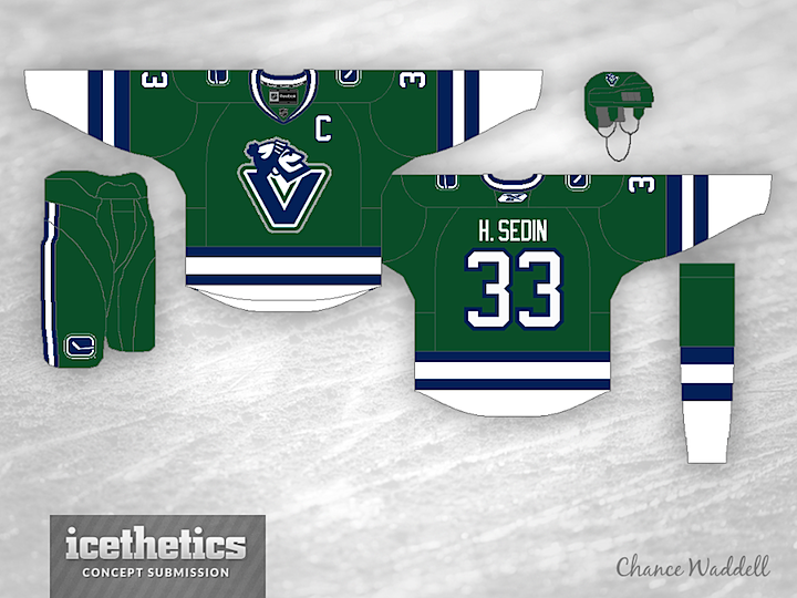
Back to green again. This time it's Chance Waddell (of our ongoing Winter Classic fauxback series) with a sharp sweater for the Canucks. They should just adopt this as their third jersey immediately. In fact, why haven't they already?
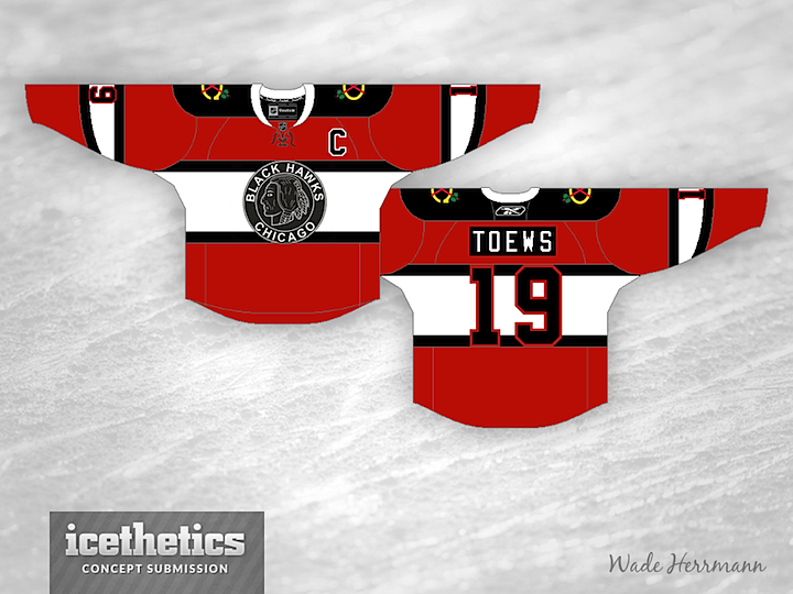
Another Original Six team gets a look here on Christmas Day from Wade Herrmann. Again, I'm a big fan! For whatever reason, I really like the black and white logo on the mostly red sweater. Sometimes I think it's too bad NHL teams don't do more one-off sweaters like they do in the minors. (Though most of the time, I'm grateful for that.)
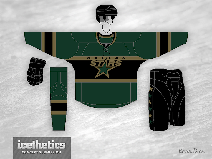
Guess Santa couldn't find anymore green teams, so we're back to the Stars — but this time in a much darker palette as designed by Kevin Dion. In fact, it's actually too dark. On TV, this uniform would look solid black from head to toe. The idea isn't bad, it just needs brighter colors and more contrast.
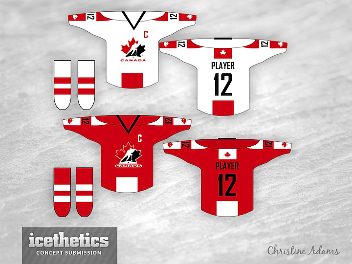
I believe Icethetics is breaking new ground today. This may be the first bit of concept art ever posted from a female designer. Gotta be honest. I don't think many of them are that interested in designing fake hockey sweaters. But kudos to Christine Adams on her new look for Team Canada.
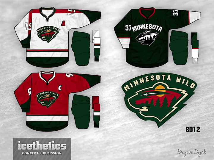
Oh wait, there was one more team with green. And they also have red. Bryan Dyck probably didn't intend for his set to have that Christmas-y look, but it kind of does anyway. Or maybe it's just me. Or Santa.
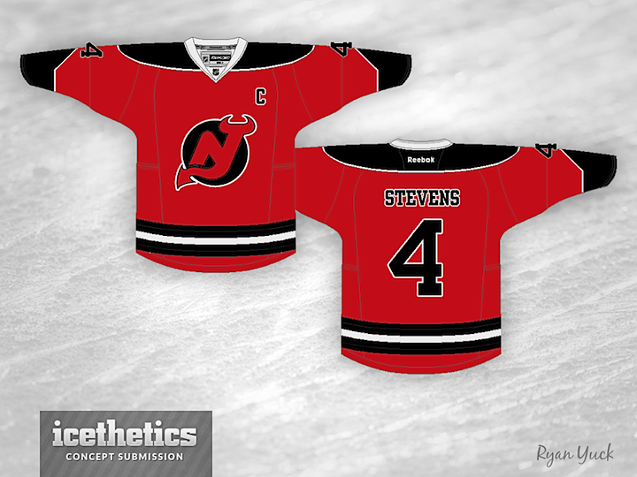
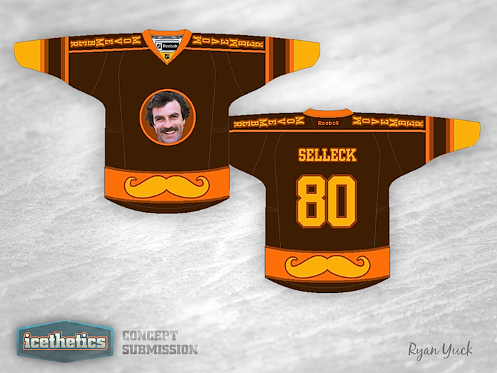
We'll wrap things up here with our 10th concept of the day. Ryan Yuck gives us this very red Devils jersey. Filling in the white area in the Devils' logo gives it a whole new look somehow. It's really interesting — as were all of today's jerseys. Which was your favorite?