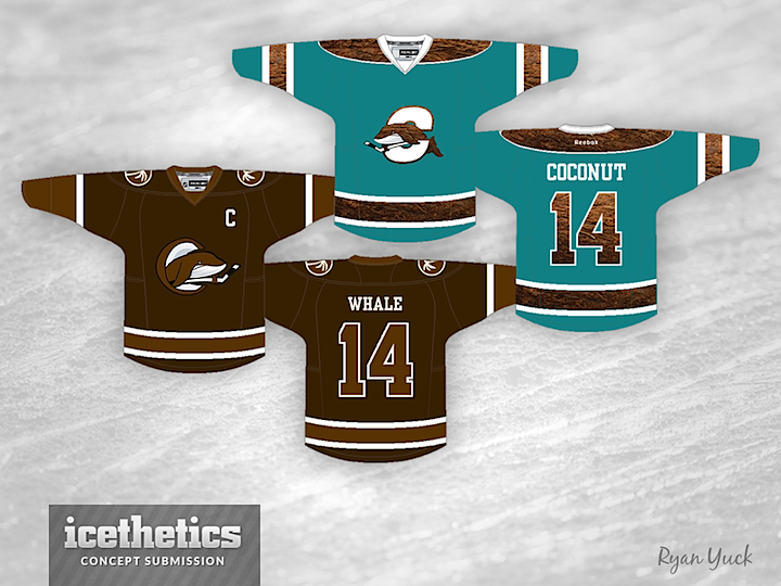
0398: The Coconut Whale

This week's Freak Out Friday is brought to us by Ryan Yuck, who takes us to the American Hockey League for a change. I'll let him explain why.

This is probably the weirdest jersey I have ever done. It's not pretty, however, I find it rather hilarious. Introducing... The Coconut Whale. My inspiration stems from the article you posted surrounding the Connecticut Whale franchise. Basically, at first glance I read, "Coconut" instead of "Connecticut". I thought to myself "what the f***?" until of course, I re-read the title of the article.

I thought it was a comical name for a team so I went along with it and made a concept. Call it a freak out, heck, call it a funny Beer League team. Whatever it is, this jersey will never see the light of day. Haha.
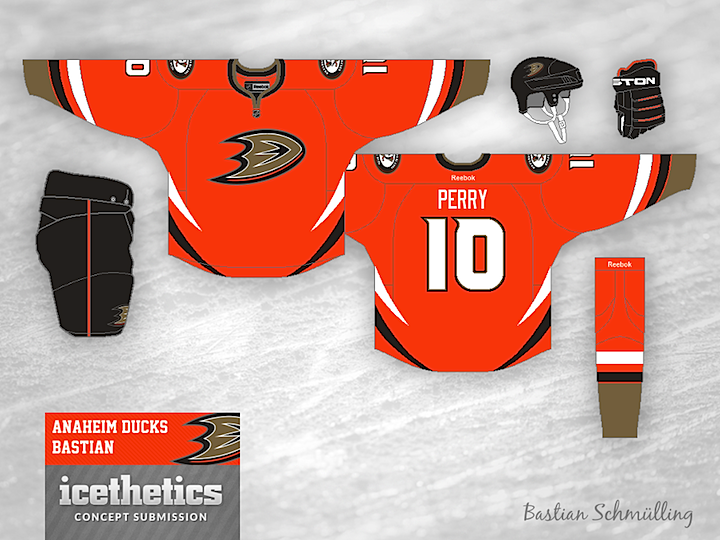
0397: The Ducks Do Orange

Orange. It's usually reserved just for the Flyers. But on Tuesday we saw how it could work for the Oilers. Today, Bastian Schmülling shows us what a sharp orange sweater could look like for the Anaheim Ducks. As orange Ducks jerseys go, I'm a big fan of this one. Am I alone there?

0396: A Rare Habs Redesign

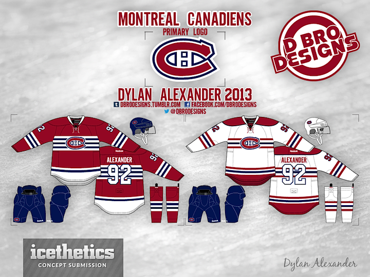
It's not often the Montreal Canadiens grace the Concepts page. Their uniforms are pretty much perfect — and the epitome of what every other NHL team strives for — so why bother? But if the Habs ever did want to change it up a bit without losing their identity, Dylan Alexander has a pair of jerseys that would fit the bill. Or so I say. What do you say?

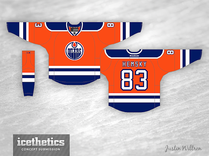
0395: Oiler Orange

At present the Edmonton Oilers have a third jersey vacancy. I know a number of Edmontonians would like to see an orange sweater reminiscent of those WHA days. And while this isn't the first time we've seen such a concept on Icethetics, I think Justin Wiltron brings one that could really work just as is. I'd vote for it.

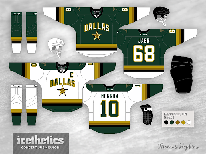
0394: Green and Two Golds

On the heels of St. Patrick's Day, I thought another green Dallas Stars concept was in order. Thomas Hopkins provides us with this look which, while more colorful, relies perhaps a bit too much on the wordmark style crest of the existing sweaters. It is the first I've seen to try a two-tone gold color scheme. Thoughts?