0544: More in Montreal

Yesterday we got a look at a female version of a Montreal hockey team. Today, we stick to the same city but switch back to the NHL. Laurent Elbaz tweaks the typically untouchable Habs sweaters. I'm intrigued, but before I'm sold, something will need to be done to make the number legible on the back of the white sweater — that's why they dumped the blue stripes ages ago.
0543: The WNHL Series, Part 1

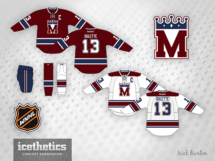
Women's hockey will be the focus of the next six Wednesdays. Nick Burton presents his WNHL series, wherein he imagines a female pro hockey league and its Original Six franchises. This week we feature the Montreal Royals.

Nick writes: "Montréal Royals/Royals de Montréal — The Royals take their colour scheme from the Canadiens but darkened to make the team unique. The team name Royals is derived from the city name itself, which translates to Mount Royal."

0542: A Mighty Retro Trio

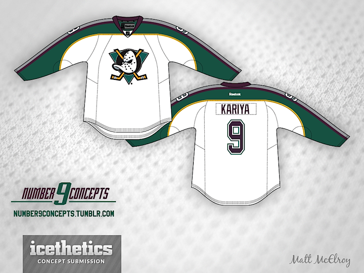
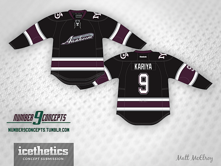
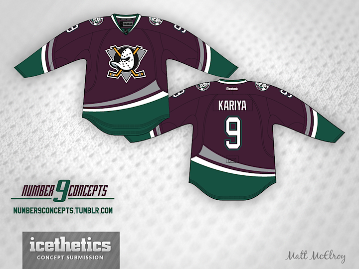
With the Ducks already confirming a "Mighty" throwback is in the works for this their 20th anniversary season, Matt McElroy lays out the intriguing possibilities that lie ahead. First, there's the classic. Can't go wrong with a little eggplant and jade. Though I might quarrel with the modern-day striping.

Then there's the white alternate worn between 1997 and 2000. Another solid look with unique sleeve striping that sets it apart from other hockey sweaters.

And of course there's the trusty black number that the club used as a third jersey during their final three seasons as the Mighty Ducks. Turned out to be a harbinger of things to come as the new Ducks have worn black ever since. Any of these three strike you as a good option for throwback fever this season in Anaheim?

0541: How to Fix Vancouver

Rob Sulava has solved the Vancouver Canucks. I'll grant this isn't something no one's ever thought of, but it is a beautiful demonstration of how good the Canucks could look if they really wanted to. And they wouldn't even have to pay for any new logos. Smashing work.

0540: Metropolitan Green III

Our Seattle Sunday series seems to be going quite well. So I'll keep it going as long as I have content to fill it. As we all wait for what is surely to be the next city to join the NHL, Bryan Dyck has a different take from the last two weeks. It's a sharp and colorful set that — despite a similar color scheme — is still miles away from Seattle's neighbor to the north in Vancouver. I might vote for a little more distinctive crest, but the colors are spot on. (And we still need a new name.)