Florida Refined
/Dallas Kirkpatrick took the Florida Panthers' new branding and refined it a little bit. The striping is more traditional and the crest no longer spells out the team's name. What do you think?
Dallas Kirkpatrick took the Florida Panthers' new branding and refined it a little bit. The striping is more traditional and the crest no longer spells out the team's name. What do you think?

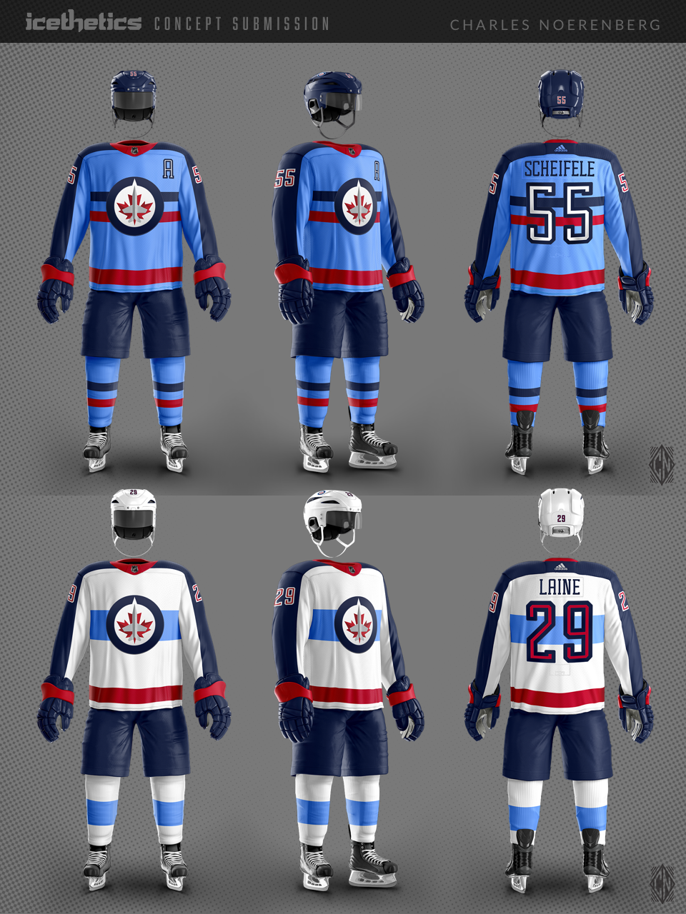
Charles Noerenberg returns with a new look for the Winnipeg Jets. He writes:
I was going for a clean, modern update to the beloved RCAF Flyers look, utilizing the light blue more. I created a new name and number typeface as well.
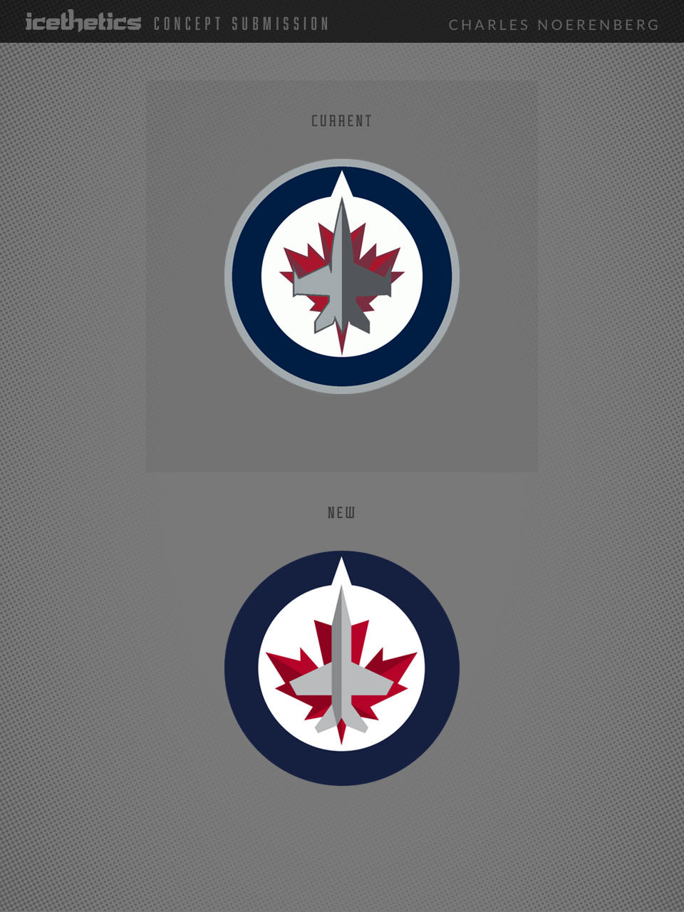
I made the revisions to the Jets' primary logo to make the plane more visible, to give the maple leaf a better form, and to give the logo better balance overall, so there isn't as much negative space on the left and right sides of the circle. I also removed the bombs from the plane's wings, to play down the militarism of the logo, and flipped the shadow to the left side of the plane, indicating a "bright future."
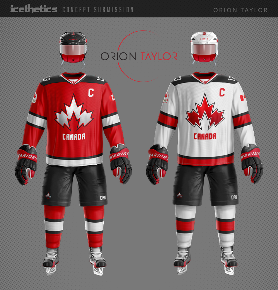
The 2018 Olympic hockey jerseys were unveiled this week and Team Canada's new threads received lot of mixed reaction. Today, Orion Taylor makes his Concepts page debut with a new take on Canada.
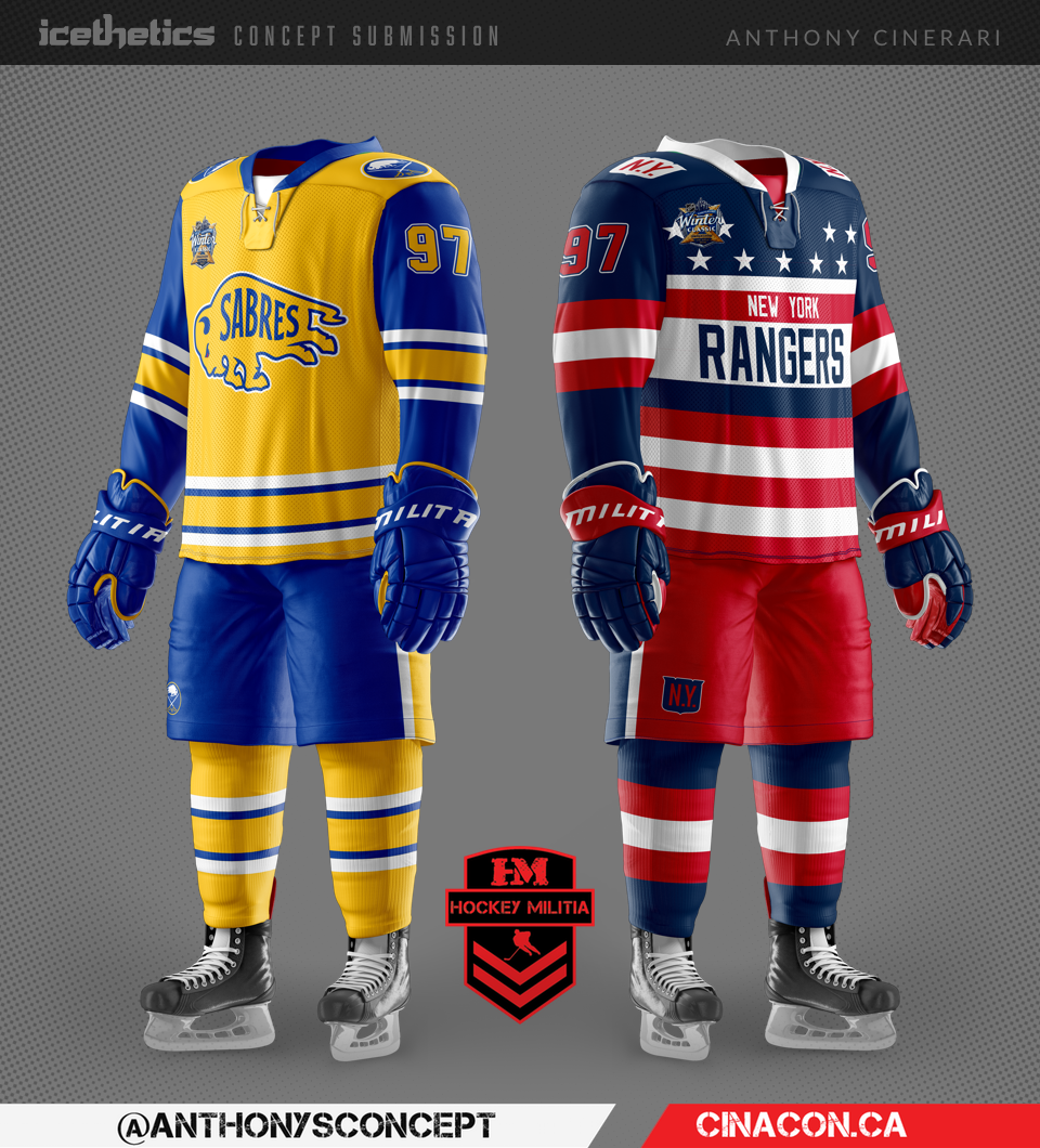
There have been so many unique and creative concepts for the next Winter Classic, I wonder if the real thing will be able to satisfy us. Anthony Cinerari's contribution is no exception. I particularly like his New York Americans-inspired Rangers jersey!
Thomas Gray makes his debut on the Concepts page today with a surprising new take on the Pittsburgh Penguins. It's kinda cool, actually, but I have to admit the colors are freaking me out a bit.