0082: Sealing Up California Week

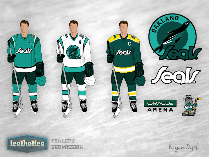
I know what you were thinking. California Week lasts four days but there are only three NHL teams in California. Means we have to double-up on somebody right? Wrong! As you can see, Bryan Dyck has a modernized Oakland Seals uniform concept. There's not enough contrast in his primary logo so it's hard to make out on the white jersey, but that's my only issue with this set. Otherwise, I kind of like it.

0081: The Sharks Without White

Happy birthday to Icethetics! The blog turns five years old today and we're celebrating the San Jose Sharks as part of California Week here on the Concepts page. Kris Lutes is trying a couple jerseys without using any white. The two sweaters are pretty close to the team's existing uniforms but the white has been replaced with grey. Unfortunately, the name bar on the teal jersey is nearly illegible, but the grey jersey looks great.

0080: Southern California Green

California Week rolls on with another shot of green in Anaheim. Kevin Dion proposes a rather dark jersey that swaps the Ducks' orange for a rarer hue. Of course that classic Disney logo is back on the front. What do you think of the overall feel of this one?

0079: Concept Redemption

It's California Week on the Icethetics Concepts page! Over the next few days I'll be sharing concepts for our favorite Golden State hockey teams. We start with the Los Angeles Kings and Matt McElroy's story, which I'll let him tell.

So like 2 years ago I submitted my first concept to Icethetics. It was featured on Jan. 8, 2010 and I was super pleased with myself because it was the first time I got my work on the site.

But after reading the comments about how like gross it was and how it should be buried deep in a hole, I was so embarrassed that I committed a lot of free time to getting to a point where I could stand my ground on the site. I have had a bunch of my other [work posted] since then, but [recently] I was looking through my computer and found the old Kings concept and decided I'd revisit it.

This is what I came up with — a new crown that I feel mixes the old Forum blue and gold with the newer silver and purple fairly well. Living in L.A. I know how popular the purple jerseys are but as a fan of the Kings' current uniforms, I didn't really want to change it all that much so I recolored the jersey to be an update of the old Kings jerseys fitting in the new striping.

Yep, two years ago, I wrote that Matt's Kings concept should be buried deep. I still stand by that comment, but he's won me over with this design. I'm a big fan, especially of the shield logo. What about you guys?

0078: The Millionaires

For their 40th anniversary season, the Canucks sported their original 1970 uniforms a few times. Maybe for their 50th, they could try something like this. Fans — at least the ones here on Icethetics — have been begging to see the team in Millionaires uniforms at some point for as long as I can remember. So... what do you think of Matthew Henderson's option?