
0233: Predators Re-Bourne
/
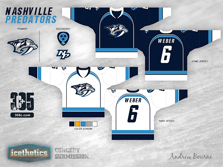
Concept artist Andrew Bourne has taken on the task of making over the NHL. In today's installment, he tackles the Nashville Predators. Hit or miss?
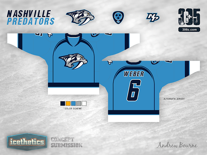
Concept artist Andrew Bourne has taken on the task of making over the NHL. In today's installment, he tackles the Nashville Predators. Hit or miss?

Is it already Sunday again? That means it's time for another college concept. This one for UCLA comes from Matt McElroy — who has a few more up his sleeve, which you'll see in the coming weeks. Want to request your favorite school? Maybe our concept artists are keeping an eye on the comments.
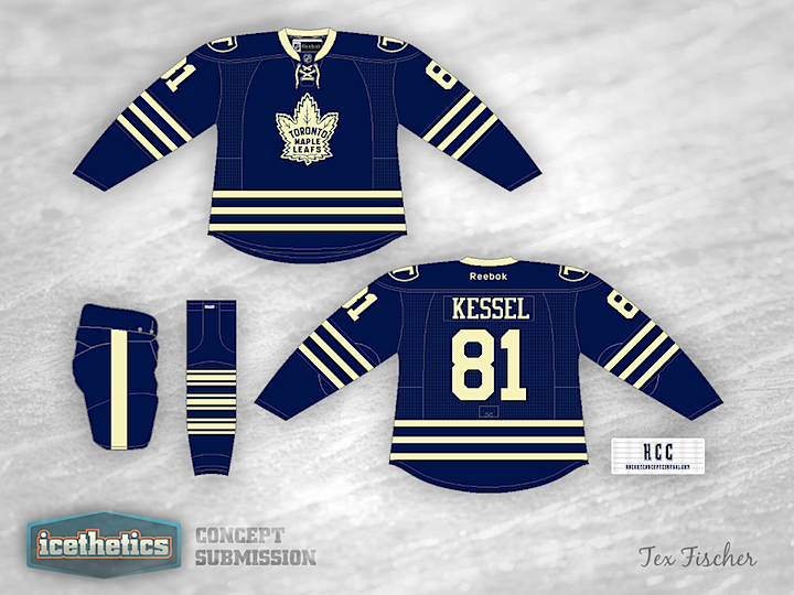
It's looking less and less like the first Winter Classic to feature a Canadian club will be nothing more than a dream. But that hasn't stopped the concepts from rolling in. This one from Tex Fischer is a little different from options we've seen in the past.

I don't think anyone but Joseph Loretz is eager to bring back the Phoenix Coyotes' original look. So we have this for our Freak Our Friday.

There's been a lot of talk about the NHL heading back to Quebec in the coming years, so naturally Nordiques concepts have been making more frequent appearances in my inbox. Here's a unique one from Benoit Lacaille.
Here's something fun. Want to see how I keep the concepts flowing on a daily basis? Watch me work — in time lapse, of course.
If you're a concept artist, maybe you could give this a try next time you sit down to design something. Might provide some neat insights for readers.

Benoit read your "reviews" and decided to make some revisions. I'll turn it over to him here:
I was surprised at some of the comments so I decided to explain myself but most of all take some of the constructive comments and make adjustments to the Quebec concept.
Now the wolf is bitting a puck and I put him inside the branding of the team. I kept some red inside the colour scheme because those are the original colours of the Nordiques. Also I put the old logo on the home uniform. It is one of the most celebrated logo in the underground rap culture, a true original and it is a good way to sell more jersey. I put the alternate logo on the right shoulders and kept only one "Fleur de Lys" on the left side. I kept the red collar on the home jersey and decided that red sleeve numbers and a red trim on the number on the back would harmonize the red in the overall jersey design.
Some remarks to the not so friendly commentary:
- I love European jerseys so thanks for the compliments. I understand they was meant as an insult but it is no insult to me.
- It's not four logos but a primary, a secondary and shoulders patches like most teams in the NHL.
- Four colours is also something you see a lot in the NHL these days.
I could, like a lot of people on the concepts page, change the colours on the jersey and put almost the same logo or work, think and create something different. I choose, like most of the good designers on this page, the second option. I love criticism and I can grow from it. I hate bashing just for the sake of bashing.
I'll drink to that.