0462: Dallas in Winterland

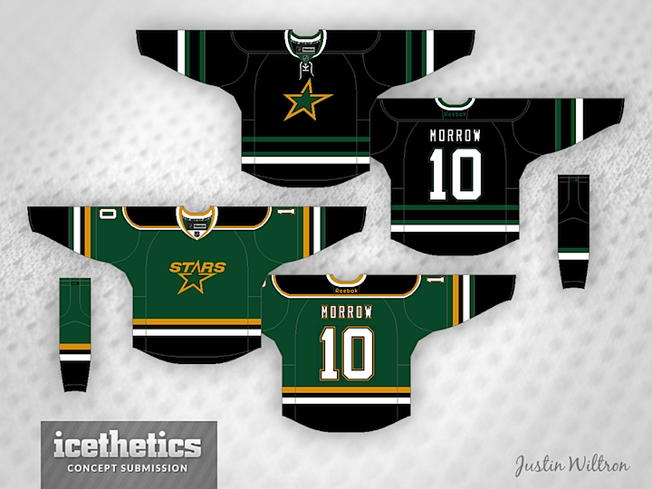
Hope you guys aren't getting tired of the Stars yet. We still have a lot to do. And being this is a Winter Classic Weekend post, I thought I'd share this one from Justin Wiltron. The throwback feels of both sweaters could work should the Stars ever participate in an outdoor game.


BONUS CONCEPT

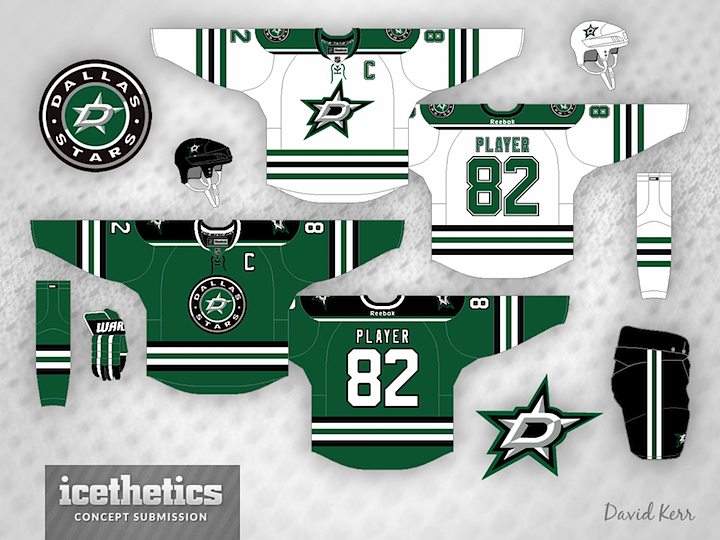
David Kerr was first to get me a concept featuring the apparent new logos of the Dallas Stars, which leaked on Thursday night. The striping is a little similar to the Blackhawks but overall it's a pretty sharp look. I wouldn't be surprised to see something similar when I'm in Dallas on June 4.

0461: Double Dallas Freak Out

Well this Freak Out Friday falls right in the middle of the double-length Dallas Stars Week. So we've got a couple of Big D oddities. First, Ryan Yuck (that's pronounced YOOK) has this unique design featuring the Dallas Cowboys logo. And yes, cowboy boots with spurs. I wouldn't wear it, but maybe that's just me.


Gary Punzak has gone completely in another direction — going for a red, white and two-tone blue style. It's actually not a terrible look but the logos could use some sprucing up.

0460: Dallas Stars IV

We know the Stars are expected to introduce new logos in a couple weeks, but it's likely the slanted star form will continue to be incorporated somehow. Thomas Hopkins basically kept the logo the same but redesign the sweaters with a lot more green and gold.


Todd Varga, on the other hand, stuck to black and white jerseys, but increased the amount of green used. I can honestly say I like this version better. Might be the simplified logo. I'm a sucker for simplicity.

0459: Dallas Stars III

On Day 1 we had one concept. On Day 2, two concepts. Today is Day 3 of Dallas Stars Week. First up is Brian Brideau, who's borrowed his design from a couple of sources. First, the running theme of the day is the Stars logo designed by Torch Creative and how it's been implemented by our artists. Brian's also borrowed the new jersey design recently unveiled by the WHL's Prince Albert Raiders. Overall, it's a very cool look!


Bastian Schmülling went with a green-only version of Torch's logo. His monochromatic set is absolutely gorgeous as far as I'm concerned. It's the Red Wings of green sweaters and one of my favorite concepts.


Finally, David Paul Kerr shares his primary and alternate uniform designs based on the Torch logos. He has a more traditional sensibility that includes Dallas' gold and black. All three of these are great. And while Torch has said they did not design the team's new logo, they've put together an awesome concept.

0458: Dallas Stars II

Dallas Stars Week proceeds with a pair of unique redesigns. Zachary T. Milyak had an interesting idea I've never seen before — turning the "D" itself into a star.


Meanwhile, Mark Morgan opted to simplify with his concept. Which of the two do you prefer?