0541: How to Fix Vancouver

Rob Sulava has solved the Vancouver Canucks. I'll grant this isn't something no one's ever thought of, but it is a beautiful demonstration of how good the Canucks could look if they really wanted to. And they wouldn't even have to pay for any new logos. Smashing work.

0540: Metropolitan Green III

Our Seattle Sunday series seems to be going quite well. So I'll keep it going as long as I have content to fill it. As we all wait for what is surely to be the next city to join the NHL, Bryan Dyck has a different take from the last two weeks. It's a sharp and colorful set that — despite a similar color scheme — is still miles away from Seattle's neighbor to the north in Vancouver. I might vote for a little more distinctive crest, but the colors are spot on. (And we still need a new name.)

0539: Frozen Ice & The L.A. Sun

Like many people, I'm eager to see how the NHL makes a sheet of frozen ice work outside in southern California. But until then, we have to wonder what the Kings and Ducks will wear when they take that Dodger Stadium ice (weird string of words right there). Alex Hackert presents a couple of throwback-inspired designs today.

0538: Blue and Gold and Out There

I'm fairly sure this is a good example of what not to do with an NHL uniform. I like the attempt at a white-free design, but I'm afraid Marshall Dunlap has created a patchwork quilt more than a hockey sweater. But I may be alone. What do you make of this Friday Freak Out?

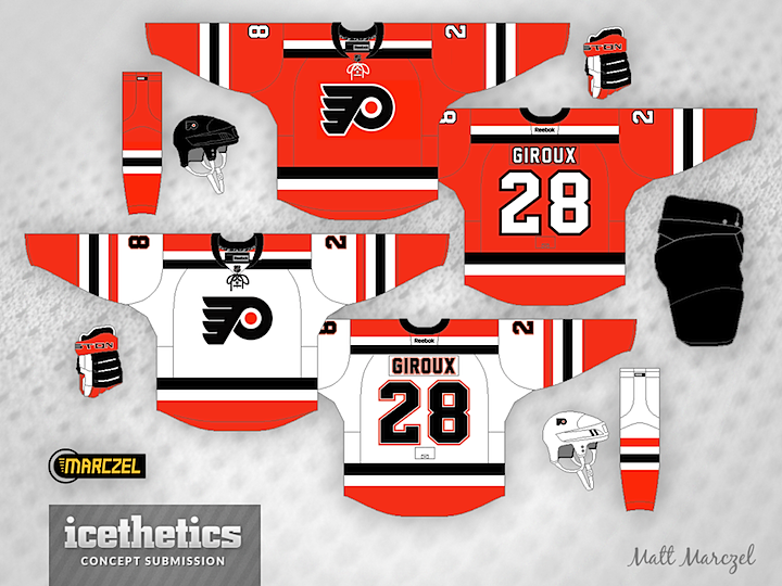
0537: Classic Philly Stripes

I can't quite put my finger on the reason why, but this is really what the Philadelphia Flyers should be wearing. I don't have many quarrels with their existing look, but Matt Marczel brings bold striping and and a shade of orange that combine to create an amazing kit. Really well done.