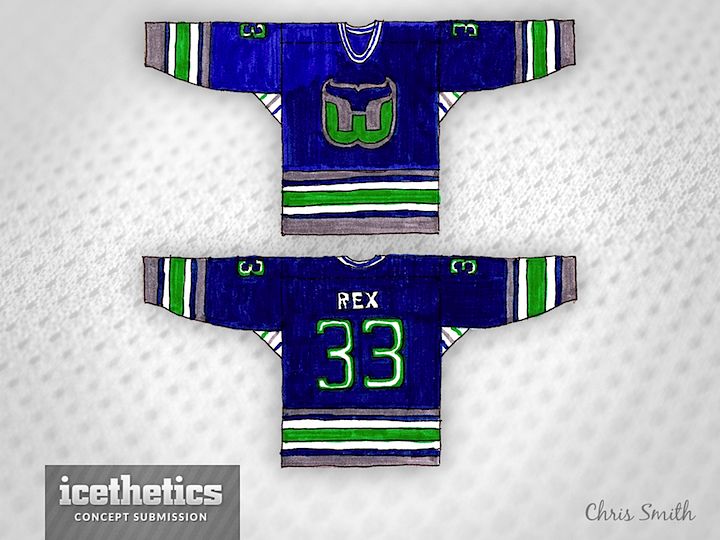
I warned you it might come to this. Given the recent popularity of the handmade concepts from Morgo Uxbridge, I thought I'd dig up a little something from my childhood. If you want to know how far back my love of hockey jerseys goes — well, here you go.
The drawing wasn't dated, but I'd say I was in the neighborhood of 11 or 12 when it was made. Not that I was an artist by any stretch. And please don't ask me why it says "REX" on the back. I couldn't possibly tell you what was in my head 20 years ago. But at least you can see I was always a fan of the Whalers' superb logo and uniforms.
And about those "victory stripes" under the arms... it's not an homage. Growing up a Lightning fan and seeing them on our jerseys, I just assumed it to be a standard feature on all hockey sweaters. Didn't realize until years later that it was something special only Tampa did.
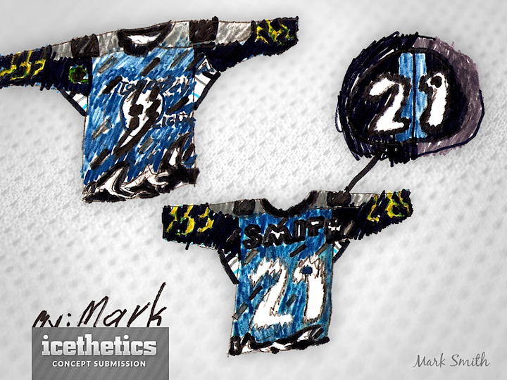
Speaking of the Lightning, my brother Mark is six years younger than me and, I believe, drew this around the same time as the one I made above. That would put him at about 5 or 6 years old so you can understand the crudeness. He's since become a very talented artist in his own right. But my brothers and I were fascinated with the Bolts' storm jersey when it was released in 1996. We thought it was way cool compared to the boring stripes of the primary jerseys. But what did we know?
What do you guys think? There's more where this came from. I just unearthed my take on the NYI fisherman jersey as well as a mash-up Mark did of the Hurricanes and Predators in 1998, when they were there new teams on the block.
By the way, feel free to say you hate this and I won't post anything more. I just thought it was funny digging up this old stuff. And hey, if you have anything like this to share, please send it along.