0667: Sweden in Sochi

If you've been unhappy with the new national team jerseys come from Nike, you've got to be excited to see what Eric Westhaver has been doing the last few weeks. His Olympic jersey concepts have been pretty spectacular if you ask me, and he continues to hit the mark with Sweden this week.

0666: Devilish History

If we couldn't get #666 to fall on a Freak Out Friday, I'd say an Outdoor Saturday is the next best thing. I'm pretty sure New Jersey won't surprise us with a new jersey for their 2014 Stadium Series game, but what about beyond? Daniel Stavina was inspired by an old hockey jersey on display at the Prudential Center.

This sweater was worn by an Eastern Hockey League team named the Jersey Devils between 1964 and 1973. Apart from the name, the team has no connection to the NHL franchise, but Daniel designed a jersey for use by the NHL's Devils in another Stadium Series or Winter Classic game by adapting the logo and incorporating the green used when the team arrived in New Jersey in 1982.

What do you think?

0665: Flyer Freak Out

We were so close to concept number 666 landing on a Freak Out Friday the 13th! How disappointing. But that's not going to stop me from trying to give you a little scare. This Philadelphia Flyers jersey was designed by Jake Wells but it's absolutely something we could imagine Nike trying, isn't it? Let's hope they never get the chance!

0664: The Pens by Hand

Everybody's favorite old-school artist is back. Morgo Uxbridge returns to tackle the Pittsburgh Penguins with one of his hand-drawn concepts. I know a lot of Pens fans don't look back on this era with much happiness, but it's still a great-looking logo and these jersey designs are sharp.

0663: Tampa Bay Fauxback

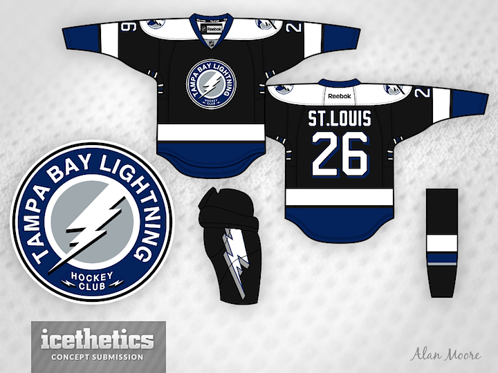
Alan Moore has merged the Lightning's current look with its original one. Here's his explanation:

Here's a Lightning alternate concept. It's more of a logo concept than a jersey concept, as the jersey is almost identical to their pre-Edge look. I do like their current home and away, but I think the alternate is out of place now.

I modified their existing secondary logo to look more like their original primary mark, adding a silver background and using the shape of the original bolt but with a more modest drop shadow. Sort of a fauxback idea.

I also applied a blue drop shadow to their existing number font. It's intended to be a throwback to their first season look.