0688: Slovakia & Austria in Sochi

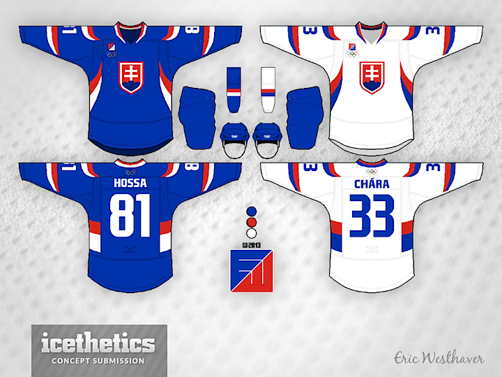
On this International Sunday we're treated to a two-fer from Eric Westhaver. First, take a look at his redesigned uniforms for Slovakia. Not much can compare to having the words of your national anthem built into the striping pattern, but this is a pretty sharp look too. Eric's comments follow.

No real significance for the Slovaks. I just figured with their bright colors that these kind of large, sweeping stripes would look pretty damn good.

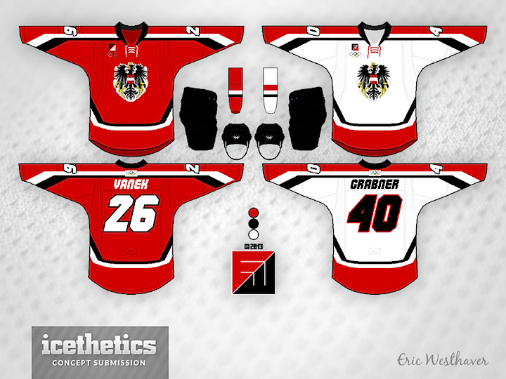
Eric also brings us his look for Austria. Another solid one. He writes:

Since the Austrians haven't been in the big tourney for 12 years, I figured some new ideas like the angular stripes and italicized font could work.

Check back next Sunday as Finland gets the Westhaver treatment.

0687: D.C. in Winter

The Washington Capitals will host the next NHL Winter Classic in 2015. But what should they wear when they do? Brian Brideau imagines a uniform inspired by the flag of the District of Columbia.

0686: Freak Out '80s Style

Tampa/Vancouver Week wraps up with a Vancity freak out. Bryan Dyck is merging the Canucks' 1980s color palette with their new Johnny Canuck logo. It's pretty clever but I'm not sure I'd want to see it anywhere outside the Concepts page. (Note the yellow socks!)

See a pattern forming here? Todd Varga added the 1980s palette to the stick-in-rink logo. Again, makes for a neat jersey set, but probably not one we'd want to see on the ice anytime soon.

Newcomer Dallas Kirkpatrick is just scaring me now.

And finally, I was saving this one. Remember yesterday's Johnny Canuck set from John Elbertson? He included this yellow one as well but it fit so much better with today's theme.

0685: Johnny Canuck

As Tampa/Vancouver Week winds down, we continue to explore the Canucks' ongoing identity crisis. On Tuesday, the stick-in-the-rink logo was featured. Today, the star is Johnny Canuck. John Elbertson created this set with a home, road and retro-inspired alternate jersey.


Now how about in green?

Ben Macdonald's contribution would actually fit in quite nicely with John's home and road set. And that Johnny Canuck logo really stands out well on green.

Devin Durocher also went with green but I thought his overall feel was different enough from Ben's to warrant posting them together. Do you have a preference? Would you like to see Johnny Canuck on the chest of a Vancouver player someday?

By the way, is there a reason why everyone who designed a Johnny Canuck jersey put a goalie's name and number on the back? Weird, right?

0684: New Year, New Bolts

Happy New Year! Hey, believe it or not there's more than one NHL game on the schedule today. The Lightning are in Vancouver today — and so am I. And that's the reason for Tampa/Vancouver Week. Brandon Holmes gets 2014 started with a sharp two-tone blue set for the Bolts.

And as a bonus, here's a rare one. A completely original uniform and logo design from Devin Durocher. I like his simplified logo. Not sure about the third jersey. Thoughts?

We'll go back to the Canucks to finish out the week!