8-Bit Sochi

Who doesn't love some classic 8-bit hockey jersey art? Al McCready is always there for us in that regard. With this submission, he tackles all 30 Olympic hockey sweaters used a couple months in Sochi.

By the way, our Olympic Jersey Tournament is down to the final four so get over there and vote!

Southern California Remix

This could be a neat Winter Classic jersey for the Kings someday. Brian Brideau has mixed a few eras to come up with this look. What do you think?

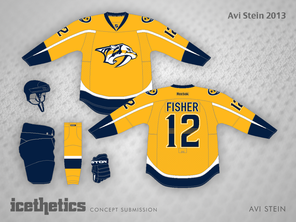
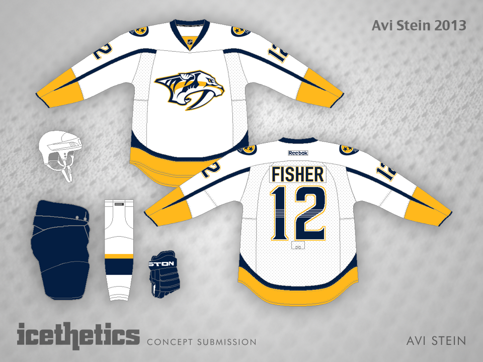
Don't Freak Out, Nashville

As a follow-up to Tuesday's April Fools' Day post, what if another team tried to use the Sabres' third jersey? It could certainly work for the Predators. You'd just have to think of the sleeve swords as fangs. Avi Stein could do it. What do you think? Is this template any less freaky when applied to another team? Or more?

Remaking a Capital Classic

Ross Taylor is a talented artist and long time friend of Icethetics, so I've done him a disservice by waiting so long to post a concept he submitted way back in 2011. But better late than never, right? It's well past time for the Ottawa Senators to update their uniforms, but I'm not in favor of their heritage jerseys as many others are. Some classics should be left for special occasions.

However, this rarely used alternate logo really needs to see time on the front of a jersey to remind us how good this team looked when it was introduced back in the '90s. Am I alone here?

South Florida Style

I always love seeing concepts artists step outside the box. Miles Miller, in his first Icethetics post, gave the Florida Panthers a unique treatment by quite literally coloring outside the lines. And for all its weirdness, when you look at it a while, it has the feel of a classic hockey sweater. I was really impressed with this one.

Though for future reference, I'm sure a handful of Panther fans (ick) will make it known that the Cats should be red, not blue. Still a sharp design, regardless.