0683: The Stick in the Rink

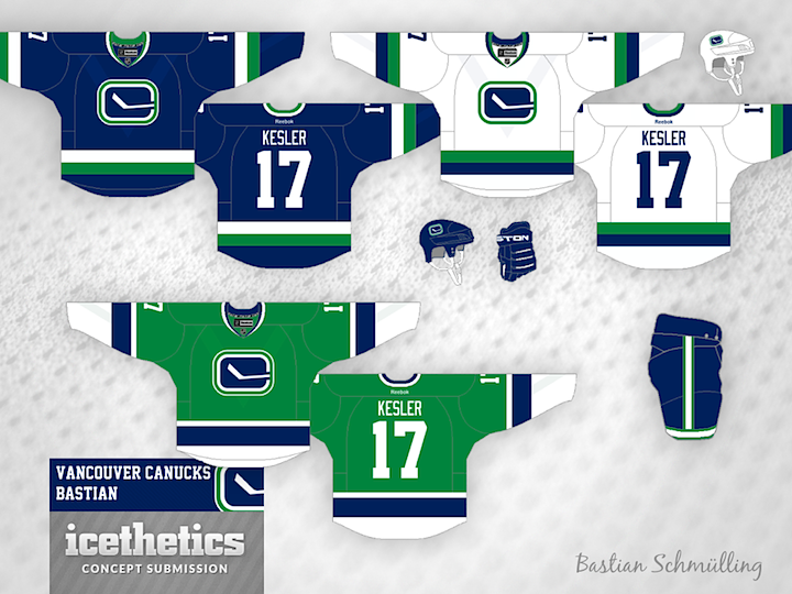
We're riding out 2013 with the Canucks today as part of Tampa/Vancouver Week. The Lightning are in Vancouver tomorrow — one of only two games taking place in the NHL. (Any guesses what the other one is?) The theme today, as you may have guessed, is the Canuck's retro stick-in-the-rink logo. It's featured on every design today, including this one from Bastian Schmülling. I particularly like the green option.

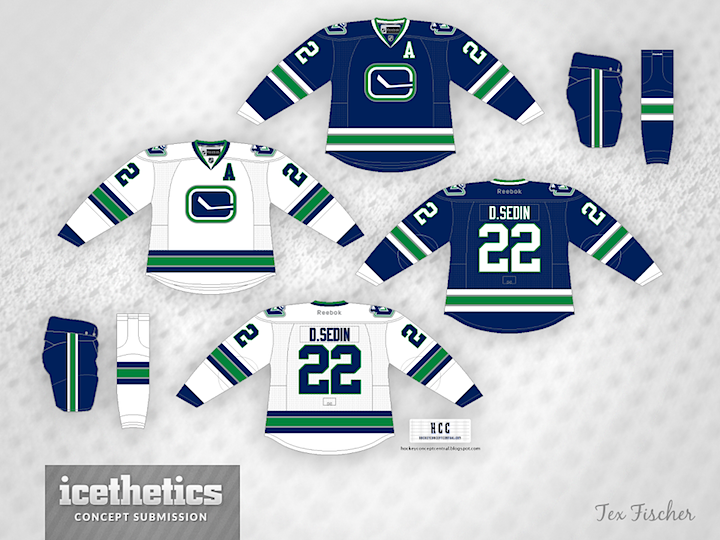
Tex Fischer brings us a more subdued set. But I think that crest can make any sweater stand out.

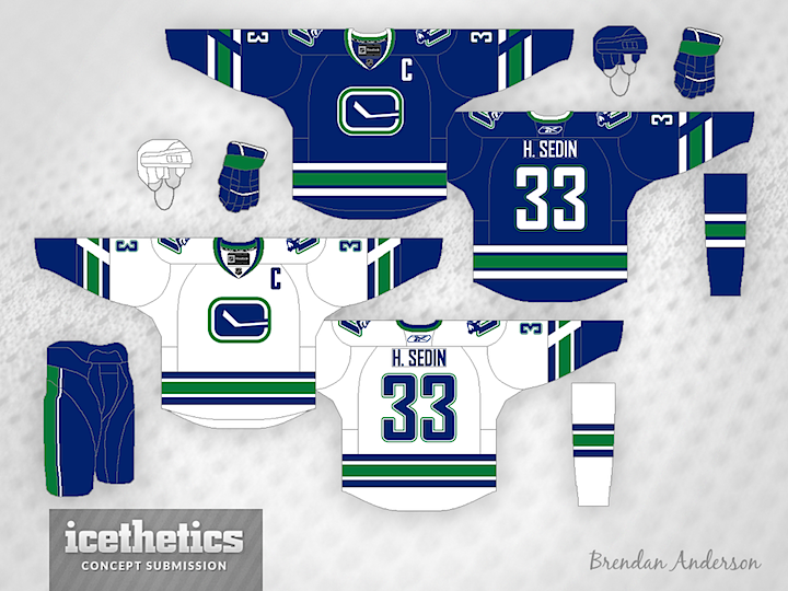
Finally, Brendan Anderson envisions a minor tweak to the Canucks' existing third before making a home and road set out of it. All three designs have unique aspects and prove that this could be a great, timeless look for Vancouver.

0645: Mighty Orange

Anaheim Ducks PR man Adam Brady recently confirmed the team will be wearing an orange jersey for their Stadium Series appearance in January. So I've gathered up the top five orange Ducks concepts recently submitted to Icethetics. First up is Brian Brideau. Recognize the inspiration for his design?

Brady Sufat's design has a bit more black, but with the "Mighty" touches, it makes for a sharp look. Though I wouldn't count on seeing that Nike swoosh anywhere near an NHL game anytime soon.

Caleb Fuller has a more retro feel to his orange number with the shoulder patch from the Ducks' third jersey placed front and center.

Brendan Anderson has not one but two ideas to share. Both are inspired by jerseys from the eggplant and jade days — only in black and orange. Personally, I prefer the top one.

And finally, Ryan Haslett gives us this one without any waist stripes. Got any favorites in the bunch? If the Ducks had to go with one of these six jerseys, which should it be?

0579: Keep Dreaming, Buffalo

Ever need something pleasant to look at? Even though you know it's just fantasy? Brendan Anderson would have the Buffalo Sabres wear a jersey like this and I think he could rally a lot of people behind that idea. Too bad it'll never happen.

0555: The White Winged P

Anyone interested in seeing the Flyers bring back black for alternate jersey purposes? Brendan Anderson has a neat idea for one. And it involves a white version of that classic logo. Yay or nay?

0472: Unveiling Day, Part 1

This day is a little unprecedented. Two NHL teams are unveiling new uniforms today. So in order to get some last-minute concepts out before the official reveals, I'm actually doing not one but two separate concept posts. Hurricanes are up first right now with the unveiling set for 12pm ET, then the Stars later this afternoon ahead of their unveiling, which will be around 6pm CT.

Up top, frequent contributor and GM of the IceHL's North Carolina Nighthawks (imagine that) Brendan Anderson takes a stab with his prediction for Carolina's new look. It's based on the bits and pieces we've seen over the last 12 days from the Canes' Instagram teaser photos.

Next another regular, Brian Brideau, tries his hand. I think ultimately, we might see a mix of these two designs. Brian's paid attention to the template change, which shows the shoulder seam beneath the nameplate instead of above it. But he doesn't seem to have the dual striping pattern or the new font.

All signs point to the Hurricanes opting for non-matching home and road jerseys with this new set. That's what Adam Ravenhill had in mind when he made this concept. Not sure where the Jets-style striping comes from on the red jersey, but it's not a bad look. What do you think of the idea of non-matching jerseys?

Remember to come back this afternoon for one last set of Stars concepts ahead of tonight's unveiling.