0586: By Brian Brideau

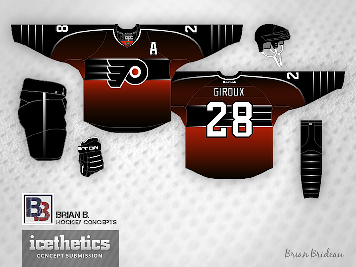
In this week of featuring some of Icethetics' most prolific concept designers, we come to an artists who's been submitting work to the site for as long as I can remember. And he's always thinking outside the box. First up, he's got a Flyers concept inspired by the first third jersey of their in-state rival, the Penguins.

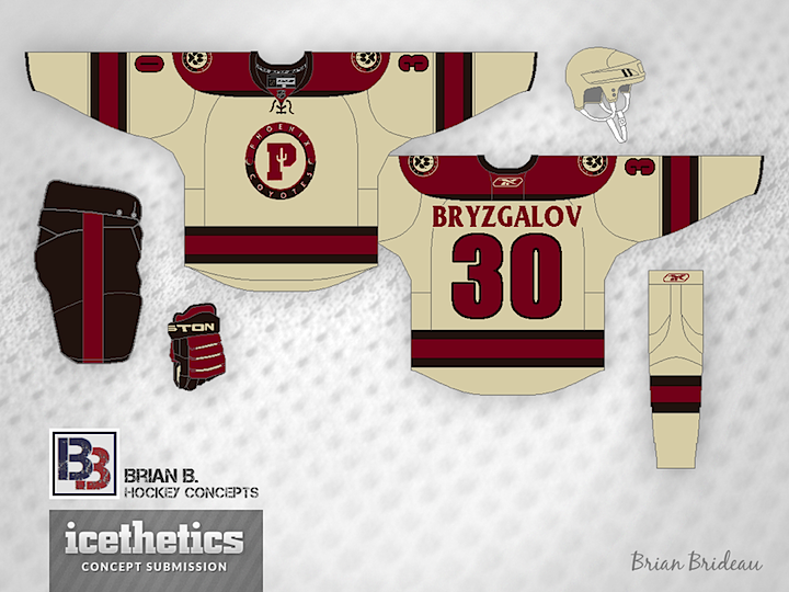
After the Coyotes unveiled their third jersey in 2008, they posted some of the unused logo designs that were considered. Brian borrows one of those logos for his Phoenix concept.

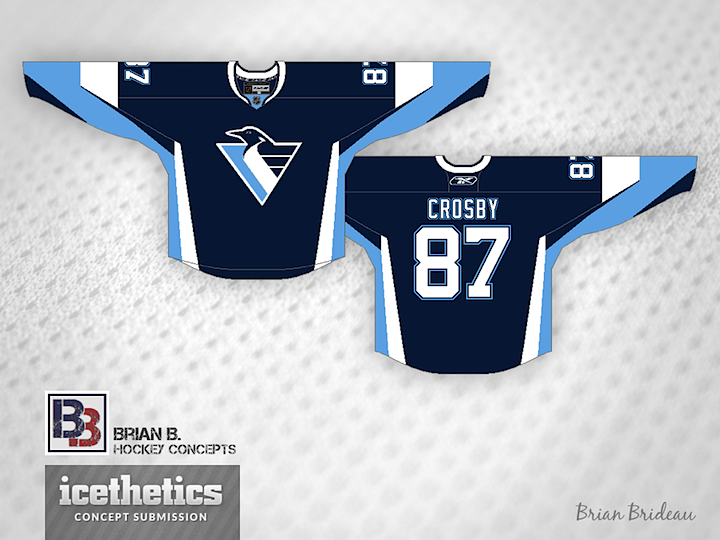
Finally, it's not the first time we've seen the Penguins in blue, and it almost surely won't be the last. But with the '90s logo? That's a bit out of place. But it makes for a very cool (pun!) sweater design.

0585: By Dylan Alexander

Dylan Alexander is a frequent contributor with a distinct style and he's the next to be featured in this special week of concept posts. First we get a look at some third jersey options for the Blackhawks.

Next, we have Dylan's attempt at fixing the Hurricanes' new uniforms. He proves it's really a simple task. Put the storm flags back!

As a bonus, here's a college concept for the University of North Carolina. Dylan's done an awesome job giving the Tarheels a makeover. Looking forward to seeing what he tackles next.

0584: By Nick Burton

Continuing our week of featuring prolific artists is Nick Burton. Last week he wrapped up his WNHL series. Today we get a glimpse at some NHL jerseys, including this very green Canucks set. Not for nothing, but I would buy that in a heartbeat.

He's got a sharp fauxback for the Kings as well. I could see a grey jersey working very well if it was executed this way.

Lastly, he's putting the Bolts back in black but with the new logos. I'm not sure it needs all the stripes, but I'm looking forward to an eventual black third jersey in Tampa.

0583: By Bastian Schmülling

I'm launching a brand new theme week today! We have so many artists who are so prolific that I thought they deserved their own week right before hockey season starts. So each day we'll feature a trio of concepts from a specific designer, starting here with Bastian Schmülling. His Wild jerseys may look a little dingy, but they also look like instant classics.

The Flames could use a uniform simplification and Bastian has the perfect answer and the best use of black I've ever seen on a Flames concept.

Finally, the Ducks need a way to distinguish their palette from the Flyers and that gold just isn't cutting it. So how about green? Not the first time we've seen green and orange combined in an Anaheim concept, but certainly among the better examples.

Bastian still has a ton of work that's gone unpublished to date, but I'm working to rectify that. He's got a great eye for uniform design and I, for one, am always excited to see what new ideas he's come up with.

0582: Seattle Ravens

Here's a cool one for Seattle Sunday. Brandon Manzione introduces the Seattle Ravens. The only problem I could foresee is when this team plays the Philadelphia Flyers. Lot of similarity in logo style there, but otherwise a really sharp concept.