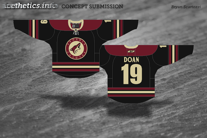
Since my return to Icethetics, it seems like I've brought back every feature but one. Arguably, your favorite one! I get emails all the time asking where the concept art went. Well it went to Twitter, but many of you have said that you want it back on the blog.
It's time to revitalize this stagnant Concepts section here at Icethetics. My goal is to get at least one new post a week on this page and ramp it up as more artwork comes in. Let's start with one of our most prolific contributors, Mike Ivall.
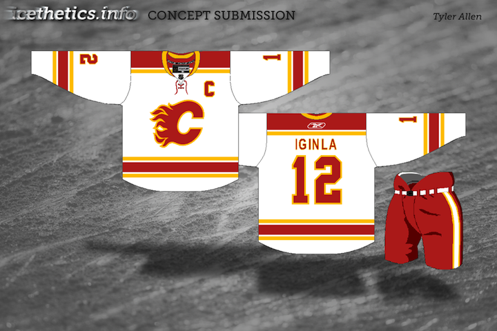
 Calgary Flames concept by Ivall
It's a kind of merging of the Flames' old third jersey logo and the classic Flaming C. The jersey designs are very interesting as well, almost evoking a sense of fire and flames — though I don't want to make too much of a case in favor of the Edge design.
Wild fans, this one's for you. Untvar has come up with several different ideas for the forthcoming alternate sweater. Take a look and tell us what you think. Each one is labeled.
 Minnesota Wild alternate concepts by Untvar
Personally I prefer the shade of green in A but I'm also partial to the striping on E. Not caring much for the North Stars-inspired designs but to each his own.
That's what I've got for now. I'm going to comb through my inbox and try to find some artwork I haven't yet posted — including all those Ducks concepts I asked for a few weeks ago! In addition, the Ice Bulls will be announcing their final decision on their new logo tomorrow so I'll be posting all of the submissions I received that didn't make the cut.
It'll all be right here in the newly reinvigorated Concepts section!
Update on 2009-08-18 15:46 by Chris
Bonus concept!
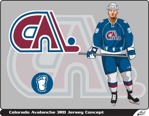 Colorado Avalanche concept by Ivall
Mike Ivall just sent in this concept he made for the Colorado Avalanche — with a very Nordique twist.
By the way, if you've got concept art you'd like to see posted. Email it to me at icethetics@gmail.com. Be sure to include your name or the way you'd like to be credited.
Update on 2009-08-20 17:12 by Chris
Looks like after all the comments, Mike took another stab at a Colorado Avalanche alternate jersey.
 Colorado Avalanche concept by Mike Ivall