 It's hard to believe 2010 is a mere four days away. That means the third annual Winter Classic is coming up at the end of the week.
And on the eve of the big event, a bunch of eager artists have started thinking about the next one. Or should I make that plural? A couple weeks ago, NHL commissioner Gary Bettman said he'd like to see a second outdoor game on New Year's Day 2011 — this one in Canada.
No decisions have been made at this point and any discussion on the topic is pure speculation. But that's what the Icethetics Concepts page is for. So as we prepare for the Philadelphia Flyers to face the Boston Bruins at Fenway Park, let's think about what we might like to see in 2011.
Rumors suggest Yankee Stadium will play host to at least one of the 2011 outdoor games. That puts the Rangers at home to face who? Islanders? Maple Leafs? Capitals? And regarding the Canada game, Bettman mentioned Calgary by name. Would the Flames face their province rivals, the Oilers? Perhaps the Canucks or even Avalanche?
Let's see what some talented people have come up with as suggestions for 2011.
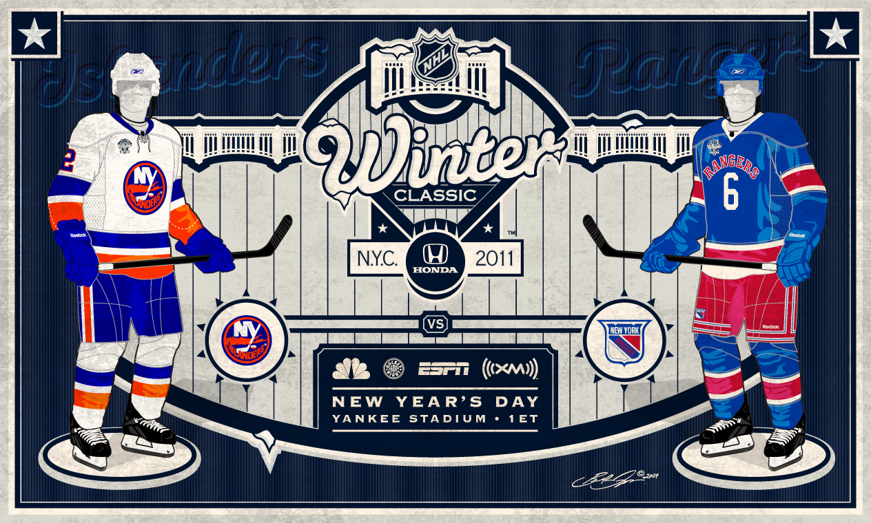
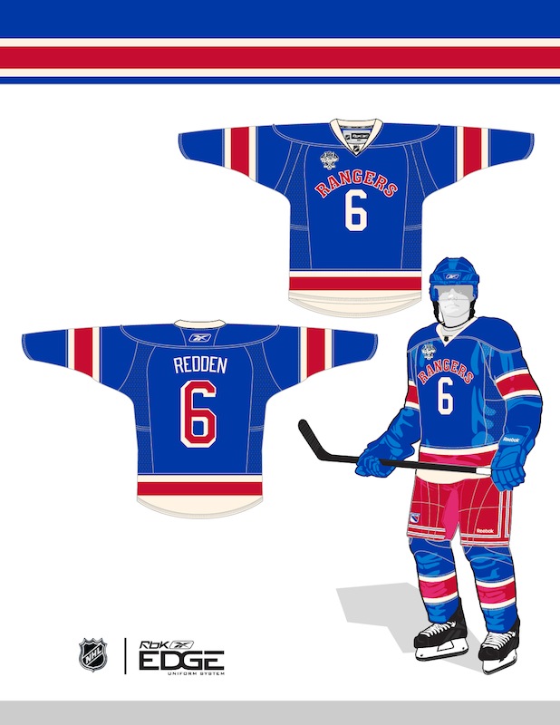
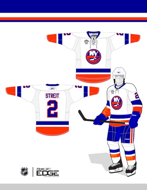
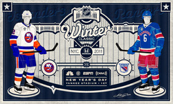 Brendan Droppo Brendan Droppo

 |
Yankee Stadium
Rangers vs Islanders
This may be the most well-designed Winter Classic 2011 concept I've received. Brendan Droppo is sticking with the New York City rumors and pairing the Rangers and Islanders at Yankee Stadium. Probably a safe bet.
He's got a great logo that evokes the locale (as the past logos have done) and a pair of classic sweaters. Though I'm not sure you can call anything but their current jersey a classic. But then I thought that about the Red Wings too. And theirs worked out just fine last year.
This is an awesome concept and I'm completely on board with it only if western Canada also gets their own Winter Classic. If they don't, I say out with the Isles. Canada deserves to get back into the outdoor games. Pit the Rangers against the Maple Leafs.
If there is a Canadian game, I'd vote to leave it the way it is. Not sure the Rangers have another rival as big as the Isles. Plus we need to share the wealth. Everyone should get a shot at a Winter Classic game. |
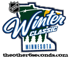 Cole Jones Cole Jones
 |
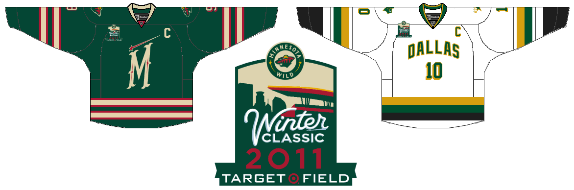
Target Field
Wild vs Stars
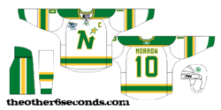
Cole Jones of The Other 6 Seconds hockey blog emailed in to tell me about his idea. You can read the full proposal on his blog, but here are the bullet points.
While I'm over here trying to get a Canadian team back into their own game, Cole, a Stars fan, is attempting to get a southern U.S. team into the mix — his own. He'd like to pit the Dallas Stars against the Minnesota Wild at Target Field, which is currently under construction in Minneapolis. It will serve as the home of the Minnesota Twins beginning in April 2010 — more than enough time to prepare it for a hockey match.
It would be a huge day for Minnesota hockey fans, that's for sure. To see their current team after 10 years on the ice, facing a blast from the past in the form of North Stars jerseys would probably send some people into a tailspin.
The only problem I see is this: Aside from Minnesotans, who cares? Part of the idea behind the Winter Classic is to appeal to new fans. To put the game in front of people who normally wouldn't watch. The past few seasons the NHL has been going for teams in big markets or with long histories. Yes, Dallas and Minneapolis are two huge markets, but the point is to go beyond them. A Rangers-Isles game would certainly do the trick. Everybody knows the Rangers, even if their not hockey fans.
But this idea of getting the Stars back to Minnesota for a big event is a pretty popular one in hockey circles... |
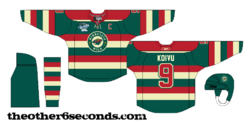
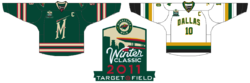 Ryan Haslett Ryan Haslett |
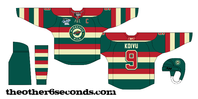
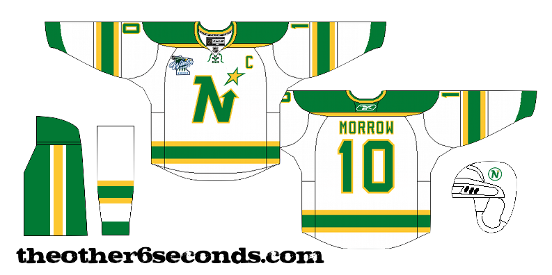
Target Field
Wild vs Stars
Another regular Icethetics artist, Ryan Haslett, independently came up with the same idea. Wild and Stars at Target Field. But Ryan's idea for an event logo and game jerseys is a little different.
They definitely feel like classic hockey, but both designs borrow from current sweaters. The "M" on the Wild jersey comes from the new green third while the Stars sweater is based off their current third, but infused with a little more gold.
Either Cole's or Ryan's designs could work well if, indeed, one of the 2011 Winter Classics were to take place in Minnesota. |
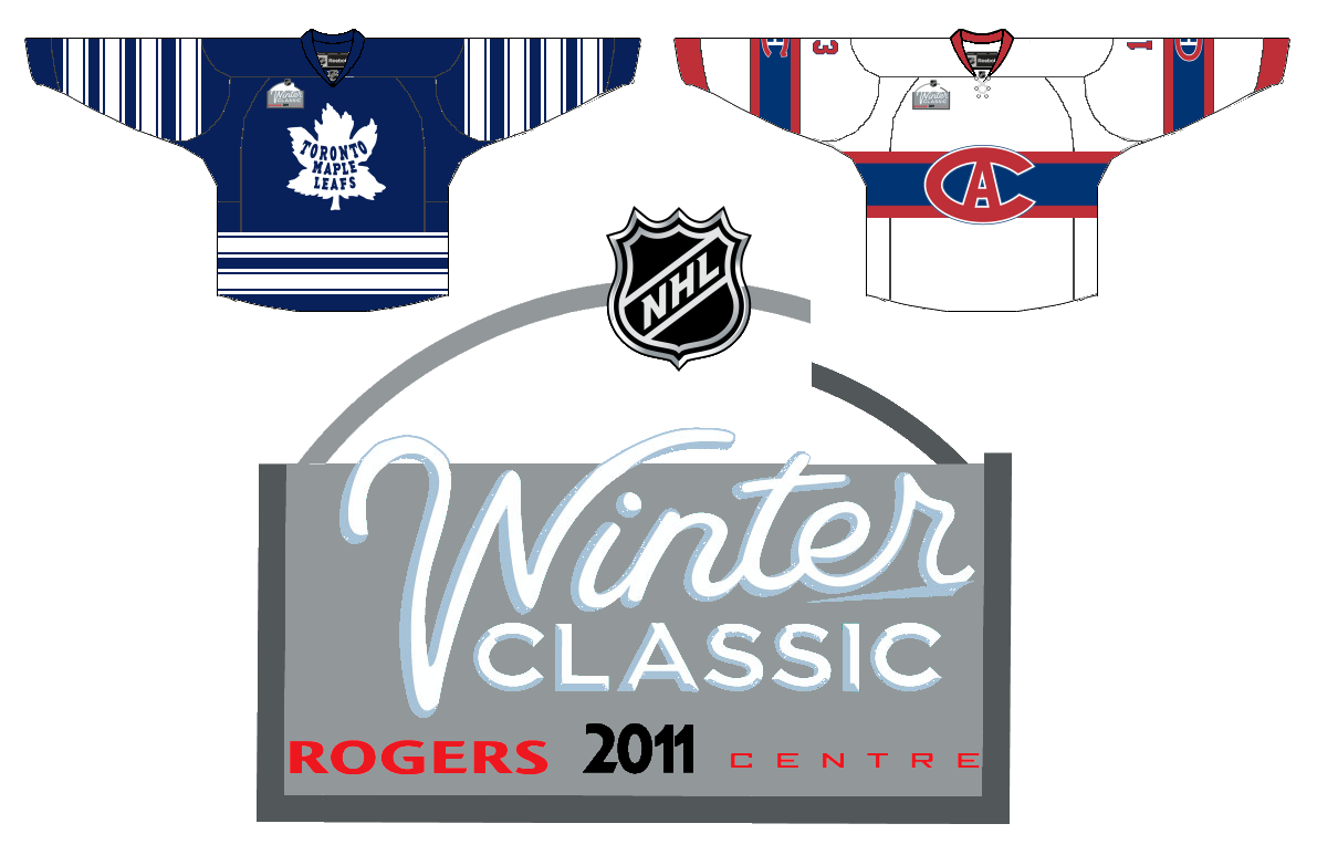
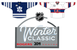 Ryan Haslett Ryan Haslett |
Rogers Centre
Maple Leafs vs Canadiens
Speaking of Canada, Ryan did have a second Canadian option — going with one of the oldest rivalries in professional sports. He's got the Habs and Leafs at Rogers Centre in Toronto. Formerly called the SkyDome, the stadium plays home to the Toronto Blue Jays and Toronto Argonauts.
As expected, he's got the teams in vintage sweaters, and surprisingly enough, one that the Canadiens have NOT worn in the past two seasons. The logo is a little weak but it plays off the simplicity of the Rogers Centre logo.
Now to be fair, the Canadiens just took part in an outdoor game in 2003. Maybe they should sit on the bench a little while longer, you know? If you're going to put the game in Toronto, maybe have the Leafs face their province rival Ottawa Senators. As I said, spread the wealth. |
One thing I've noticed with these concepts is they're all set at baseball stadiums. Let's not forget the first two NHL outdoor games took place in football stadiums and were quite successful.
In wrapping things up, the one concept I don't have to share that I would really like to see is Calgary. I'm not familiar enough with the city to know where it should be played, but the Flames should host it and their opponent should NOT be the Oilers. (The Oilers faced the Habs in 2003 in Edmonton.) I think it comes down to the Maple Leafs, who play in a huge market and have a long history, or the Canucks, who are geographically closer and a more common foe during the regular season. But it's not up to me.
So what are your thoughts on the 2011 Winter Classic(s)? If you have have concept art to share, I'd be happy to add it to this post. If you just have another thought about a good match-up, drop a line in the comments.
By the way, happy new year!