Concept Collection 19

No theme for this collection. Just a nice, varied assortment. But of course we have to start with the Senators' forthcoming Heritage Jersey — which we got a sneak peek of this week.

The way the jersey is folded in the photo the Sens provided leaves the design open to interpretation. It's not a bad attempt by Avi, but I think he may have strayed from the target. The shield he's put on the chest appears to be on the shoulder instead. And if it is in fact the "O" on the front, the photo does show that it doesn't have the double-stroke seen here. Otherwise, I'd bet it's pretty close. Anyone else want to take a crack at it?

Brendan's design is likely pretty close to the road uniform we'll see from the Kings next season. I'd bet on a black collar and maybe more black on the sleeves to add contrast. Now for the fun stuff...

So what do you think of that? I'm particularly fond of Colin's Canucks design!

Concept Collection 12

New set of concept art for you this evening.

Keep them coming! Send in your work by email to have it included in a future post.

Concept Collection 2

Continuing with the new concept art format. Seems to be getting good reviews. Today brings a handful of great designs by some Icethetics regulars.

If you recognize the logo in Ryan's Capitals concept, you're not alone. It's not an original design. In fact, it's a logo commissioned by the Capitals years ago but never used. It was included in a post a couple years ago about lost logos registered with the patent office but later abandoned.

There's Something About Retro

They say fashion is cyclical. Trends come and go and come around again. In the NHL, we seem to be re-entering a retro phase. Throwback jerseys have always been popular with fans, but it seems only in the last few years have teams started to take advantage of that. Classic designs that bring history back to life have started making their way back into the mainstream, in the form of alternate jerseys and special events such as the Winter Classic.

So "retro" is the theme of today's post. Let's see what our artists have come up with.


Jared LeBlanc

I'm a big fan of Jared's Winter Classic concept uniforms, especially what he's done for the Penguins. It's been suggested that the Pens might join the Bruins in borrowing elements from multiple past jerseys for a unique new look that still feels vintage.

Jared's also submitted some ideas for the Heritage Classic, details of which will be announced later today. Regarding the design, he writes, "The Canadians jersey is really the only vintage jersey left that they haven't worn already. ... For the Flames, I took a look at the Cowboys jerseys, which looked like a pretty solid design. I considered doing a carbon copy but I thought they might still want the Flames logo on it."

Both sets get a big thumbs up from me!

Connor Hanley

Another set of retros based in real life, come by way of Connor. Over the summer, it was announced that the Canucks would don a throwback jersey to celebrate their 40th anniversary. While this won't be the one, the Kings' vintage threads seen here are probably not far from what they'll be wearing on a few occasions this season.

The Kings did give their first round draft pick a gold jersey from the 1960s after all. We're still waiting on an official announcement from the team, however.

Connor Hanley

Connor also sent in this set which calls back to the 1920s and the NHL clubs that arrived long before the Penguins and Flyers — that's the Pirates and Quakers. Of course the design is a little dated now with Gagne's name on the back. (He plays for my team now!)

I suppose it might be a treat for centenarian hockey fans in Pennsylvania to see those two sweaters hit the ice again. But they shouldn't hold their breaths.

Jack Martineau

Canadian fans always like to see their teams don the retro duds. Jack digs back deep into Maple Leafs history with these St. Pats sweaters. The team actually wore that green jersey for a game or two back in the mid-90s. They should do it again!

Ryan Haslett

And while we're on the subject, here's another throwback for the Leafs from Ryan. Just like the St. Pats jersey, this one also saw life in the afterlife when it was dusted off for at least one game in the early '90s. Now that the Leafs seem to be taking an interest once again in looking like the storied hockey team they are, maybe more of these throwbacks are in the cards.

Matt Marczel

And to finish things off, one of our most prolific artists, Matt Marczel, offers up this throwback to the previous iteration of the Ottawa Senators club. He points out that it could be used if the Sens ever play in a Winter/Heritage Classic. Unfortunately, the first problem is legibility. The second is the Canadiens just wore a very similar stripe-y sweater last year.

By the way, I have lots of new concept art ready and waiting. Someone needs to stay on me about keeping this page updated. I'm very forgetful.

Strauss NHL Rebrand VIII

After a slight delay we pick up with Part 8 of the NHL Rebrand series by Elliott Strauss. Today we see big changes out west and sometimes change isn't really necessary — if you're part of the Original Six.

The Kings, Bruins and Canadiens are featured this week. Elliott's descriptions are in bold text.


Elliott Strauss

This is the one concept that gave me the most trouble. I went through about five drafts, with secondary logos that included a lion and an interlocking LA, but all secondaries were eventually scrapped.

I finished with this rendering of a crown and the lack of purple in favor for the Gretzky era colors of black and silver. The striping is very atypical and was inspired by the old alternates from the mid-90s.

Unfortunately I am not happy with the final product here but I'm showing it anyway. I'm thinking about a complete redo, which I will send to Chris if I get around to doing it.

It's certainly not as bad as Elliott is making it out to be. But it does look like it is still in the process of being perfected. Is it better than what the Kings currently have? Maybe not. But with a little more work it could be.

Elliott Strauss

Not many changes here. I made the stripes on the arms go white-yellow-white on the home to match the white outlining on the numbers. Same goes for the shoulders, reversed on the roads. A new thing is yellow socks on the roads as well with stripes tweaked to match the arms.

Not much has changed at all here. Kudos to Elliott for recognizing some teams are perfect already.

Elliott Strauss

Obviously this team's identity is timeless but lets face it, the home and away aren't consistent, which is slightly bothersome to me. I tried making them correspond more, it's a little hard to even explain my thinking here, but hopefully you can see the consistency this design brings. I actually sort of like the blue backdrop stripe for the logo and numbers, which plays off the current homes.

The uniform change is significant and might require some getting used to, but it's certainly not the worst thing we've ever seen. And here again, there are some classic, iconic logos you just can't change.

Just six more teams left to cover in this series. Check back for some very sharp rebrands for the Predators, Canucks and Rangers in the next two weeks.

Sticks and Sunshine

California seems like an odd place for hockey, doesn't it? Though I guess it's no stranger than Florida. But today we visit the Golden State, which also tends to see the sunshine year-round. What do our illustrious concept designers have in store for SoCal?


Matt McElroy

Matt thinks the Kings could be well-served by a permanent transition to the third jersey. Here he's added a white version for our enjoyment.

Me? I'm a fan of the purple. So many readers find black jerseys to be boring. Imagine if they had no other color in them. Well actually, you don't have to. I'm looking at you early '90s Kings.

Ryan Haslett

But wait, Ryan has another idea for a white version of that third. Is this a popular concept? Are we so nostalgic for the Gretzky years that we'd want to abandon one of the best-looking identities in the NHL? The purple works. At least I think so.

Chris Fraterrigo

I've often theorized that one of the things that could save the Ducks' current/dreadful identity is a bit of green. But this is not what I had in mind.

While this designer has the home and road crests right, I worry the overload of green — and an ugly green at that — might not be the best plan. Back to the drawing board.

Freak Out Friday XLIV

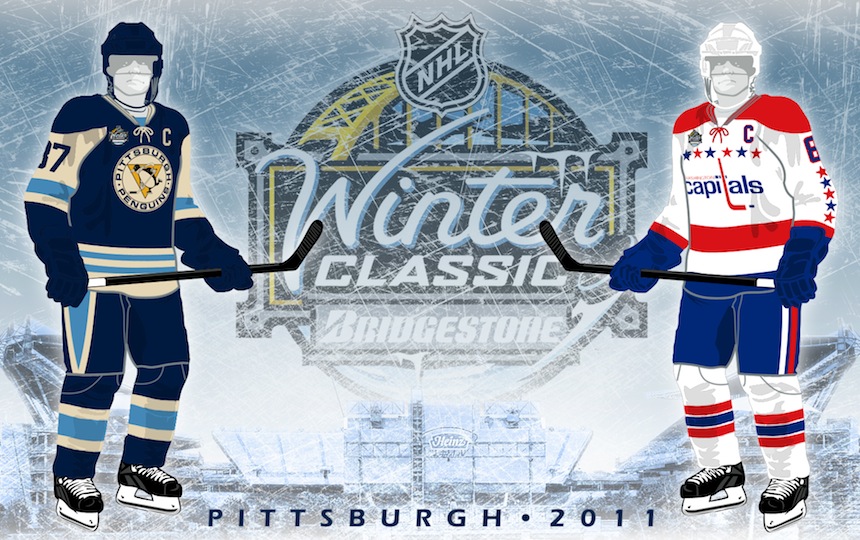
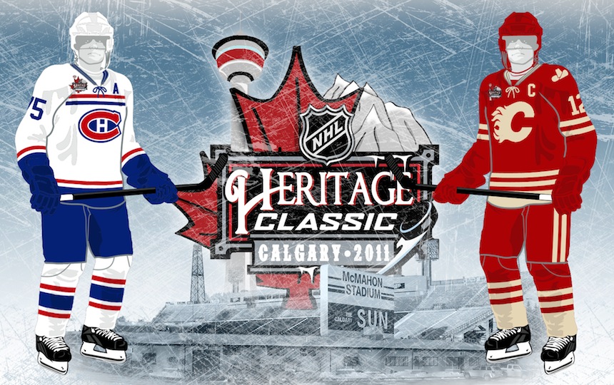
Happy Friday, all! Right now, I'm on an airplane bound for Las Vegas. This is the first of five auto-posts that should keep you guys occupied with new concept art while I'm off getting married. I've scheduled one for every day that I'm away and each one has its own theme.

Today's theme is an Icethetics fan favorite: Freak Out Friday! For new readers, this was a very popular regular feature of the site when I used to get loads of concept art sent in. Sometimes it would miss the mark — meaning we would never want to actually see it on the ice. Here's what I mean...


John B

The last time the Coyotes put a cactus on their jersey, it came to us in the form of one incredibly unpopular green third jersey in the late '90s. Unfortunately, this makes no improvements on that.

The designer is obviously trying to take a bad page out of the Lightning and Senators' books by running the nickname across the front. Yotes works about as well as Bolts and Sens. And while the sand and brick colors are still used today in the Phoenix color scheme, the purple and green are not.

John B

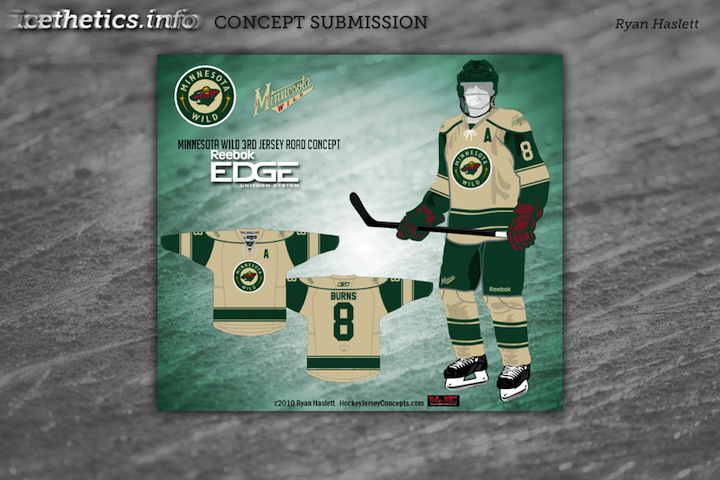
While we're on the subject of colloquialism failures on jerseys, let's add Minny to the list. I think Wild fans would agree there's just no call for it.

I don't want to dismiss this design out of hand, though. The striping is pretty nice, if not based somewhat off of Minnesota's current home and former third jersey. The red and beige color combo is one of the best looks in hockey right now.
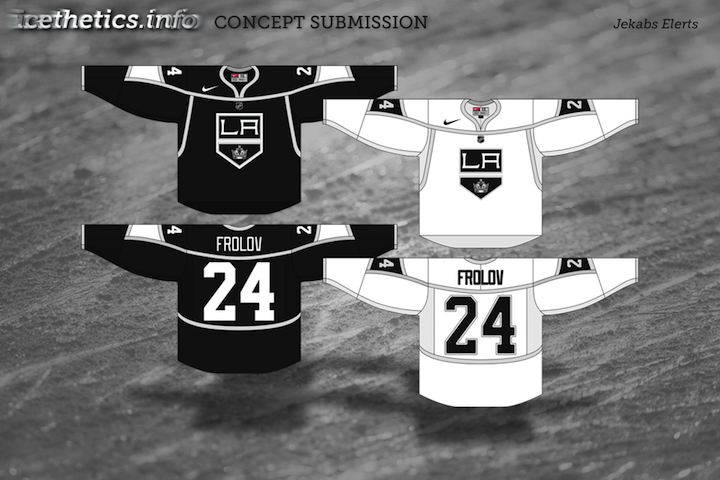
Jules

Some of you may not necessarily be freaked out by this idea of a Kings third jersey, but I sure am. It may not be a popular notion, but I think one of the best uniform overhauls in NHL history was when the Kings switched to silver and black. Then they improved upon it by adding the purple back. But at no point do I want to see them wearing yellow on a regular basis again.

The only way I could excuse it is for a special night with historical significance as a one-off jersey. But now that I've said my peace, I'm curious what the rest of you think of a return to the '60s color scheme. At least at that time the NHL wasn't overrun with only two colors. Variety is good.

Matt McElroy

But hopefully we can all agree that such a variety of color on a single jersey is not a plus. A deep purple sweater with neon yellow sleeves and silver accents is in the dictionary next to "ugly."

That was harsh, but look, even the purple in the logo doesn't match the purple of the jersey itself. Same with the gold. And that numbering style is not a saving grace either.

This jersey design needs to be buried. Deep.

So while I'm enjoying myself in Vegas, I hope this post freaked you out sufficiently. As I mentioned earlier, there will be new concept art posted right here automatically every day until Tuesday.