Collection 40: Golden Jerseys

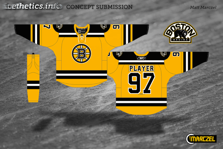
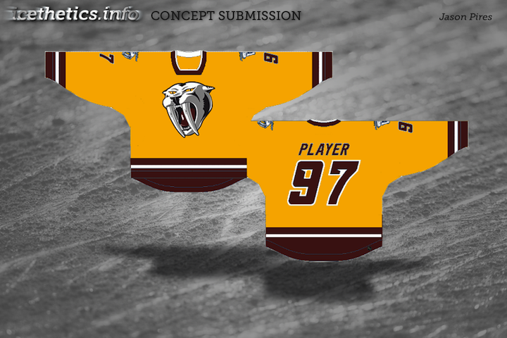
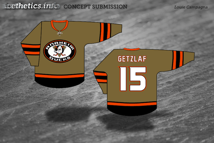
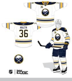
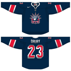
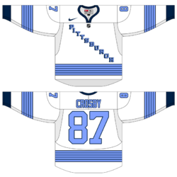
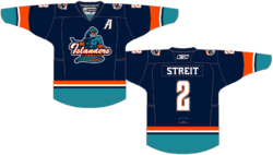
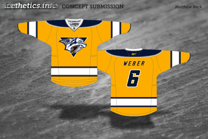
In honor of the Predators' forthcoming gold home jersey — a first in the NHL in decades — here are some yellowish uniforms designed by our Icethetics concept artists.

Still anticipating a Winnipeg Jets post before the team officially unveils their new logo and uniforms, but oddly, not a lot of concepts coming in at this point. You know how to reach me!

Collection 27: So Long, Pittsburgh

I'll be honest. Despite my rabid Tampa Bay Lightning fandom, I wasn't sure we could take the Pens. But as our conference quarterfinal series proved, the Bolts are progressing a lot faster than we might've thought. So in honor of my readers who call themselves Pittsburgh Penguins fans, this one's for you.

This may seem like salt in the wound considering how much most of you just hate love the '90s logo you've nicknamed the "Robo-Penguin" — and you know, that whole era in general. But this is what our artists are coming up with these days.

Again, perhaps traditional Penguins fans would be turned off by most of these designs, but I like the way they each borrows from the past while mixing with the present. That's all for today as my team prepares for the Caps and I contemplate new ways of rubbing it in with concept art. (Kidding!)

Concept Collection 6

No theme today, just another random assortment of concept art here.

Up first, Mike Ivall provides his take on a 2012 Winter Classic possibility. Rumors have suggested the game could be played in Philadelphia or New York next year.

Dallas Stars concept removed at artist's request

By the way, the Lightning concepts just keep streaming in, so I imagine that'll require another post or two in the near future. That's all for now.

Concept Collection 3

The newly reformatted concept art has been quite a popular feature lately. I can't remember the last time these posts have had so much feedback on a consistent basis. So let's keep it rolling. I've got another mish-mash to share this morning.

Paul had a similar idea to Mike Ivall's concept from the last post. Once again, there's just something about that color combination for me. The Cats can keep the light blue as a trim color so long as they keep the red. That's my decree.

Coming up this week: Mike Ivall has sent in enough new artwork fill another post. He's been working hard lately. He's covering the Preds, Isles and Thrashers among others.

Third Jersey Theories

Today's batch of concept art deals with a handful of teams with new sweater designs on the way. While we wait for official unveilings, our concept artists get to work on some predictions of their own.


Alex Valvo

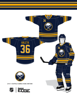
The Sabres will unveil their new third jersey on Sept. 18. All right, technically these aren't third jersey concepts, but the expectation is that the Sabres will promote their current third jersey to home status — while adding a white version for the road. That's the concept Alex is offering up today.

Jekabs Elerts

We keep hoping for the Lady Liberty logo to return when the Rangers unveil their new third jersey in November. That's what Jekabs has for us — though he likes to work with the Nike Swift jersey template, as opposed to the Reebok Edge standard. Regardless, it's a solid sweater design.

Jekabs Elerts

The Penguins will use the 2011 Winter Classic to launch their new third jersey. Jekabs's guess is that they're going with this 1967 replica. But since they're the home team, it probably won't be a white jersey — but you never know. The Sabres wore white when they hosted in 2008.

Ryan Haslett

I'm a big fan of this one. Ryan, a prolific concept artist, has put a unique spin the much-maligned Islanders jersey from the mid-90s. Not a bad treatment if you ask me. Perhaps if the Isles had done something a little less radical and a little more like this, fans wouldn't have rioted so much. I like that font, by the way!

Connor Hanley

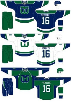
The Whaler talk these days has been intense. More on that in an upcoming blog post. In the meantime, Connor joins Howard Baldwin in hoping for the NHL's return to Hartford. Such a great logo. And solid uniforms all around.

Jack Martineau

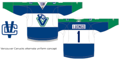
And finally, while the Canucks aren't actually planning a new third jersey — that we know of — I decided to toss Jacks' concept into this post as a bonus. The logo used on the jersey just won the NHL secondary logo tournament here on Icethetics.

As always, feel free to email in concepts. I'm working on adding a bunch more to the Facebook page this weekend.

There's Something About Retro

They say fashion is cyclical. Trends come and go and come around again. In the NHL, we seem to be re-entering a retro phase. Throwback jerseys have always been popular with fans, but it seems only in the last few years have teams started to take advantage of that. Classic designs that bring history back to life have started making their way back into the mainstream, in the form of alternate jerseys and special events such as the Winter Classic.

So "retro" is the theme of today's post. Let's see what our artists have come up with.


Jared LeBlanc

I'm a big fan of Jared's Winter Classic concept uniforms, especially what he's done for the Penguins. It's been suggested that the Pens might join the Bruins in borrowing elements from multiple past jerseys for a unique new look that still feels vintage.

Jared's also submitted some ideas for the Heritage Classic, details of which will be announced later today. Regarding the design, he writes, "The Canadians jersey is really the only vintage jersey left that they haven't worn already. ... For the Flames, I took a look at the Cowboys jerseys, which looked like a pretty solid design. I considered doing a carbon copy but I thought they might still want the Flames logo on it."

Both sets get a big thumbs up from me!

Connor Hanley

Another set of retros based in real life, come by way of Connor. Over the summer, it was announced that the Canucks would don a throwback jersey to celebrate their 40th anniversary. While this won't be the one, the Kings' vintage threads seen here are probably not far from what they'll be wearing on a few occasions this season.

The Kings did give their first round draft pick a gold jersey from the 1960s after all. We're still waiting on an official announcement from the team, however.

Connor Hanley

Connor also sent in this set which calls back to the 1920s and the NHL clubs that arrived long before the Penguins and Flyers — that's the Pirates and Quakers. Of course the design is a little dated now with Gagne's name on the back. (He plays for my team now!)

I suppose it might be a treat for centenarian hockey fans in Pennsylvania to see those two sweaters hit the ice again. But they shouldn't hold their breaths.

Jack Martineau

Canadian fans always like to see their teams don the retro duds. Jack digs back deep into Maple Leafs history with these St. Pats sweaters. The team actually wore that green jersey for a game or two back in the mid-90s. They should do it again!

Ryan Haslett

And while we're on the subject, here's another throwback for the Leafs from Ryan. Just like the St. Pats jersey, this one also saw life in the afterlife when it was dusted off for at least one game in the early '90s. Now that the Leafs seem to be taking an interest once again in looking like the storied hockey team they are, maybe more of these throwbacks are in the cards.

Matt Marczel

And to finish things off, one of our most prolific artists, Matt Marczel, offers up this throwback to the previous iteration of the Ottawa Senators club. He points out that it could be used if the Sens ever play in a Winter/Heritage Classic. Unfortunately, the first problem is legibility. The second is the Canadiens just wore a very similar stripe-y sweater last year.

By the way, I have lots of new concept art ready and waiting. Someone needs to stay on me about keeping this page updated. I'm very forgetful.

Creative Inspiration

Has it really been seven weeks since the last concept post? Unacceptable. Yes, there have been a lot of blog and tournament updates. And yes, I've been busy lately. But seven weeks is a long time. So I'm going to try some new things to keep the concepts flowing.

Since getting this page updated is lower on my list of website priorities due to the time/effort required, I'm going to start adding new concept art to our brand new Facebook page on a regular basis to keep everyone satisfied. However, I will continue to save some items to be showcased here on the site.

So I'm taking some time out this holiday weekend to post a handful of new work. Most of the concepts sent in tend to be a slight re-imagining of a team's uniform. Usually some stripes are rearranged or colors changed. But every so often, an especially creative concept appears. That's today's topic.


Peter Debay

Peter has an interesting take on the look of the Vancouver Canucks. Interesting choice of colors and type. Gives the sweater a very classic feel.

Ryan Haslett

Ryan is one of our most prolific designers, and here I've got three of my favorites. (I know there's only one rating, by the way, so just make it an average.) First, awesome Canucks jersey. Forgot the Johnny Canuck V logo, go Johnny Canuck all the way!

I also like this Avalanche concept. Great callback to the old Colorado Rockies logo in the burgundy and blue. And green is just what the doctor ordered for the Ducks. Heck, I'd settle for orange if they'd just use the webbed D on the front!

Matthew Duke

This post is about creativity and sometimes that can yield a somewhat disappointing result. I like where Matthew is going with the uniform designs, but that ATL logo was not well-liked as a 10th anniversary mark, and it's sure not any better here. But at least it gets us thinking about things for the Thrashers.

Vin Maccioli

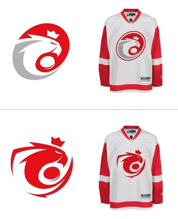
Here's a cool one. Vin offers up a unique alternate sweater with a very retro feel. It may not work for the Red Wings on a regular basis, but maybe as a one-off specialty thing instead. And yes, I'm also posting this one as a tribute to my Bolts' new GM — Stevie Y! I'm expecting great things from him.

Jake Slavik

The last concept is a little Winter Classic 2011 bonus. And with all respect to Jake, this is pretty far out. He's combined so many different eras of the Penguins and Capitals that it's become kind of a jumble.

On the other hand, it does help us see what was good and what was bad about these clubs' past uniforms. For example, Weagle good, funky striping not. And sadly, he's left the gold out of the Penguins' jersey entirely. Despite the blue sweaters in the Pens' early years, the penguin logo was never without gold.

I'm shooting for concept updates on a weekly basis, but that may be too much to ask for. Just know that I'm doing the best I can. I'm assuming things will quiet down on the news front as the summer goes on, which will allow more time for concept posts.

Black & Blue in Pittsburgh

The playoffs start next week so I figured why not post some concepts in honor of the Stanley Cup champion that's soon to be unseated. My prediction: Sharks vs Caps for the chalice. So here are some Penguins concepts that have been sent in — some dating back over a year!


Matt Marczel

Is it bad that I still have concept submissions waiting to be posted from December 2008? The first two items were sent by Matt long ago. But I haven't forgotten about them. And now as the Pens mull a third jersey overhaul, they certainly have piqued my interest.

The second one, titled Version 3, incorporates a little black and calls back to the logo introduced in 1992. Seems strange in blue.

But two more recent black-based designs are also pretty slick. The Penguins seem to like black and light blue, so why not combine them? And while I think the '90s logo is the best the Pens have had, I'm sure a lot of Pittsburgh fans would disagree.

Joshua Heckman

So let's just lose the logo altogether. After all, the dark jerseys from that era were just black and yellow with text on the front. But those were based on the original 1967 sweaters — before the team was comfortable placing a skating penguin there.

Joshua's design is based in part on the distant past and more recent past — the Reebok Edge era excluded. But this dark blue is looking better and better the more we see it, as long as the light blue doesn't make itself too scarce.

Brad McPelican

Brad gives us another way of looking at it — going back to the classic gold in the primary logo only. It's always odd to see a crest that doesn't match the rest of the uniform. Odd in a good way, that is. I could see the Pens wearing an alternate like this one day.

Ryan Haslett

Ryan's going both ways. He likes a blue jersey and a gold jersey. His two-tone blue incorporates the Vegas gold penguin and some odd striping patterns that Reebok would just adore, I'm sure. But it does give the uniform a cutting-edge look.

As for the other... Personally, while I think the yellow gold worked for the Bruins at the Winter Classic, I'm not sure it's a good way to go for Pittsburgh. If you want to return to the glory days, do it properly. Lemieux and Jagr would be proud only then.

Doug Graham

Doug has tried a few things. First, he's got a throwback-based look using current Vegas gold. It's not bad but it's not great. And it looks like Pittsburgh's coat of arms on the shoulder.

He also went back to the vintage yellow in what's essentially a recoloring of the current powder blue third jersey. Works better in blue if you ask me — and I know no one did.

Matt McElroy

We finish where we started — with a Matt. In the most sweeping change, Mr. McElroy changed the logo by losing the penguin's legs. He's also added a gold jersey reminiscent of the Habs' in a way. But man that's a lot of yellow. I'm sticking with my hopes for a dark blue third in 2010.

Even more concepts on the way this week as any blog-worthy news seems to have slowed down. Don't forget that Elliott Strauss' NHL Rebrand series picks up with Part 8 this weekend.

JerseyWatch Concepts

In today's brand new concept post, we take a look at what's in store for the 2010-11 season. The following designs are what Icethetics artists came up with based on descriptions in the initial JerseyWatch 2010 post.


A.J. Bloomquist

One concept that caused a stir after the JerseyWatch post went live was this one by A.J. He posted his work on Sabres' message board months ago. The crest, a script similar to what was described to me, is taken from the old logo of the Buffalo Bisons of the AHL.

A.J. submitted a clean version of his concept so we could all get a good look at it. And who wouldn't love to see Buffalo paying tribute to their town's hockey history on their 40th anniversary?

Jeff Wozniak

Similarly, Jeff sent in his understanding of the rumored new script crest. But this veers pretty far from what I was originally told — which is that it's basically a baseball-type script with the 1970s logo positioned in the tail.

Still, that was just a preliminary concept and things can change. So Jeff may be right on the scent.

Doug Graham

The Penguins are also big news right now. Word from Reebok is they're launching a new alternate sweater for 2010, not to mention all the rumors that the Pens will see action in their second Winter Classic in four years.

Doug's concept is based on the rumor that the Penguins will dig up another blue jersey from their past. He could be on the right track with this. I could see them making it the home jersey one day.

Tony Galiffo

The Blue Jackets will allegedly be debuting a new third jersey in the fall. The team has said it will feature a cannon as its primary emblem. So Tony's incorporated that as well as his own little tribute to the old Cleveland Barons, who wore large patches shaped like Ohio on their sleeves.

Michael Lapsley

Michael tackled a couple of JerseyWatch rumors. The Maple Leafs will be putting stripes and shoulder patches back on their mostly-plain jerseys next season. This is more than likely what we should expect to see — unless the Leafs design a brand new shoulder patch.

Michael Lapsley

And the Ducks are on the list to add a new third jersey in 2010. Absolutely no details have circulated as of yet, but Michael's thinking they go with an orange sweater with the webbed D front and center on the chest.

He's done some nice work but I kind of hope he's wrong. I'd like to see the Ducks introduce a new logo with this alternate sweater. Maybe something that actually resembles a duck wouldn't be too much to ask?

Our NHL rebrand series continues with Part 7 this weekend!

Your Sunday Concept Fix

I've been getting some great concept art submissions in the past couple weeks, but I wanted to keep Haiti at the top of the page for a little while. I just added a few new items to that post, by the way. But now I think it's time to start sharing some of the other great artwork that's been coming in.


Mark Komondor

We'll begin with the Penguins and a concept created by an artist brand new to Icethetics. These are his first submissions and he sure seems to know what Pens fans want. Imagine Crosby in the same uniforms that Lemieux and Jagr once wore when they lifted the Stanley Cup together.

Of the first one, he writes:

I was going for a throwback look by incorporating elements from the late 80s/early 90s sweaters the Pens wore when they won two stanley cups. I took that uniform and simplified it, using the Wild's red home sweater as a guide. I feel like this is a good mixture of the 90s elements, and the circle logo which has found popularity on the blue sweaters.

He says the other is simply a combination of the jerseys worn just prior to and since the Age of Reebok.

Adam L'Italien

Adam's Canucks concept makes some revisions to the new Johnny Canuck/V logo introduced on the third jersey last year. He says, why not use the full-body JC on the V?

But the most important thing about this jersey: it's green!

Brian Brideau

Rumors that the Predators plan to launch new home and road jerseys for 2010-11 could result in something like what Brian has come up with here. In fact, these should look familiar. I posted the first two jerseys two weeks ago.

What's new is the blue alternate sweater Brian has now added. For the most part, I like this one. The striping is unique but the Flyers-copycat nameplate is what I think needs to be revised. I truly hope differently-colored nameplates do not become a league-wide fad.

More concepts coming during the week.

What's in a Third?

Monday is here again. But while you guys are headed back to work or school, I'm probably in a casino wondering what time it is or something like that. Not to rub it in or anything.

Here we are at the fourth of five auto-posts featuring all new concept art from talented Icethetics artists. Today's theme is another fan favorite — third jerseys. Several of you have come up with ideas for alternate sweaters based on what's actually being worn in the league right now. Let's get started.


Ryan Haslett

The Pittsburgh Penguins are up first because we're pretty sure they're actually getting a new third jersey next fall. Folks keep saying the powder blue sweater is on its way out. Personally, I think that paves the way for an '80s style third reminiscent of the Mario Lemieux/Jaromir Jagr days, but I digress.

Ryan's got a whole new set of jerseys here which includes a black third loosely based on the team's earliest NHL days — sans the blue, of course. But it might suffer from the same problem that Bruins currently have. That being both the home and alternate sweaters are black.

One of them needs to be gold (I'm speaking both about the Bruins and Penguins). Gold will solve all their problems.

Charles Cadieux

Also in the east, the Canadiens introduced — or should I say re-introduced — a handful of vintage sweaters to celebrate their 100th anniversary. They started last season and continued into this one.

One of the favorites was the blue one with the big white C. I believe Charles' attempt was to turn it into a third jersey but putting the classic CH we've all come to know and love, front and center.

I'm torn. Part of me likes it because it means this jersey could stick around. But the other part of me says it's just wrong.

Brian Brideau

Moving ever westward, we now land in Nashville. The Predators have discussed making wholesale uniform changes to just simplify. Brian, here, thinks they'd be wise to just make a light version of the new third jersey and go with it.

He's saved them the extra steps by having already designed it. This is hard not to like and the Preds are in need of some jersey overhauls. This could just be the ticket.

The only thing I'm not sure about is the triangle on the white jersey. It's not necessary to making the logo stand out and it actually takes away from the simplicity effort. That aside, these are top notch.

Chris Fraterrigo

Sticking to the direction of the sunset, Chris Fraterrigo thinks the Avalanche could use a uni redo. And ever since the Age of Reebok was ushered in, I can't say I disagree with him.

In this new set, the "modern" striping elements are gone. Instead, the simple striping from the new third jersey is carried over to the home and road shirts. And the alternate here is simplified losing all striping — which actually doesn't hurt it.

I'm a big fan of incorporating the black into the burgundy sweater. However it's not done as well on the white one here. Overall, though, a solid look. The only thing I might add is some striping around the bottom — just so it doesn't look like a t-shirt.

Uncleben

At last we find ourselves as close to the west coast we're going to get today. I think the Coyotes have a pretty decent third as it is and this one may be a little cluttered. Still I'm a big fan of that paw logo and traditional jersey striping.

It has its pros and cons. But the largest con is probably the use of the Maple Leafs' lettering and numbering. Huge no-no. But we won't crucify anyone for it. We just don't want to see it on a real Phoenix jersey is all.

One more auto-post to go! You'll see right here tomorrow morning at 9. But at this point, my concept art reserves are beginning to dwindle. If you've thought at all about dipping your toe into the artistic pool, email your designs to me at icethetics@gmail.com.

Strauss NHL Rebrand III

The new concept series in which designer Elliott Strauss takes on the immense task of creating the ideal look of the NHL now continues. All 30 teams will receive his rebranding treatment — some with big changes, others small changes — all, hopefully, for the better.

In Part I, Elliott took on the Capitals, Coyotes and Panthers. Part II, saw updates for the Oilers, Red Wings and Thrashers. This time it's the Penguins, Maple Leafs and Stars.

The bold text below are Elliott's own descriptions.

Pittsburgh Penguins

The logos are all new. I tried to create a dramatic-looking penguin on Pittsburgh's signature triangle. Vegas gold is gone and yellow is back.

An igloo is featured as a patch logo and the jerseys pay tribute to the sweaters from the early '90s. The alternate brings in elements from the mid-00s triangles and also the new triangle featured in my logos.

Certainly a menacing penguin and the classic design is hard to beat. However, it does leave a little to wonder about in terms of logistics.

I like the idea of a yellow third, but is it dark enough that the opposing team could wear white? And while the two-tone jersey numbers may look cool, they don't quite meet their practical responsibility which is legibility — not to mention the nightmare for the person in charge of customizing each sweater.

Despite that critique, though, I am a fan of this look for the most part. By switching to Vegas gold, the Penguins weren't giving themselves the shinier look you'd imagine but rather desaturating their color scheme. It looks horrible and needs a change.

One thing I do like about the Penguins' current design is how they've stepped out of the box with the third jersey in using an entirely new color scheme. Even the Panthers only changed one color. The Pens went all the way.

Toronto Maple Leafs

The jerseys aren't much to speak of in terms of changes but I did come up with a new logo package. The leaf is spiky and help forms a T. The shoulder patch is a portion of the iconic CN tower behind a blue version of the Canadian flag.

This will probably end up being one of Elliott's most controversial designs if for no other reason than the sweeping logo changes.

However, the simplicity is hard to argue with and while it breaks from tradition in a big way, I don't think it's for the worse.

The one change I'd make is to dull the corners of the leaf — make them not so sharp. Then when you squint at it, it kind of looks like the Toronto Arenas shield.

Maybe it's just me.

Finishing up in the south with some not-so-sweeping changes in Dallas.

Dallas Stars

Since they seem to be more inclined toward black these days, I left black as the primary jersey color and switched up the logo a little bit. The chest mark is simply a star on top of Texas.

For the striping, I tried to make it in such a way that the gold looks best with the two colors — I'm not sure about a specific thought process.

The alternate eliminates the black and has stripes similar to their current uniforms.

I think Elliott was definitely going for a look that evokes the Stars' early days in Dallas. Apart from the sleeve stripes, it's almost a dead ringer.

I like the green third. It's something Dallas has struggled with in the Age of Reebok. I still think their best jersey was the green one with a giant star that was once an alternate.

Unfortunately, the Edge stifles that sort of creativity. Am I bitter? Never.

I'm aiming to get Part 4 posted within the next week. It will feature my Tampa Bay Lightning among others.
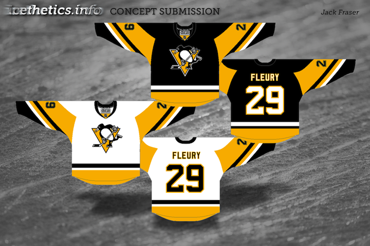
Concept Collection VII

I have new artwork to share with you tonight from a number of artists.

We begin with Jake Niehl who has put together a new look for the Penguins. You do not want to mess with this flightless fowl.

Pittsburgh Penguins concept by Jake Niehl

Earlier this week we talked about the possibility of the Ducks placing the wordmark on their jerseys with the much less heinous "webbed D." Matt Marczel writes in with what that might look like...


Anaheim Ducks concept jerseys by Matt Marczel

...as does Jules.

Anaheim Ducks concept jersey by Jules

Both designers stuck with black jerseys but make it work much better than the Ducks currently do. But if you really want a change in Anaheim, check out this logo by Mike Notko.

Anaheim Ducks concept logo by Mike Notko

That is quite something.

Wojtek from Poland writes in with a very sharp new look for his country's national team.

Team Poland concept logos by Wojtek

Still wondering what's up for the 2010 Winter Classic? Look no further. DC Designs put together a rather smart brown uniform for the Bruins.

Boston Bruins Winter Classic concept jersey by DC Designs

And finally, tonight, we finish up with some artwork that harkens back to the days of Freak Out Friday. First, the Panthers — well, Cats?

Florida Panthers concept jersey by J.B.

Then the Stars...

Dallas Stars concept jersey by J.B.

...who I believe are on sale for $0.99 at your local grocer. Thanks to J.B. for freaking us out.

If you've got any great hockey logo and uniform concept art that you think needs to be shared to the world, you know how to get it to me. Until next time.