Collection 46: Sunny South Florida

A few weeks ago I promised a concept post dedicated to the Florida Panthers. That was before the Winnipeg Jets logos happened. Now it's been way too long since the last update, so it's time to deliver.

Still working on theme ideas for the next post. If you have a suggestion, let me know.

Collection 24: The Blue & Gold

As I get to work on building the next jersey gallery, I thought it might be time to share some concept art. Perhaps theme of this post will clue you in on the next team being represented in the galleries.

I know last time I said we'd do some concepts focusing on playoff teams. That's still coming. In the meantime, send along whatever you've got and it'll surely find its way onto this page soon enough.

Collection 23: Summer Comes Early

Over the next two months, most of the hockey world will forget that the NHL actually extends beyond 16 teams. So before the playoffs kick into gear, I thought I'd share some concepts for a handful of clubs that have already wrapped up their seasons and will start the summer early.

Perhaps next we'll look at some teams that did qualify to play for the Stanley Cup in 2011.

Concept Collection 19

No theme for this collection. Just a nice, varied assortment. But of course we have to start with the Senators' forthcoming Heritage Jersey — which we got a sneak peek of this week.

The way the jersey is folded in the photo the Sens provided leaves the design open to interpretation. It's not a bad attempt by Avi, but I think he may have strayed from the target. The shield he's put on the chest appears to be on the shoulder instead. And if it is in fact the "O" on the front, the photo does show that it doesn't have the double-stroke seen here. Otherwise, I'd bet it's pretty close. Anyone else want to take a crack at it?

Brendan's design is likely pretty close to the road uniform we'll see from the Kings next season. I'd bet on a black collar and maybe more black on the sleeves to add contrast. Now for the fun stuff...

So what do you think of that? I'm particularly fond of Colin's Canucks design!

Concept Collection 11

Got a new set of concept art for Trade Deadline Day.

That Panthers logo is a little frightening. Your thoughts?

Concept Collection 9

You guys weren't impressed with Sunday's crop of Ducks concepts, so let's try something a little different. These are all designs I think you might actually like.

Keep the artwork coming! My email address is in the Quick Links box at the top of the page.

Concept Collection 3

The newly reformatted concept art has been quite a popular feature lately. I can't remember the last time these posts have had so much feedback on a consistent basis. So let's keep it rolling. I've got another mish-mash to share this morning.

Paul had a similar idea to Mike Ivall's concept from the last post. Once again, there's just something about that color combination for me. The Cats can keep the light blue as a trim color so long as they keep the red. That's my decree.

Coming up this week: Mike Ivall has sent in enough new artwork fill another post. He's been working hard lately. He's covering the Preds, Isles and Thrashers among others.

Mike Ivall is Back!

Long time concept contributor and friend of Icethetics, Mike Ivall has caught the creativity bug, eager to express himself with jersey artwork. And I think that's something we're all happy to hear. Over the last few days he's immersed himself in the following designs.

After the St. Pete Times shared some new details on what the Lightning may be planning for their upcoming uniform redesign, Mike took a stab with some familiar elements. The lack of any black or silver does squarely put the look in Maple Leafs territory, which I'm not wild about. But you never know what Stevie Y has up his sleeve (i.e.: Dwayne Roloson).

I don't know what it is about this color combination but I absolutely love it. I saw Mike's concept and it's made me want to completely redesign Icethetics again — in these colors. The two-tone blue is all right if not overused these days, but add the red and suddenly it's completely unique. Anybody else with me on this?

How can Ottawa improve upon this? It's simple. They can't. Do this and the Senators will never need another jersey for the next century.

As usual, Mr. Ivall's work is outstanding and worthy of a post all to himself. And I can assure you there is more coming not only from Mike but many other talented artists as well.

Predicting the Future

Hey, looks like it's time again for our monthly concept post. Really sorry about that, but as I've said, the blog and logo tournaments come first because that's what most people seem to be interested in — though I recognize there's a core group here that just can't get enough concept art. This one's for you.

Today's theme deals with the future — our designers taking a stab in the dark at what could be. Bookmark this page. We'll see how close they get.


Brian Brideau

First up, Brian sent in this concept based on a description I wrote of the Anaheim Ducks' new third jersey. Based on what I saw, it's pretty darn close. There are some minor dissimilarities, but for the most part, he's got it.

This image I put together (right) is a better example of what I think the shoulder patch looks like. It was small in the image I saw so it's difficult to be sure. But it's the best we have to go on at the moment.

The Ducks will sport their new alternate sweater for the first time on Nov. 26 against the Blackhawks. That's probably the first time we'll get to see it legitimately.

Jayde Garrow

The other day, the Hartford Wolf Pack announced Howard Baldwin is taking over business operations and his first act will be changing the team's name to the Connecticut Whale at midseason. So Jayde took a stab at a possible logo. Very nice tribute to the classic Hartford Whalers mark and very simple.

Stephen Griesmer

Yesterday, it was announced the newest ECHL team will be named the Chicago Express. Logos were unveiled but jerseys are still under wraps. Here's one idea from Stephen for home, road and alternate sweaters. The team doesn't begin play until the 2011-12 season.

Mike Wytrykus

The next two aren't really future jerseys — but I suppose they could be, right? Mike's rendition of a throwback-inspired Red Wings jersey is, well, inspired. This is one example of a jersey that in no way takes away from the team's long history. In fact, it plays it up. Count me a fan.

Sean Ryan Cooley

And lastly, Sean tried his hand a rebrand for the Panthers. As I told him, I feel like the colors don't work together that well, but I like the direction and the logo designs are solid. I think the Panthers have one of the best logos in hockey, but they're certainly working toward something simpler as evidence by last year's third jersey.

Until next time... (which I do hope to be sooner than a month from now.)

Next Winter Classic: Revisited

The Winter Classic at Fenway Park was nothing short of classic. It's such an awesome tradition and there's no shortage of opinions on who should play in future outdoor games. Since the last concept post, a few other artists have submitted some interesting ideas. I have a pair here I thought worth sharing before we move on to a new concept topic.


Brad McPelican

Brad writes in with an idea for a New Year's Day game not in 2011 but in 2014. He calls it the Canadian Classic. It would feature the Ottawa Senators and Vancouver Canucks (playing as the Millionaires) at Frank Clair Stadium in Ontario.

It may seem a bit unusual, so I'll let him explain. He wrote a very long proposal which I have actually edited way down for your convenience. All the key details are intact.

There was a time when the Stanley Cup was a challenge cup exclusively for Canadian clubs and in the Canadian Classic, I would like to relive that era.

The contest I find would be the best is one between Ottawa and Vancouver. Both cities currently are home to NHL franchises who have never won the Stanley Cup but, in hockey's early days, had taken home the prize as two of the nation's finest teams.

What makes this game even more special is that — 100 years earlier, in 1914-15 — the Vancouver Millionaires played in a best-of-five series in Vancouver and won the Cup. It was the last time the Stanley Cup would be exclusive to the best Canadian team — with the Portland Rosebuds joining the PCHA. This series was the last truly Canadian challenge for the Stanley Cup, which I think is pretty special.

As for the jerseys and event logo, I tried to make them as classic and as true to their time as possible. The logo was designed to look like the old team championship pictures and features vintage colors. The jerseys, on the other hand, are almost exactly what they wore — refitted for Reebok Edge jerseys of course — with Ottawa wearing brown pants and Vancouver wearing white ones. You might notice as well that their are no names on the back of the jerseys. This is to be true to the times, not a mistake.

If that game doesn't satisfy traditionalists, nothing could. By the way, just wanted to point out (because I know someone will) that the nameplates on NHL jerseys are currently part of NHL regulations and would probably require an Act of Bettman to sidestep. And he hates Canada.

John B

Obviously this one is just meant to be for fun. You could call it Winter Classic Freak Out. While my little corner of Florida has been atypically cold the last couple of days, there's clearly no way it could sustain a sheet of ice outdoors.

But as a Lightning fan, this was a fun concept to look at and muse on. As long as the Winter Classic is around, I don't ever imagine the Bolts or Panthers getting a shot at it. It will forever be reserved for teams who play where outdoor ice is a viable option.

John does have some interesting artwork here but I'm just not sure these "classic" jersey designs really work. Tampa hockey club? An F with cat ears and a tail? I'll pass.

The icing on the cake probably has to be the Winter Classic-themed surfboard design.

Thanks to John for giving us a laugh.

Thanks to all the artists who sent in their ideas for future Winter Classics.

Fixing the Cats' Thirds

Hope you're enjoying your morning. I've got some new concept art for you as part of the re-launch of the Icethetics concept format. From now on, I expect to have more frequent posts with fewer items.

Today, three artists take a look at what the Florida Panthers' probably should've done with their new third jersey this season. Dark blue has been done. And just because you add a new color to your arsenal doesn't make it acceptable.


Peter Cabral

This is probably closest to what the Panthers should've done — and it's the closest to what they actually did. It keeps the rounded shoulder yoke intact as well as the new logos. The only major change is to the color of the sweater itself — and they need to bring back the red.

One other neat change is the gold. It works really well with those shades of blue and red. But you may prefer the current yellow. For an idea of what that might look like, look no further...

Chris Fraterrigo

That's the true Panthers gold. But personally, I think either way you go, red is definitely the winner here. The point of the alternate uniform is to show off some colors your home crowd isn't used to seeing. They skirted that with the powder blue splashed about.

I'm not saying Florida has a bad third jersey, because that couldn't be farther from the truth. I just feel like they missed an opportunity to return to their roots a little. The Cats wore red for years. As a matter of fact, their first blue sweater was a third.

Glen Cuthbert

This last one may be the best version. While it's differences are slight, they are significant in their simplicity. First, drop the gold. Just because it's a third sweater doesn't mean it requires a third color. Red and blue work perfectly and separate the sweater from the home and road jerseys.

Second, the circle around the new panther head is not important and while to some it may elicit the feel of old-time hockey, all it really does is paint itself as a Penguins/Wild/Blues copycat. Still, it may need a white stroke to help it stand out a bit more on its own.

Everything else works. The striping is great as well as the shoulder yoke and new logos. There's nothing else I'd change.

And that wraps up the first edition of the new concept format. Hope you enjoyed it and I hope you enjoyed all your awesome Christmas presents this morning!

Strauss NHL Rebrand I

We're kicking off a new concept series today here at Icethetics. Designer Elliott Strauss has been on a mission to rebrand the NHL for the better. Some teams need sweeping changes, others not so much. For the 10-part series, Elliott set out with the following goals:

  • Get rid of Reebok EDGE motifs like useless piping (Panthers), piping that randomly stops (Flames), unmatching home/away templates (Wild/Thrashers), awful-looking templates (Sens third), and teams with the same template.
  • Come up with some brand new modern designs and make sure every team has a distinct identity.
  • Pay attention to detail with fluid identities that feature striping that both makes sense and is consistent.
  • Keep tradition when necessary.

I think Elliott is on the right track, for the most part here (though I may disagree with the need to make home and roads always match). Distinct identities, attention to detail and tradition are all important aspects to NHL uniforms. Let's see how they stack up!

All bold text in this post is in Elliott's own words. Artwork MAY NOT be reproduced without permission.

Washington Capitals

The colors stay the same, but the logo is new as I took the U.S. Capitol dome and combined it with a red star and circle — my version of the pre-Ovechkin primary.

Uniforms are a little top heavy but pants stripes help balance it out. The alternate is somewhat similar to the Capitals' current home, thought I thought the Weagle logo made a better crest.

A great start to this series. The only change I would make is to swap the home and third jerseys. To me, the Caps will always be red despite their late-90s identity crisis.

That Weagle as a crest is an incredible look that Washington needs to take advantage of one of these days.

Phoenix Coyotes

The sand color is darker here throughout the Coyotes identity.

With the jerseys, I wanted to move away from the extreme traditional look a little. Notice that the stripe on the bottom of the hem forms the same design between the jersey base and the pants as is on the arms. For that reason, the pants color had to change.

The road uniform is sand — just something different.  The crest of the alternate is based on an old patch they had when they still wore purple and green.

Another inspired concept here. I think the only missed opportunity was the sweater numbers. The rest of the design really works — even the non-white road sweater.
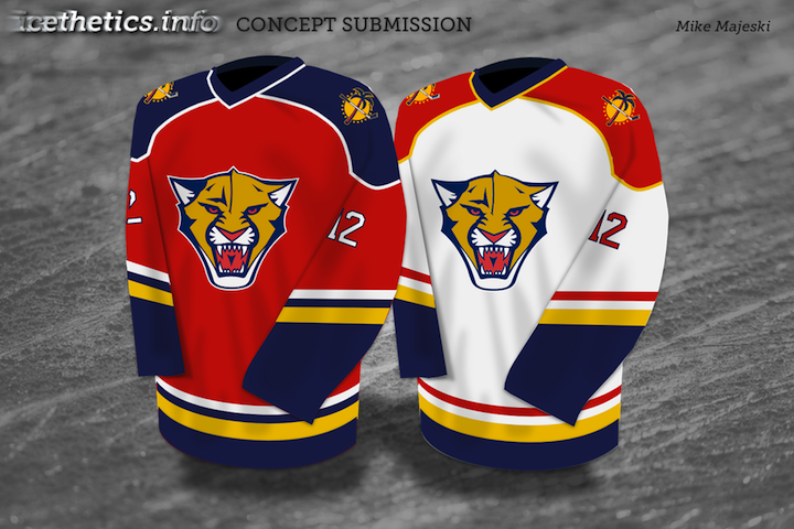
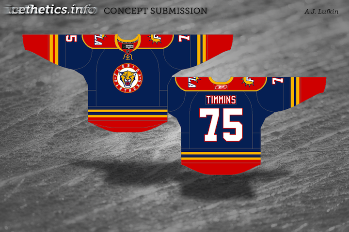
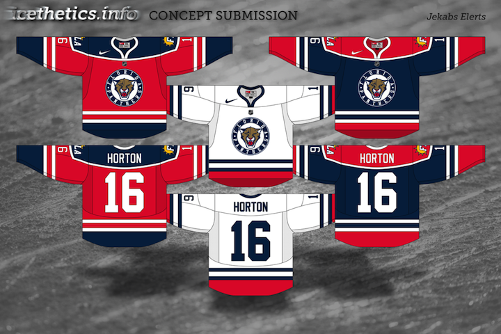
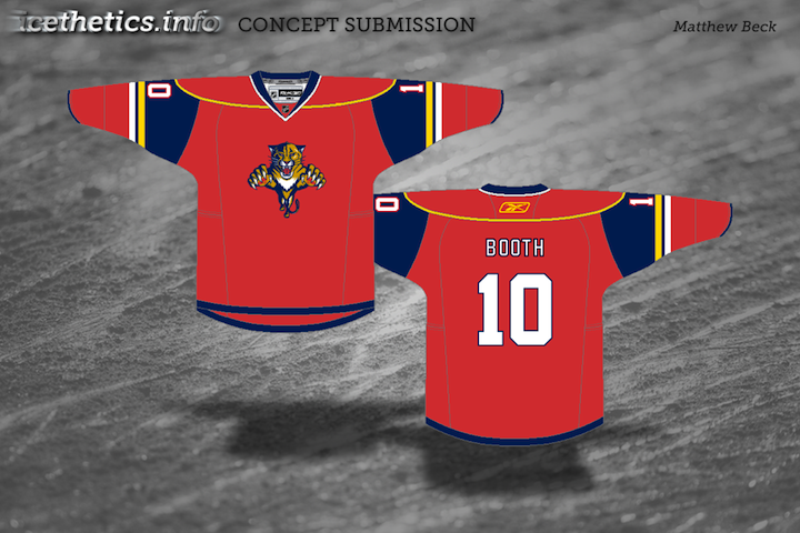
Florida Panthers

I took the Panthers' logos and updated them to be smoother and more intense.

The uniforms play heavily on the claw motif — even slight claw marks on the numbers.

The alternate relies on the contrast between navy and red.

The Panthers have had great uniforms since their inception in 1993 — at least until the Age of Reebok. What Elliott's done brings them back into the 21st century.

The jerseys are sharp and so are the logos. Very nice work as we wrap up this series debut.

Elliott Strauss is a talented artist whose work has been seen previously as finalists for both the USF Ice Bulls and KractIce logo projects here at Icethetics.

We'll certainly see more from him over the next several weeks.

In next week's edition of the Strauss NHL Rebrand, prepare for teh Oilers, Red Wings and Thrashers.

Concept Collection VII

I have new artwork to share with you tonight from a number of artists.

We begin with Jake Niehl who has put together a new look for the Penguins. You do not want to mess with this flightless fowl.

Pittsburgh Penguins concept by Jake Niehl

Earlier this week we talked about the possibility of the Ducks placing the wordmark on their jerseys with the much less heinous "webbed D." Matt Marczel writes in with what that might look like...


Anaheim Ducks concept jerseys by Matt Marczel

...as does Jules.

Anaheim Ducks concept jersey by Jules

Both designers stuck with black jerseys but make it work much better than the Ducks currently do. But if you really want a change in Anaheim, check out this logo by Mike Notko.

Anaheim Ducks concept logo by Mike Notko

That is quite something.

Wojtek from Poland writes in with a very sharp new look for his country's national team.

Team Poland concept logos by Wojtek

Still wondering what's up for the 2010 Winter Classic? Look no further. DC Designs put together a rather smart brown uniform for the Bruins.

Boston Bruins Winter Classic concept jersey by DC Designs

And finally, tonight, we finish up with some artwork that harkens back to the days of Freak Out Friday. First, the Panthers — well, Cats?

Florida Panthers concept jersey by J.B.

Then the Stars...

Dallas Stars concept jersey by J.B.

...who I believe are on sale for $0.99 at your local grocer. Thanks to J.B. for freaking us out.

If you've got any great hockey logo and uniform concept art that you think needs to be shared to the world, you know how to get it to me. Until next time.