Concept Collection 50

I wanted the 50th collection to be something special. Instead, it's just something to fill the gap so we don't go a full month without concept art. I've been keeping busy lately, blah blah, you already know. I have a new plan to keep this Concepts page fresh which I will be rolling out just as soon as... I have the time. For now, look at these...

If I go another several weeks without an update, just be patient with me. Doing my best.

Collection 47: Blue

Since I don't have any news to post on the blog today, how about some new concepts? I tried to pick one of the themes suggested in the comments of the last post, but I didn't really have what you guys were looking for. I know you'll be sad to hear that so here are some blue jerseys.

Concept Collection 34

Today is my birthday so I'm celebrating with this gift to you: New concept art! Since I didn't feel like coming up with a theme, here are five randomly selected concepts which have been submitted to Icethetics. Enjoy!

Obviously, the next set, which should be up this week, will feature the Winnipeg concepts that have come in.

Collection 30: Still on the Hunt

The theme for today's concept art is the Conference Finals! Just four teams remain and here are some fan-made jersey revamps for them. (And a bonus.)

And as a bonus (so I can round out this post with five pieces), here we have the Red Wings, the last team to be eliminated from the playoffs.

Coming soon, we'll take a look at what we might see for the 2012 Winter Classic. Send along your concepts!

Collection 28: Canadian White Out

It's weird. Last time I updated Concepts was only a week ago and the Lightning had just dispatched with the Pittsburgh Penguins in the first round of the playoffs. Now the Bolts are already moving on to the Conference Finals with a sweep of the Capitals! So much can happen in a week.

Now with a brief break in the action, I thought it might be time for a concept post that honors a playoff tradition — the white out. And it just so happens these are all Canadian teams.

If it seems my team's unlikely playoff run is resulting in fewer updates to the site, I won't argue with that. I fully expected to be enjoying the Stanley Cup playoffs from the sidelines. But with my team in the middle of it, I find it hard to spend my free time doing anything but cheering them on.

I'll do my best to keep the updates coming when I can.

Collection 25: Playing For It All

Enjoy these new concepts for a handful of teams competing in the 2011 playoffs. More to come, of course.

My personal favorites are Brian's Ducks and Glen's Rangers designs at the top. And I do think the Canucks shoulder start moving toward Colin's concept. But I don't see any of those things happening very soon.

Concept Collection 19

No theme for this collection. Just a nice, varied assortment. But of course we have to start with the Senators' forthcoming Heritage Jersey — which we got a sneak peek of this week.

The way the jersey is folded in the photo the Sens provided leaves the design open to interpretation. It's not a bad attempt by Avi, but I think he may have strayed from the target. The shield he's put on the chest appears to be on the shoulder instead. And if it is in fact the "O" on the front, the photo does show that it doesn't have the double-stroke seen here. Otherwise, I'd bet it's pretty close. Anyone else want to take a crack at it?

Brendan's design is likely pretty close to the road uniform we'll see from the Kings next season. I'd bet on a black collar and maybe more black on the sleeves to add contrast. Now for the fun stuff...

So what do you think of that? I'm particularly fond of Colin's Canucks design!

Concept Collection 12

New set of concept art for you this evening.

Keep them coming! Send in your work by email to have it included in a future post.

Concept Collection 9

You guys weren't impressed with Sunday's crop of Ducks concepts, so let's try something a little different. These are all designs I think you might actually like.

Keep the artwork coming! My email address is in the Quick Links box at the top of the page.

Concept Collection 1

I'm testing out a new format for concept posts. It features a standardized look for all submissions as well and limited commentary from me. Some posts will still have a particular theme, but from now on, most will just be a hodge-podge of whatever's in the Icethetics inbox. Feel free to leave your thoughts in the comments.

I know I said the last Connecticut Whale concepts would be the last. But Ross' attempt was too good not to share. We always talk about logo simplicity. This is one of those great designs that you can see a kid drawing on his notebook.

Unfortunately, this new format doesn't yet include ratings but I'm sure the artists will appreciate your feedback in the comments. Just added ratings. Enjoy!

Third Jersey Theories

Today's batch of concept art deals with a handful of teams with new sweater designs on the way. While we wait for official unveilings, our concept artists get to work on some predictions of their own.


Alex Valvo

The Sabres will unveil their new third jersey on Sept. 18. All right, technically these aren't third jersey concepts, but the expectation is that the Sabres will promote their current third jersey to home status — while adding a white version for the road. That's the concept Alex is offering up today.

Jekabs Elerts

We keep hoping for the Lady Liberty logo to return when the Rangers unveil their new third jersey in November. That's what Jekabs has for us — though he likes to work with the Nike Swift jersey template, as opposed to the Reebok Edge standard. Regardless, it's a solid sweater design.

Jekabs Elerts

The Penguins will use the 2011 Winter Classic to launch their new third jersey. Jekabs's guess is that they're going with this 1967 replica. But since they're the home team, it probably won't be a white jersey — but you never know. The Sabres wore white when they hosted in 2008.

Ryan Haslett

I'm a big fan of this one. Ryan, a prolific concept artist, has put a unique spin the much-maligned Islanders jersey from the mid-90s. Not a bad treatment if you ask me. Perhaps if the Isles had done something a little less radical and a little more like this, fans wouldn't have rioted so much. I like that font, by the way!

Connor Hanley

The Whaler talk these days has been intense. More on that in an upcoming blog post. In the meantime, Connor joins Howard Baldwin in hoping for the NHL's return to Hartford. Such a great logo. And solid uniforms all around.

Jack Martineau

And finally, while the Canucks aren't actually planning a new third jersey — that we know of — I decided to toss Jacks' concept into this post as a bonus. The logo used on the jersey just won the NHL secondary logo tournament here on Icethetics.

As always, feel free to email in concepts. I'm working on adding a bunch more to the Facebook page this weekend.

There's Something About Retro

They say fashion is cyclical. Trends come and go and come around again. In the NHL, we seem to be re-entering a retro phase. Throwback jerseys have always been popular with fans, but it seems only in the last few years have teams started to take advantage of that. Classic designs that bring history back to life have started making their way back into the mainstream, in the form of alternate jerseys and special events such as the Winter Classic.

So "retro" is the theme of today's post. Let's see what our artists have come up with.


Jared LeBlanc

I'm a big fan of Jared's Winter Classic concept uniforms, especially what he's done for the Penguins. It's been suggested that the Pens might join the Bruins in borrowing elements from multiple past jerseys for a unique new look that still feels vintage.

Jared's also submitted some ideas for the Heritage Classic, details of which will be announced later today. Regarding the design, he writes, "The Canadians jersey is really the only vintage jersey left that they haven't worn already. ... For the Flames, I took a look at the Cowboys jerseys, which looked like a pretty solid design. I considered doing a carbon copy but I thought they might still want the Flames logo on it."

Both sets get a big thumbs up from me!

Connor Hanley

Another set of retros based in real life, come by way of Connor. Over the summer, it was announced that the Canucks would don a throwback jersey to celebrate their 40th anniversary. While this won't be the one, the Kings' vintage threads seen here are probably not far from what they'll be wearing on a few occasions this season.

The Kings did give their first round draft pick a gold jersey from the 1960s after all. We're still waiting on an official announcement from the team, however.

Connor Hanley

Connor also sent in this set which calls back to the 1920s and the NHL clubs that arrived long before the Penguins and Flyers — that's the Pirates and Quakers. Of course the design is a little dated now with Gagne's name on the back. (He plays for my team now!)

I suppose it might be a treat for centenarian hockey fans in Pennsylvania to see those two sweaters hit the ice again. But they shouldn't hold their breaths.

Jack Martineau

Canadian fans always like to see their teams don the retro duds. Jack digs back deep into Maple Leafs history with these St. Pats sweaters. The team actually wore that green jersey for a game or two back in the mid-90s. They should do it again!

Ryan Haslett

And while we're on the subject, here's another throwback for the Leafs from Ryan. Just like the St. Pats jersey, this one also saw life in the afterlife when it was dusted off for at least one game in the early '90s. Now that the Leafs seem to be taking an interest once again in looking like the storied hockey team they are, maybe more of these throwbacks are in the cards.

Matt Marczel

And to finish things off, one of our most prolific artists, Matt Marczel, offers up this throwback to the previous iteration of the Ottawa Senators club. He points out that it could be used if the Sens ever play in a Winter/Heritage Classic. Unfortunately, the first problem is legibility. The second is the Canadiens just wore a very similar stripe-y sweater last year.

By the way, I have lots of new concept art ready and waiting. Someone needs to stay on me about keeping this page updated. I'm very forgetful.

Creative Inspiration

Has it really been seven weeks since the last concept post? Unacceptable. Yes, there have been a lot of blog and tournament updates. And yes, I've been busy lately. But seven weeks is a long time. So I'm going to try some new things to keep the concepts flowing.

Since getting this page updated is lower on my list of website priorities due to the time/effort required, I'm going to start adding new concept art to our brand new Facebook page on a regular basis to keep everyone satisfied. However, I will continue to save some items to be showcased here on the site.

So I'm taking some time out this holiday weekend to post a handful of new work. Most of the concepts sent in tend to be a slight re-imagining of a team's uniform. Usually some stripes are rearranged or colors changed. But every so often, an especially creative concept appears. That's today's topic.


Peter Debay

Peter has an interesting take on the look of the Vancouver Canucks. Interesting choice of colors and type. Gives the sweater a very classic feel.

Ryan Haslett

Ryan is one of our most prolific designers, and here I've got three of my favorites. (I know there's only one rating, by the way, so just make it an average.) First, awesome Canucks jersey. Forgot the Johnny Canuck V logo, go Johnny Canuck all the way!

I also like this Avalanche concept. Great callback to the old Colorado Rockies logo in the burgundy and blue. And green is just what the doctor ordered for the Ducks. Heck, I'd settle for orange if they'd just use the webbed D on the front!

Matthew Duke

This post is about creativity and sometimes that can yield a somewhat disappointing result. I like where Matthew is going with the uniform designs, but that ATL logo was not well-liked as a 10th anniversary mark, and it's sure not any better here. But at least it gets us thinking about things for the Thrashers.

Vin Maccioli

Here's a cool one. Vin offers up a unique alternate sweater with a very retro feel. It may not work for the Red Wings on a regular basis, but maybe as a one-off specialty thing instead. And yes, I'm also posting this one as a tribute to my Bolts' new GM — Stevie Y! I'm expecting great things from him.

Jake Slavik

The last concept is a little Winter Classic 2011 bonus. And with all respect to Jake, this is pretty far out. He's combined so many different eras of the Penguins and Capitals that it's become kind of a jumble.

On the other hand, it does help us see what was good and what was bad about these clubs' past uniforms. For example, Weagle good, funky striping not. And sadly, he's left the gold out of the Penguins' jersey entirely. Despite the blue sweaters in the Pens' early years, the penguin logo was never without gold.

I'm shooting for concept updates on a weekly basis, but that may be too much to ask for. Just know that I'm doing the best I can. I'm assuming things will quiet down on the news front as the summer goes on, which will allow more time for concept posts.

Strauss NHL Rebrand X

Time for the big finale. Here is the final installment in Elliott Strauss' NHL rebrand series. His descriptions appear in bold text.


Elliott Strauss

I think this is one of the more interesting concepts of the series because it gives a fairly drastic change to an untouchable team. I updated the familiar shield and brought back the Lady Liberty logo. The diagonal stripe on the uniforms has the same angle as the wordmark and is meant to match the diagonal sash on the primary logo.

The wordmark/numbers contrast the sleeve stripe order on the home and away jersey. The alternate is almost an exact replica of the pre edge alts, but the silver is dropped in favor of royal blue.

Definitely a shock at first glance — in a good way. All the key elements are still there. They just don't look the way we're accustomed to seeing them. This is one of my favorites of the entire series.

Elliott Strauss

Originally I had left some gray in here, but considering the nickname represents the Union army, I found the color gray pointless, as this is what the Confederates wore. I think these uniforms are inspired by the original jerseys for the franchise.

The red pants stay and a blue insert with star on the pants match up with the panel that you can see on the road jersey. I created no alternate because a red jersey would go against the nickname and another blue jersey would be redundant.

Straight after one my favorites is my least favorite of Elliott's series. I'm not here to put down anyone's work but this set feels lazy. Gray was never one of Columbus' colors. It's always been silver. It's an important distinction. Without the silver, the star in the logo looks out of place. And the Blue Jackets made a second blue jersey work in 2003. Just a little creativity is required.

Now with that out of the way, I love the jersey design! The sleeves are cool and so are the stars under the arms. It's a little like the stripes on the armpits of the Lightning's jerseys. Adds an interesting visual element when the players raise their arms to celebrate a goal.

Elliott Strauss

I feel that the Johnny Canuck V logo is the best they have, so it becomes the main crest in my design. The orca stays, just modified, and has a much less prominent role. Green and blue also stay, as I like this unique scheme. I've always wondered what a green alternate would look like, I think this simple striping pattern would make the blue stand out on the green.

Here I applaud Elliott's use of an existing logo because the Canucks have never had a more uniquely identifiable logo in their arsenal. It's just a shame they haven't put it to good use yet. And for what it's worth, the whale doesn't look half bad on green.

There it is. All 30 teams as envisioned by Icethetics concept artist Elliott Strauss. Do you think you have what it takes to rebrand the NHL? Send in your concepts and show us you can think outside the box when it comes to branding pro hockey!

Winter Winding Down

As the winter winds down, there's been a lot of talk about next year's Winter Classic. Rumor has it the Washington Capitals will get to host. And by far, the most popular opponent among Icethetics readers seems to be the Ottawa Senators. That's our theme for today's post.


Tyler Allen

There's no question in my mind that the Senators need to wear something like this when they eventually get selected for the outdoor game. Tyler's done a great job with this concept.

But his Capitals jersey is more of a Frankenstein creation than anything else. It seems he's literally taken element from every past Caps uniform and injected the Weagle. It's not terrible, but I think the stars are a bit distracting. Might be different on the ice.

Drew Krause

If it's simplicity the Sens would like in a Winter Classic sweater, Tyler's may be the right look. But if it's true vintage they want, look no further than Drew's concept. I didn't like the crazy stripes when Montreal did it, but that might've been because the blue threw it off. Maybe the Sens could do it better in black.

Drew also threw in a couple of logos, including a simplified version of the old primary mark along with a new heritage mark to go with that jersey.

Mike Bell

The Caps' owner may have recently nixed plans for an actual third jersey, but that doesn't mean concept versions can't live on here at Icethetics. Rather than incorporating the Weagle, which many have done (because of its awesomeness), Mike opted for a simple color reversal. Blue jersey, red logo. Not sure about the number being on the front though. We have enough to read there as it is.

Brad McPelican

Brad went the more traditional route with his third, but the key in this concept are the home and road jerseys. Check out the stars on the shoulders! That jersey belongs on a bit marquee sign, rather than a hockey player.

And if that logo looks familiar to you, it comes from the Capitals' old primary logo from the late '90s.

Ryan Haslett

And lest we leave Canada out of the Winter Classic one more time, Ryan Haslett has put together this 2011 concept for a match-up between the Flames and Canucks in Calgary. You don't get any more classic with a Flames jersey.

However, I'm not sure it's the best idea to go with a Canucks jersey from the era in which they wore the same colors as Calgary. For the Canucks, there'd be no choice but to go back to the 1970s and the classic stick-in-rink log.

By the way, I do have a few more Olympic concepts to share. I'll try to get those posted before the weekend.

Your Sunday Concept Fix

I've been getting some great concept art submissions in the past couple weeks, but I wanted to keep Haiti at the top of the page for a little while. I just added a few new items to that post, by the way. But now I think it's time to start sharing some of the other great artwork that's been coming in.


Mark Komondor

We'll begin with the Penguins and a concept created by an artist brand new to Icethetics. These are his first submissions and he sure seems to know what Pens fans want. Imagine Crosby in the same uniforms that Lemieux and Jagr once wore when they lifted the Stanley Cup together.

Of the first one, he writes:

I was going for a throwback look by incorporating elements from the late 80s/early 90s sweaters the Pens wore when they won two stanley cups. I took that uniform and simplified it, using the Wild's red home sweater as a guide. I feel like this is a good mixture of the 90s elements, and the circle logo which has found popularity on the blue sweaters.

He says the other is simply a combination of the jerseys worn just prior to and since the Age of Reebok.

Adam L'Italien

Adam's Canucks concept makes some revisions to the new Johnny Canuck/V logo introduced on the third jersey last year. He says, why not use the full-body JC on the V?

But the most important thing about this jersey: it's green!

Brian Brideau

Rumors that the Predators plan to launch new home and road jerseys for 2010-11 could result in something like what Brian has come up with here. In fact, these should look familiar. I posted the first two jerseys two weeks ago.

What's new is the blue alternate sweater Brian has now added. For the most part, I like this one. The striping is unique but the Flyers-copycat nameplate is what I think needs to be revised. I truly hope differently-colored nameplates do not become a league-wide fad.

More concepts coming during the week.

We Are All Canucks

I'll be making the long cross-country journey back to the Sunshine State today. Sad.

This is the final of five auto-posts featuring new concept art and it is being written nearly a full week before it will even see the light of day. Trippy. Or not.

You knew it was coming eventually. Not a single Canucks-centric post all weekend. How can this be possible? I saved it all up for today, that's how. Readers seem to send in more Canucks concepts than any other team. I don't know if it's the team's undying identity crisis or the possibility that Canada somehow funnels its most artistic people into one corner of the country.


Matt Marczel

We'll kick things off with my personal favorite. Matt Marczel's concept depicts the ideal Canucks identity. It's not plagued by spaghetti, corporate interests or over-simplification. That logo represents Vancouver and Johnny Canuck. And it incorporates the green and blue to boot. What more could you ask for?

The design also manages to hang on to its history by keeping the modernized stick-in-rink logo on the shoulders. If ever there was a 40th anniversary jersey that could spell perfection, folks, this might as well be it.

What's even better is this set paves the way for a brilliant green third jersey.

Jared LeBlanc

Jared LeBlanc has provided us with just such an example of a green third. It certainly shouts Reebok Edge but it shows a willingness to accept the things we cannot change and work inside certain parameters.

That being said, the curved tail of the sweater may be rather exaggerated. We get it.

As long as the greens matched up, there's really no reason that Matt and Jared's designs couldn't form a complete package here. Jared's even offered a nice pants design.

Ryan Haslett

Continuing with Matt and Jared's ideas, if it's a special event, vintage type design you're looking for, Ryan Haslett has the answer. He's gone with the "vintage white" and the new VC logo.

Do I smell a Winter Classic coming? Though to be fair, all the previous Winter Classic jerseys have either taken elements or entire jerseys from actual historical record. This would just be vintage for its own sake. Not that that's bad.

Could I be any more equivocal? The point is these are all great designs but what really needs to happen for the Canucks is they need to choose one and commit to it — for more than a few years.

Kevin Krilow

This next concept by Kevin Krilow focuses on the full-body Johnny Canuck logo. It's just as good as some of the previous artwork so what can you really say? Now it just comes down to personal preference. Do you prefer the full body or just the head?

You know where I stand but that doesn't mean I'm right.

This set comes with a home, road and alternate jersey. Surprisingly, it's the home and road sweater the make use of the text logo. Not necessarily bad, but uncommon.

Ryan Broda

The last one had to be an '80s recreation. You just knew it.

If the Canucks never introduced the orca logo in 1997, it's entirely possible their current Reebok Edge uniforms could look something like what Ryan Broda has come up with here. It features an orange (some call it red) alternate and gold vintage jersey. Though I'm surprised the Flying V hasn't found a place on the gold sweater.

The red/black/gold stick-in-rink logo is even there on the shoulders of all four sweaters. Glad to see it there. It was the cornerstone of the team's original identity and even if it can't be center stage anymore, it needs to be part of their look in some way forever.

The only drawback this set seems to have is the numbering and lettering styles. I think for these, you need to just stick with your standard block text. Don't try to be fancy.

The end. I hope you guys appreciate all the effort I put in to make sure there was new content on the site every day while I was gone.

I'll be back in town Tuesday night but have some errands to run on Wednesday so the next update to the blog/concept page may not come until Thursday. In the meantime, enjoy the archives!

Next Winter Classic: Revisited

The Winter Classic at Fenway Park was nothing short of classic. It's such an awesome tradition and there's no shortage of opinions on who should play in future outdoor games. Since the last concept post, a few other artists have submitted some interesting ideas. I have a pair here I thought worth sharing before we move on to a new concept topic.


Brad McPelican

Brad writes in with an idea for a New Year's Day game not in 2011 but in 2014. He calls it the Canadian Classic. It would feature the Ottawa Senators and Vancouver Canucks (playing as the Millionaires) at Frank Clair Stadium in Ontario.

It may seem a bit unusual, so I'll let him explain. He wrote a very long proposal which I have actually edited way down for your convenience. All the key details are intact.

There was a time when the Stanley Cup was a challenge cup exclusively for Canadian clubs and in the Canadian Classic, I would like to relive that era.

The contest I find would be the best is one between Ottawa and Vancouver. Both cities currently are home to NHL franchises who have never won the Stanley Cup but, in hockey's early days, had taken home the prize as two of the nation's finest teams.

What makes this game even more special is that — 100 years earlier, in 1914-15 — the Vancouver Millionaires played in a best-of-five series in Vancouver and won the Cup. It was the last time the Stanley Cup would be exclusive to the best Canadian team — with the Portland Rosebuds joining the PCHA. This series was the last truly Canadian challenge for the Stanley Cup, which I think is pretty special.

As for the jerseys and event logo, I tried to make them as classic and as true to their time as possible. The logo was designed to look like the old team championship pictures and features vintage colors. The jerseys, on the other hand, are almost exactly what they wore — refitted for Reebok Edge jerseys of course — with Ottawa wearing brown pants and Vancouver wearing white ones. You might notice as well that their are no names on the back of the jerseys. This is to be true to the times, not a mistake.

If that game doesn't satisfy traditionalists, nothing could. By the way, just wanted to point out (because I know someone will) that the nameplates on NHL jerseys are currently part of NHL regulations and would probably require an Act of Bettman to sidestep. And he hates Canada.

John B

Obviously this one is just meant to be for fun. You could call it Winter Classic Freak Out. While my little corner of Florida has been atypically cold the last couple of days, there's clearly no way it could sustain a sheet of ice outdoors.

But as a Lightning fan, this was a fun concept to look at and muse on. As long as the Winter Classic is around, I don't ever imagine the Bolts or Panthers getting a shot at it. It will forever be reserved for teams who play where outdoor ice is a viable option.

John does have some interesting artwork here but I'm just not sure these "classic" jersey designs really work. Tampa hockey club? An F with cat ears and a tail? I'll pass.

The icing on the cake probably has to be the Winter Classic-themed surfboard design.

Thanks to John for giving us a laugh.

Thanks to all the artists who sent in their ideas for future Winter Classics.

IX: Oddball Parade

As most of you noticed, I took the past week off. Plenty of stuff to talk about but not enough time to write updates. So I made a change. The Concepts section is now the Icethetics home page — rather than the blog. The blog is still there but now you'll find it in tab bar at the top of the page.

Over the past week while I was away, a fair amount of concept art came in — some worthy of posting, some not (for various reasons). But for the most part, it was all pretty odd. Tonight, we're taking a look at it.

We'll start with the Canucks in a combination I don't think we've ever seen here before.

Tristan Parfect

Last week I posted a Vancouver concept after which I mentioned the Canucks had never before worn a red jersey. Naturally, I was inundated with emails telling me how wrong I was. So I should explain. That mid-90s third jersey you're all referring to — I consider it orange and black, not red. Fine line? Maybe. Let's move on.

The New Jersey Devils announced over the summer that they're planning a special green-infused throwback jersey for St. Patrick's Day 2010. But what could be more fitting than the Boston Bruins going green for St. Patty's?

mcskilz

That same artist also delivered a pretty shocking concept for a Rangers third.

mcskilz

You know, I used to like that Lady Liberty logo. Yikes.

I know none of us can really imagine the Red Wings making a major uniform overhaul, but consider these for a moment.

Paul Chamberlain

Then quickly wipe them from your memory.

I also have an announcement coming tomorrow relating to a new concept art series that's starting soon. Remember the old days of Matt (aka GhettoFarmBoy) and his incredible NHL rebrands? If you don't, I highly recommend catching up. (Hint: No, he's not back... yet.)

Check back tomorrow for details on this new series.

Concept Collection VIII

You've been patient (most of you). My inbox has seen a lot of concept art over the past few weeks and I'm thrilled to finally be posting it! (Seriously, if someone can help me figure out a way to make Icethetics my only job, we'll all be a lot happier. A lot.)

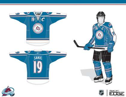
All right, I've got 14 items to get to tonight, so let's not waste time. We'll begin with the Colorado Avalanche, whose brand new third jersey has recently been leaked (see the blog for more info on that).

A lot of readers have bemoaned a lack of creativity, I believe having to do with the fact that it's simply a revision of the Avs' previous third. This first concept certainly avoids drawing on past designs while simultaneously reminding us the Nordique spirit will never die.

BD

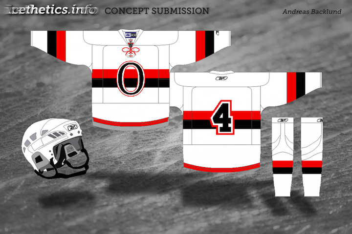
The other team soon releasing a brand new third will be the Florida Panthers. Rumor would have us believe it may look a little something like this.
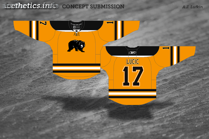
Ryan Haslett

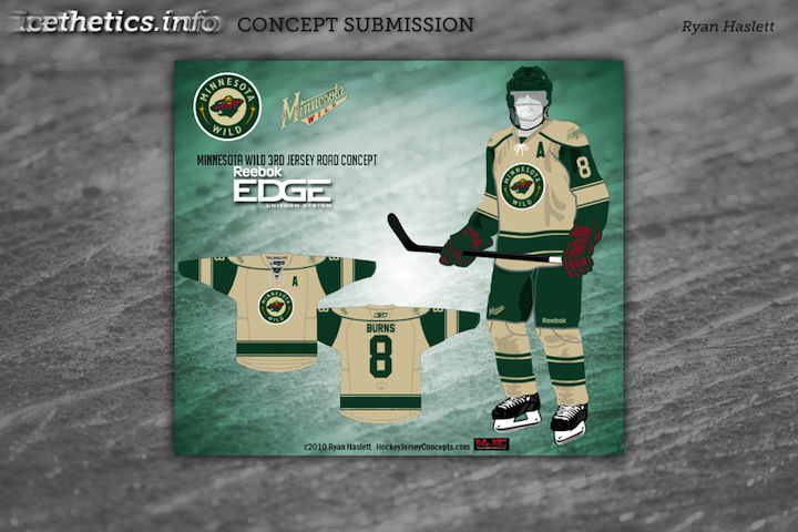
It's a return to red, which I'm sure longtime Cats fans will appreciate, and it borrows very heavily from the Wild's home uni — easily one of the best in the NHL.

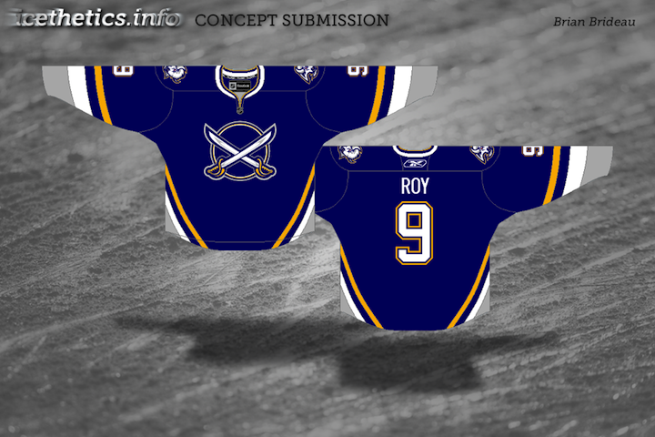
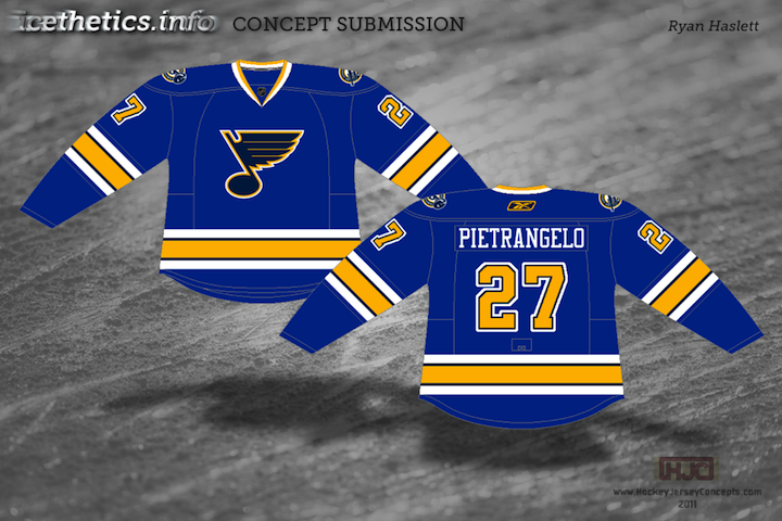
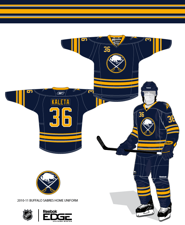
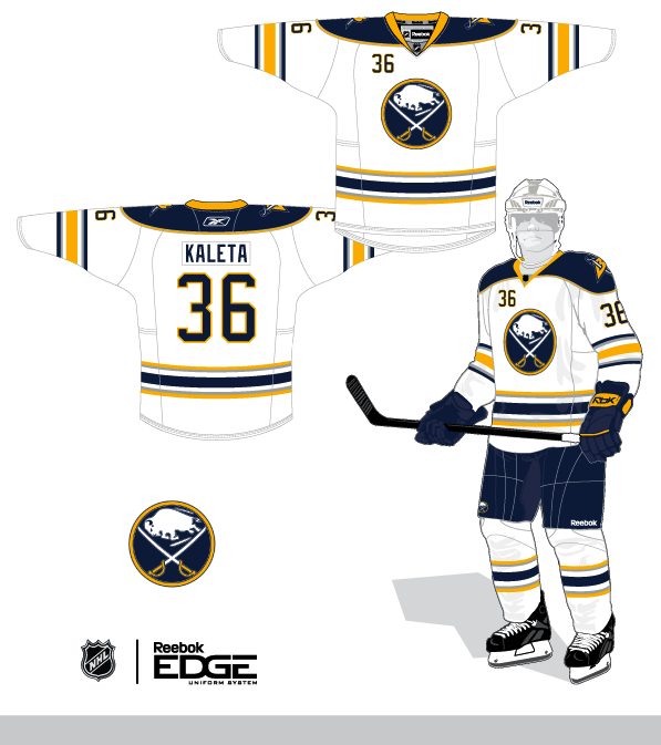
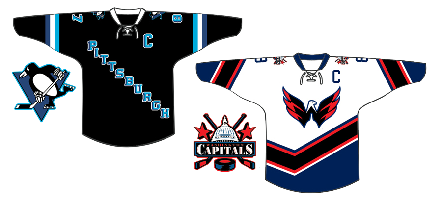
Seeing all these new third jerseys the last couple of years makes me wonder who got it right and who didn't. Some teams don't have one and could really use it. Obviously, the Penguins, Wild, Sabres and Blues got it right.

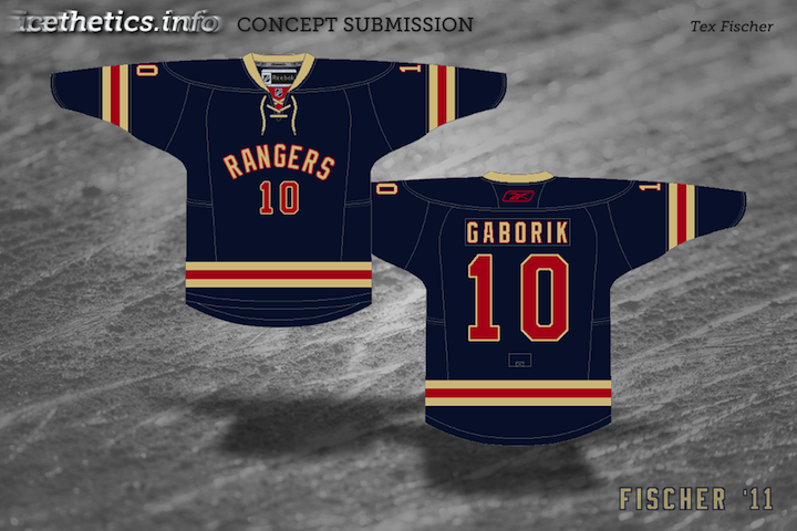
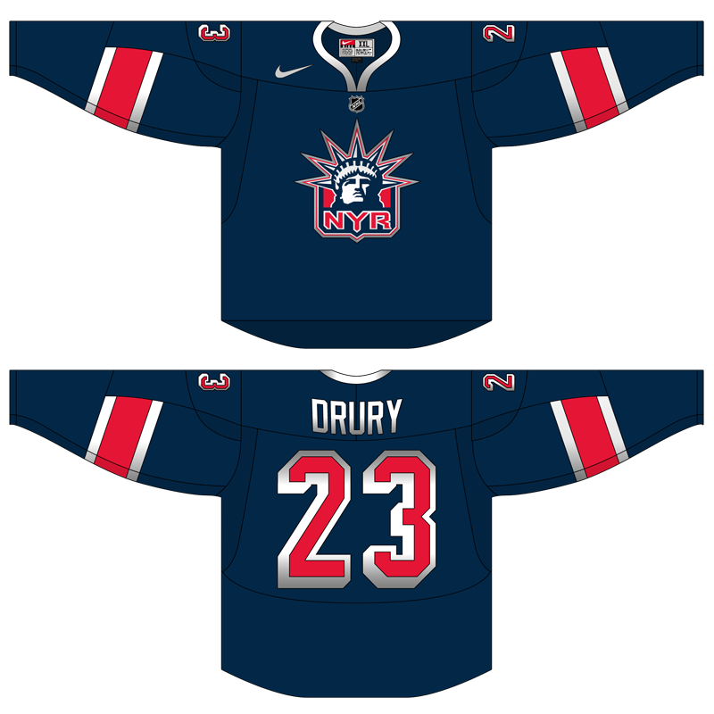
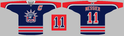
I've been hoping the Rangers would one day return to the Lady Liberty jersey which at one point was my favorite in the league. Here's a re-envisioning of that.

nyr1583

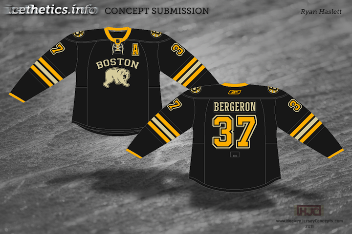
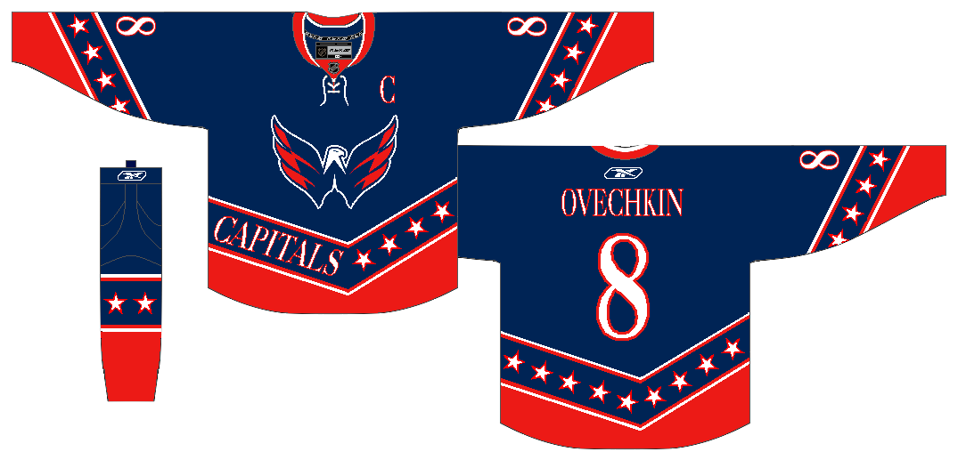
The Capitals would do well to add a blue jersey. Many have suggested the Weagle take center stage, but why not a red version of the primary logo? How would it all look on a Lethbridge Hurricanes sweater?

Ryan Haslett

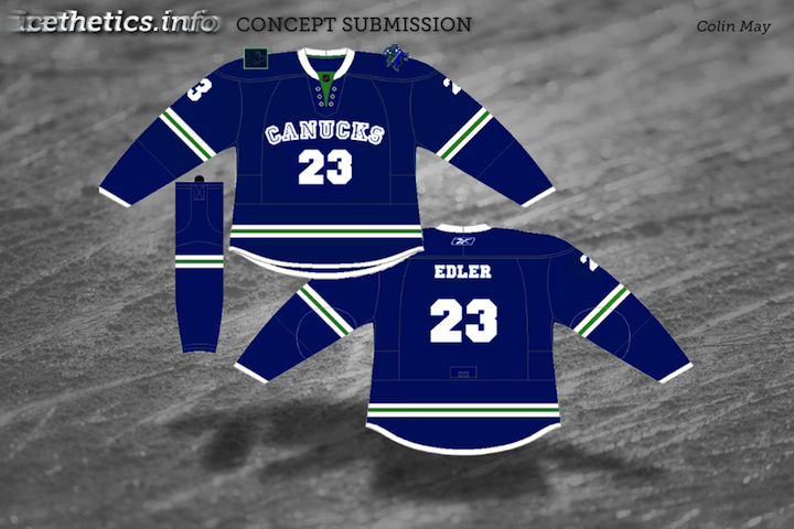
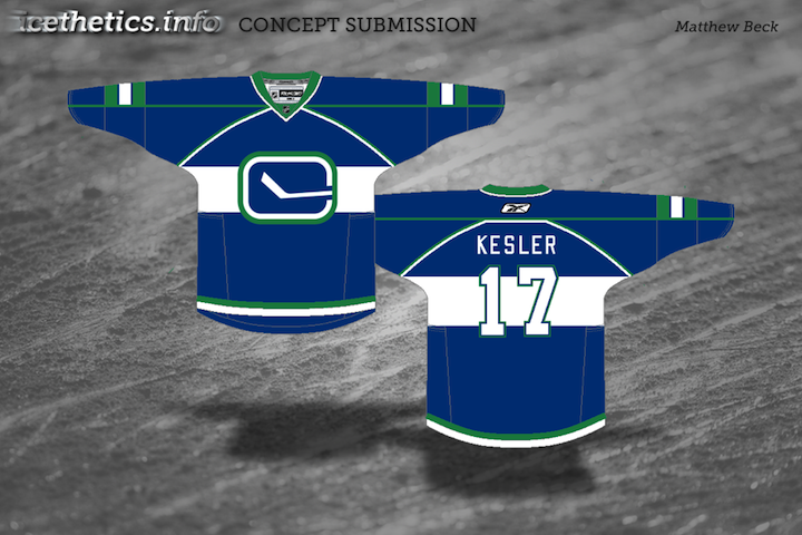
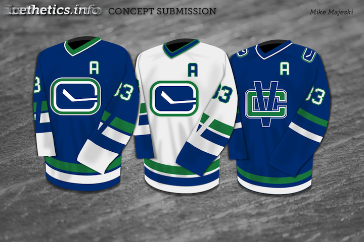
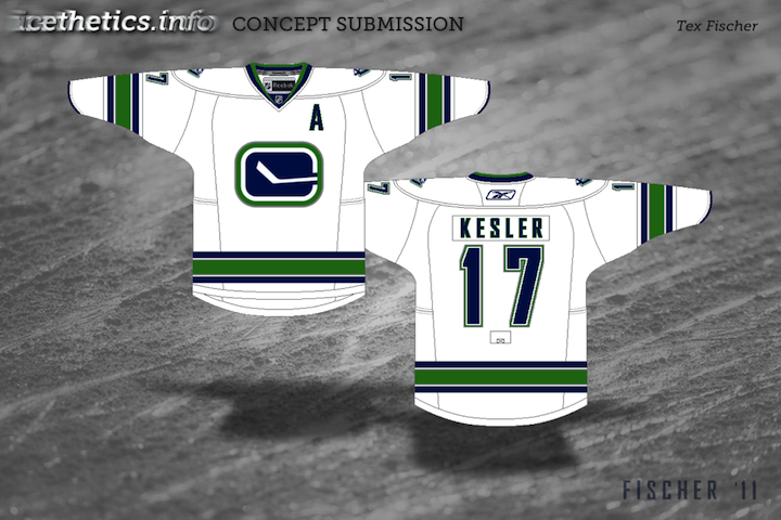
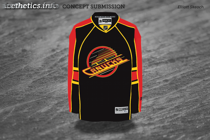
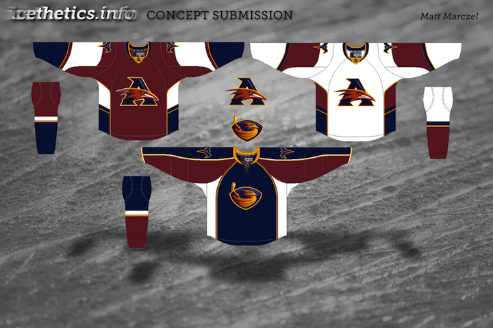
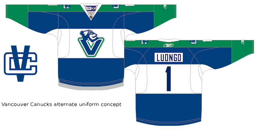
The Canucks dropped the ball with their third last year. It was what we all expected, but that should be their home sweater, and not an alternate. Here's one idea for an alternate with yet another brand new logo.

Matt Marczel

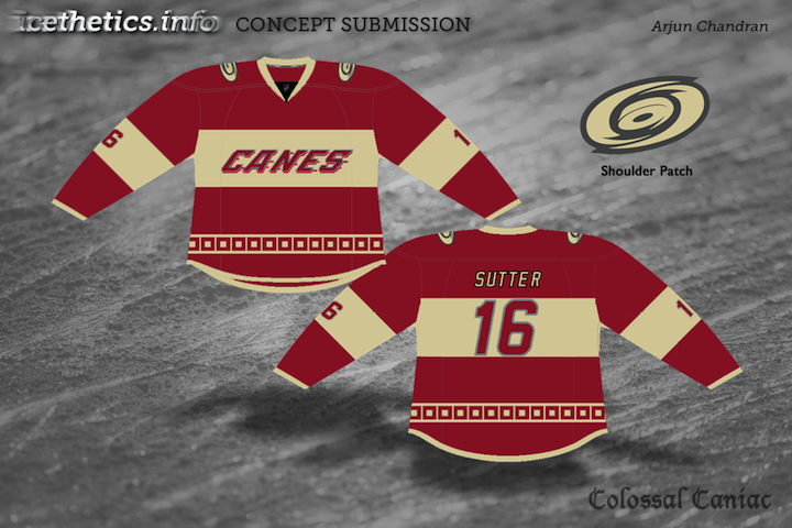
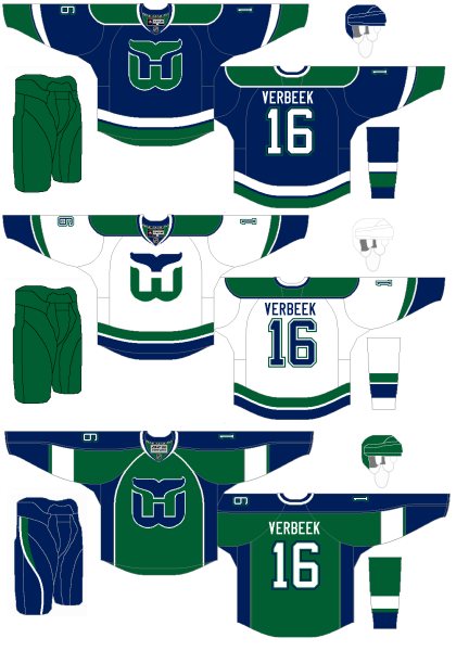
Now that Whalers merchandise is making its way back onto store shelves, maybe the Hurricanes could pay tribute on one St. Patrick's Day sometime.

Matt Marczel

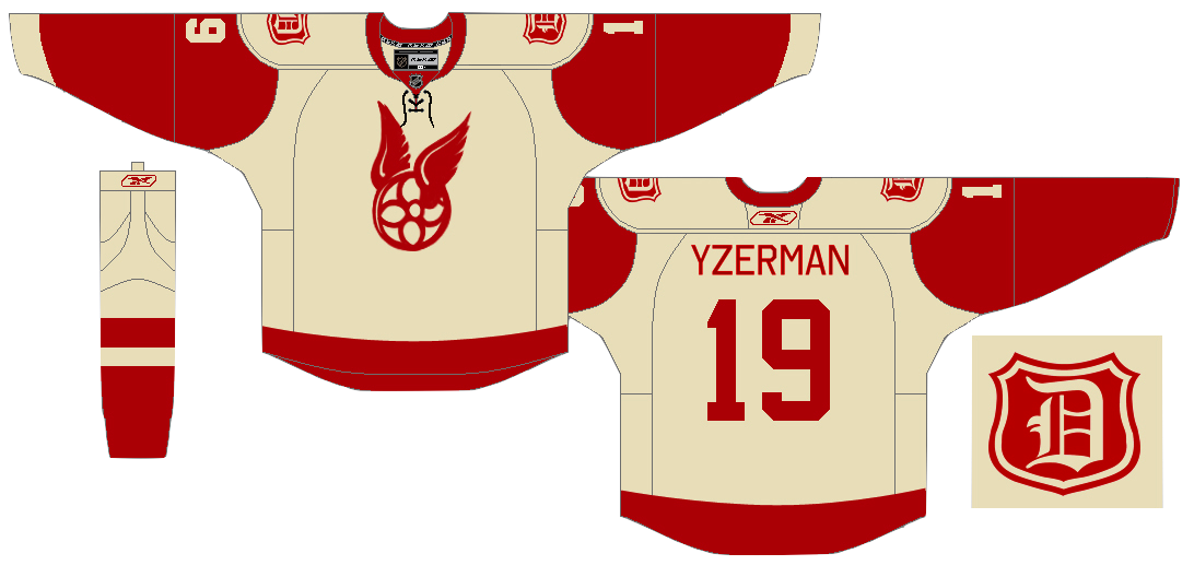
Maybe even the Red Wings could get in on the third jersey action — even though they've never been one to follow that crowd.

Matt Marczel

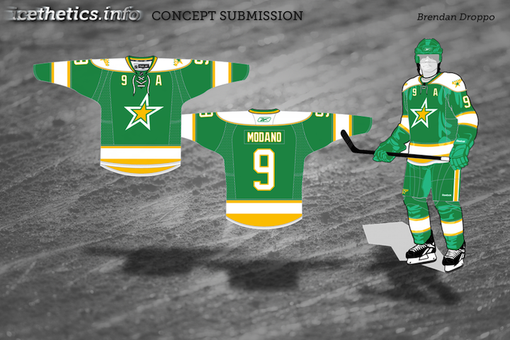
The Dallas Stars dropped the ball worse than anyone two years in a row — bad home and road sweaters followed by a shockingly worse third. Since we're talking nostalgia and vintage these days, why not a trip down memory lane the heart of Texas?

Matthew Duke

Lastly, the Ducks. It seems like every concept post at some point feels the need to help out those poor Anaheim Ducks. Nobody was sad to see the "Mighty" go away, but nor were they glad to see the artistic carnage that would ensue on the sweaters to follow.

mcskilz

I'm not saying gold is the way to go necessarily, but maybe stepping outside the box isn't a bad thing. Anyway, the colors are great, but the logo could use a lift.

Jake Niehl

Hey, an actual duck. Go figure.

I enjoy ending a concept post with a little something to freak you out, if at all possible. Tonight is no exception. The Sabres and Canucks have their 40th anniversaries coming up next season. Let's get started by putting an actual saber on the Sabres' jersey.

J.B.

And hell, why not just run the gamut of past logos and colors for the Canucks? You know they never did have a red jersey.

J.B.

A little something to frighten Panthers fans. As we near Halloween, perhaps this could be a costume.
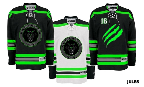
Jules

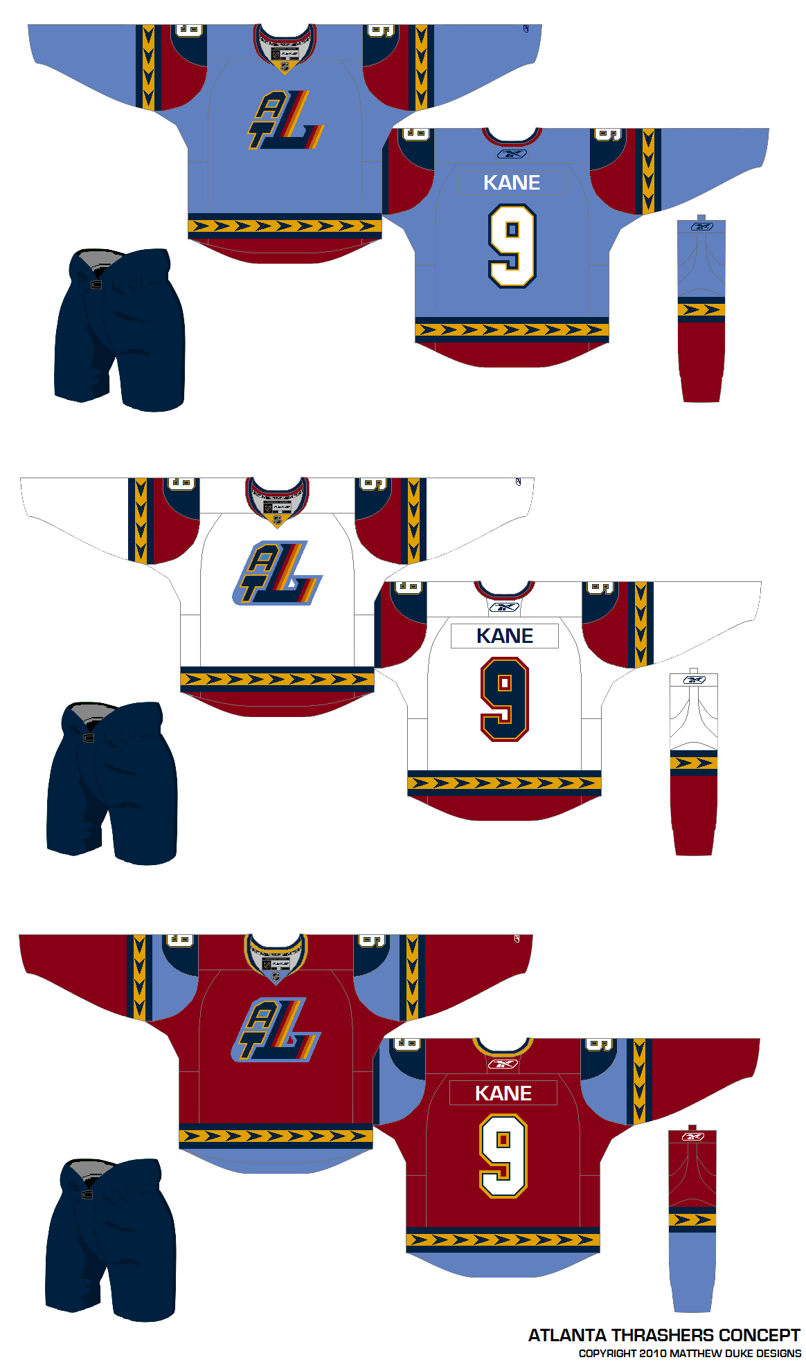
And lastly, one of the most ridiculous Atlanta Thrashers concepts ever to grace these pages.

mcskilz

Show your mcskilz! To the first person who can legitimately make the rest of the numerals out of that simple Thrash logo — bragging rights for life!

Hope the wait was worth it. I'm really trying to keep this updated. And since I know it's what you guys want, I'll make a special effort to have something new hear at least once a week — though it likely won't be in the quantity you see tonight.

Keep those concepts coming! Email them to icethetics@gmail.com.