Collection 30: Still on the Hunt
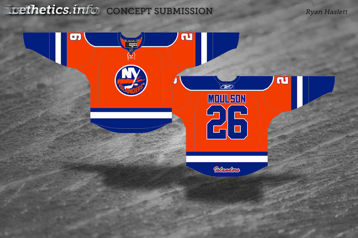
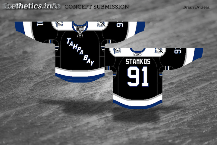
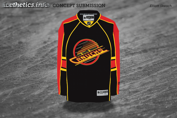
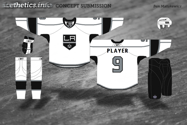
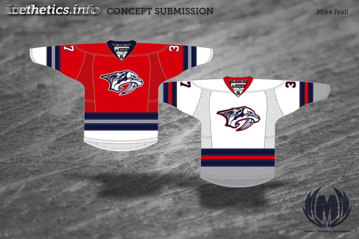
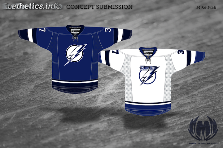
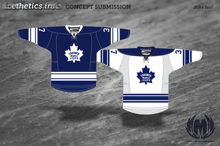
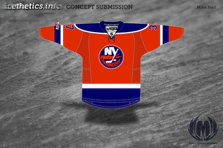
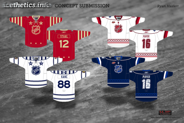
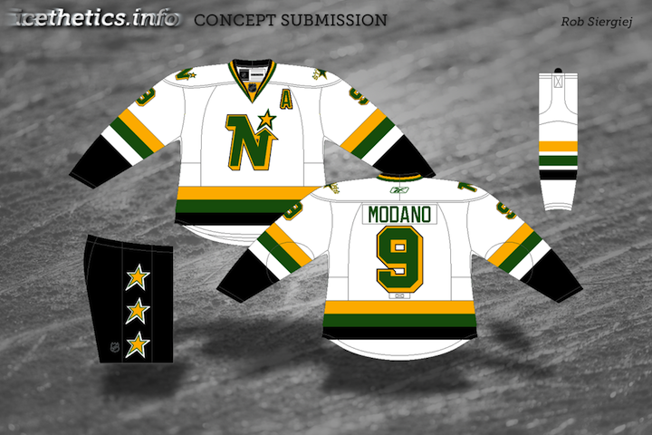
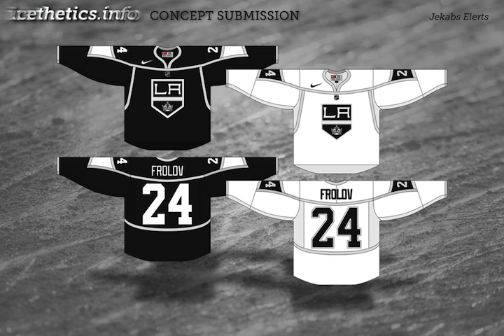
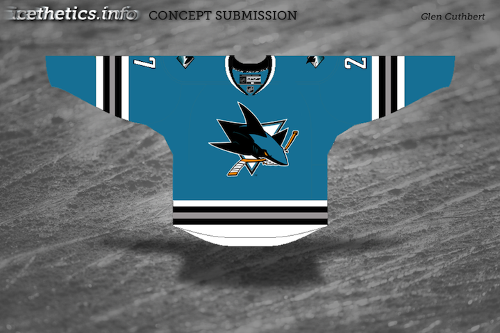
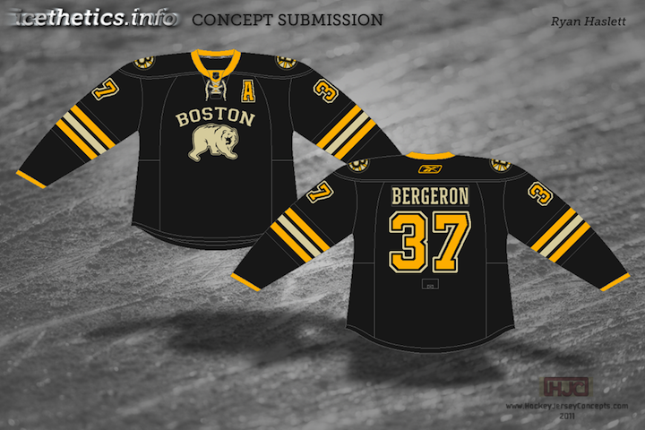
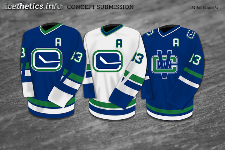
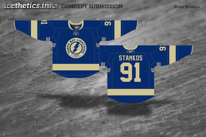
The theme for today's concept art is the Conference Finals! Just four teams remain and here are some fan-made jersey revamps for them. (And a bonus.)

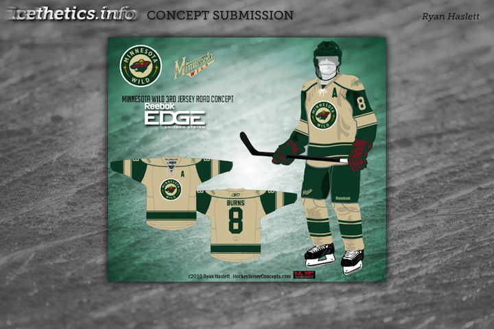
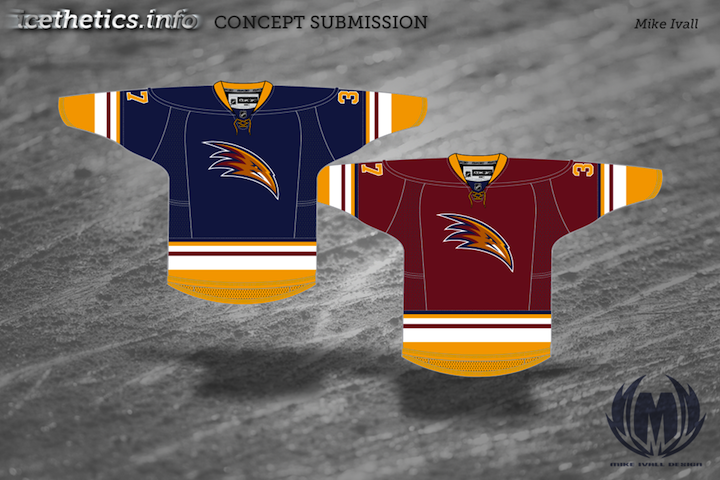
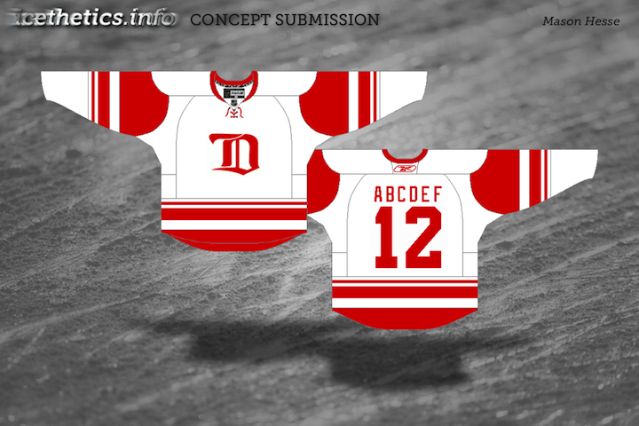
And as a bonus (so I can round out this post with five pieces), here we have the Red Wings, the last team to be eliminated from the playoffs.

Coming soon, we'll take a look at what we might see for the 2012 Winter Classic. Send along your concepts!

Concept Collection 12

New set of concept art for you this evening.

Keep them coming! Send in your work by email to have it included in a future post.

Collection 7: Lightning Revisited

The Lightning's new identity has been controversial, as we all know. So once again, Icethetics concept artists are trying their hands at improving it. You be the judge.

I think that wraps up the Tampa Bay concepts — for now.

Collection 5: Bolt Yourself In

The Tampa Bay Lightning unveiled new logos and uniforms today. It brought a surprisingly divisive reaction — some saying the changes were too drastic and oversimplified, others saying it's exactly the kind of look the NHL needs. So let's see what some Icethetics concept artists think would be ideal.

To start, Jacob merely took the uniforms the Bolts actually unveiled today and reconfigured the placement of some of the logos. I like the bolt on the pants, but I prefer the actual jersey crests, myself. Here are some other ideas...

So what do you think? Is anything here an improvement on what the Bolts actually unveiled today? Or did they get it right already?

Collection 4: Ivall Redux

I've got a handful of new concepts to share from Mike Ivall. He's tackling Predators, Thrashers and Islanders as well as revisiting the Bolts and Leafs.

Knowing the Lightning are looking to ditch the black and silver and go with a blue/white color scheme, Mike thought perhaps they might try a two-tone blue. Personally, I'm a fan.

A lot of you have been asking about how to make your own concept art. Unfortunately, there's no simple or quick way to throw stuff together. Most of the designers who submit work are very talented graphic artists with knowledge of image editing software. If you want something free to get started, look up something like Gimp or Inkscape. I'd love to put together some kind of tutorial, but it's not really that simple. I will try to get together some templates at some point though. So keep an eye out for that.

Mike Ivall is Back!

Long time concept contributor and friend of Icethetics, Mike Ivall has caught the creativity bug, eager to express himself with jersey artwork. And I think that's something we're all happy to hear. Over the last few days he's immersed himself in the following designs.

After the St. Pete Times shared some new details on what the Lightning may be planning for their upcoming uniform redesign, Mike took a stab with some familiar elements. The lack of any black or silver does squarely put the look in Maple Leafs territory, which I'm not wild about. But you never know what Stevie Y has up his sleeve (i.e.: Dwayne Roloson).

I don't know what it is about this color combination but I absolutely love it. I saw Mike's concept and it's made me want to completely redesign Icethetics again — in these colors. The two-tone blue is all right if not overused these days, but add the red and suddenly it's completely unique. Anybody else with me on this?

How can Ottawa improve upon this? It's simple. They can't. Do this and the Senators will never need another jersey for the next century.

As usual, Mr. Ivall's work is outstanding and worthy of a post all to himself. And I can assure you there is more coming not only from Mike but many other talented artists as well.

Concept Collection 2

Continuing with the new concept art format. Seems to be getting good reviews. Today brings a handful of great designs by some Icethetics regulars.

If you recognize the logo in Ryan's Capitals concept, you're not alone. It's not an original design. In fact, it's a logo commissioned by the Capitals years ago but never used. It was included in a post a couple years ago about lost logos registered with the patent office but later abandoned.

Next Winter Classic: Revisited

The Winter Classic at Fenway Park was nothing short of classic. It's such an awesome tradition and there's no shortage of opinions on who should play in future outdoor games. Since the last concept post, a few other artists have submitted some interesting ideas. I have a pair here I thought worth sharing before we move on to a new concept topic.


Brad McPelican

Brad writes in with an idea for a New Year's Day game not in 2011 but in 2014. He calls it the Canadian Classic. It would feature the Ottawa Senators and Vancouver Canucks (playing as the Millionaires) at Frank Clair Stadium in Ontario.

It may seem a bit unusual, so I'll let him explain. He wrote a very long proposal which I have actually edited way down for your convenience. All the key details are intact.

There was a time when the Stanley Cup was a challenge cup exclusively for Canadian clubs and in the Canadian Classic, I would like to relive that era.

The contest I find would be the best is one between Ottawa and Vancouver. Both cities currently are home to NHL franchises who have never won the Stanley Cup but, in hockey's early days, had taken home the prize as two of the nation's finest teams.

What makes this game even more special is that — 100 years earlier, in 1914-15 — the Vancouver Millionaires played in a best-of-five series in Vancouver and won the Cup. It was the last time the Stanley Cup would be exclusive to the best Canadian team — with the Portland Rosebuds joining the PCHA. This series was the last truly Canadian challenge for the Stanley Cup, which I think is pretty special.

As for the jerseys and event logo, I tried to make them as classic and as true to their time as possible. The logo was designed to look like the old team championship pictures and features vintage colors. The jerseys, on the other hand, are almost exactly what they wore — refitted for Reebok Edge jerseys of course — with Ottawa wearing brown pants and Vancouver wearing white ones. You might notice as well that their are no names on the back of the jerseys. This is to be true to the times, not a mistake.

If that game doesn't satisfy traditionalists, nothing could. By the way, just wanted to point out (because I know someone will) that the nameplates on NHL jerseys are currently part of NHL regulations and would probably require an Act of Bettman to sidestep. And he hates Canada.

John B

Obviously this one is just meant to be for fun. You could call it Winter Classic Freak Out. While my little corner of Florida has been atypically cold the last couple of days, there's clearly no way it could sustain a sheet of ice outdoors.

But as a Lightning fan, this was a fun concept to look at and muse on. As long as the Winter Classic is around, I don't ever imagine the Bolts or Panthers getting a shot at it. It will forever be reserved for teams who play where outdoor ice is a viable option.

John does have some interesting artwork here but I'm just not sure these "classic" jersey designs really work. Tampa hockey club? An F with cat ears and a tail? I'll pass.

The icing on the cake probably has to be the Winter Classic-themed surfboard design.

Thanks to John for giving us a laugh.

Thanks to all the artists who sent in their ideas for future Winter Classics.

Strauss NHL Rebrand IV

It's time for another installment of the concept series by artist Elliott Strauss. In this edition he takes on the Buffalo Sabres, Tampa Bay Lightning and Calgary Flames. The artist's descriptions appear in bold text next to each set.


Elliott Strauss

Buffalo Sabres

I updated the logos, taking the B from the shoulders, changing the shape, and crossing the swords that are also on the shoulder logo on top of a circle.  The jersey plays on the theme of their Winter Classic jerseys: striping that switches its direction from hem to arms. The alternate is a retro design.

The Sabres have long been a staple of Icethetics concept art. The problem is that ever since 1996 when they ditched the blue and gold, fans have been unhappy. Fourteen years later, the message finally seems to be getting through to team management, but we'll see how that goes.

Elliott has a great concept here, mixing the old with the new and keeping the classic logo alive on the alternate sweater. Personally I always loved the logo on the red third jerseys and this harkens back to that.

Elliott Strauss

Tampa Bay Lightning

Hopefully here you see an obvious throwback to their pre-Edge uniforms with the simple two solid stripes at the base. The shoulder designs get a little more abstract. A very miniscule amount of silver is found in all three unis. The primary logo is slightly tweaked and the new wordmark I tried to make very jagged to match the nickname.

As a Lightning fan, I have my own thoughts on this one, which I'll try to keep to a minimum. First, I think the current secondary should be the primary mark. It doesn't need the text if you ask me, tweaked or otherwise. And for that matter, the wordmark needs some adjustment. This isn't a criticism of Elliott so much as the team itself. Not the best choice, if you ask me.

Regarding the jerseys, I like the striping, but the font isn't quite suited — or perhaps it would just require some getting used to. Mainly, though, I'm glad to see the lightning bolt sill on the pants.

Elliott Strauss

Calgary Flames

Black is dropped here as I wanted to get a more retro feel the jersey. But the design has some modern influences in the angled patterns — reminiscent of the old Pens jerseys.

The Flames are a team with an established visual identity that is difficult to improve upon. The Flaming C will last longer than a lot of other NHL logos which is likely why Elliott saw no point in changing it.

He mixed elements of Calgary's pre-Edge uniforms and I think it really works. However, I'm not sure there's any way to beat the classic '80s jerseys that the Flames pulled out as a 30th anniversary tribute this season.

In Part 5, Mr. Strauss tackles — you guessed it — the Blackhawks, among others. In the meantime, check back for new concept art. I plan to have new posts here several times a week.